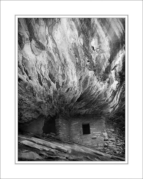
Butler Wash Ruin (Monochrome)
Apr 19, 2015 19:19:34 #
I posted another view of this ruin the other day. Here it is from a different angle and done in monochrome.
Have at it. :-)
Have at it. :-)
Apr 19, 2015 19:58:17 #

Its spot on my man. You do not need a hack like me to nit pick this.
Im in awe of the process so at the risk of being told to take a hike or even worse for my massive ego IGNORED!!!! Give the peasants a crumb and tell a little of how you processed this.
Im in awe of the process so at the risk of being told to take a hike or even worse for my massive ego IGNORED!!!! Give the peasants a crumb and tell a little of how you processed this.
Apr 20, 2015 09:20:49 #

Photographer Jim wrote:
I posted another view of this ruin the other day. Here it is from a different angle and done in monochrome.
Have at it. :-)
Have at it. :-)
Now I know why your other photo looked so darned familiar!!I didn't recognize its official name, but I do know House-On-Fire and it is one remarkable place! Good job at doing something a little different with it in both shots. Nice monochrome version that calls attention to what it is famous for but is different from 90% of the shots taken there - the fire colors. Great execution.
Apr 20, 2015 10:47:03 #
minniev wrote:
Now I know why your other photo looked so darned familiar!!I didn't recognize its official name, but I do know House-On-Fire and it is one remarkable place! Good job at doing something a little different with it in both shots. Nice monochrome version that calls attention to what it is famous for but is different from 90% of the shots taken there - the fire colors. Great execution.
Minnie, the name House on Fire Ruin became popular after Laurent Martres used it in his How to Photograph the Southwest book series. What I found interesting is that the "flames" are much more subtlety colored than what you see in most photographs. Saturation sliders can do wonders!
Which, Billy, brings me to your answer. The key to bringing out the detail and structure in the flames was also a matter of using the saturation sliders. When I made the conversion in PS, the adjustment layer gives you a set of sliders for colors. I simply darkened all reds and lightened all yellows. The result was a dramatic improvement in tonal range for the monochrome. From there, it was just dodging and burning to balance everything out.
Thank you both for commenting. Hopefully others will join in. I intend to print this for a competition on Wednesday, so I'd appreciate feedback (even nit-picky stuff)!
Apr 20, 2015 11:47:30 #

Photographer Jim wrote:
I posted another view of this ruin the other day. Here it is from a different angle and done in monochrome.
Have at it. :-)
Have at it. :-)
Is this the same place that had the beautiful cactus plant in the foreground? If it is, what a difference!!! I like this photo a lot! I think in a contest it could win.
Just one question: What do you think about tilting it a bit to the right? The way it tilts to the left is an odd perspective for me. But it may just be I, so if you don't think it needs changing, don't. It's a very dramatic photo and your pp accomplishes just what you wanted.
Apr 20, 2015 12:01:35 #
Photographer Jim wrote:
b Minnie /b , the name House on Fire Ruin became ... (show quote)
If it were mine, I'd probably brighten the structure just a touch in the deepest shadowed part, and would probably burn the brightest white of the "flames" just a touch, but that is my own personal lean towards shadows/highlights, and isn't shared by all, and might even change depending on how the print looked.
Apr 20, 2015 14:03:27 #
minniev wrote:
If it were mine, I'd probably brighten the structure just a touch in the deepest shadowed part, and would probably burn the brightest white of the "flames" just a touch, but that is my own personal lean towards shadows/highlights, and isn't shared by all, and might even change depending on how the print looked.
Actually, we are thinking alike. After doing the first print, I did in fact lighten the actual ruin some more. In the print, it was a tad bit "muddy" and in need of a bit of lightening and contrast adjustment. Thanks for your comments.
Apr 20, 2015 14:11:27 #
ediesaul wrote:
Is this the same place that had the beautiful cactus plant in the foreground? If it is, what a difference!!! I like this photo a lot! I think in a contest it could win.
Just one question: What do you think about tilting it a bit to the right? The way it tilts to the left is an odd perspective for me. But it may just be I, so if you don't think it needs changing, don't. It's a very dramatic photo and your pp accomplishes just what you wanted.
Just one question: What do you think about tilting it a bit to the right? The way it tilts to the left is an odd perspective for me. But it may just be I, so if you don't think it needs changing, don't. It's a very dramatic photo and your pp accomplishes just what you wanted.
Yes, same ruin, but from a very different angle. When I took the shot, I had a level mounted on my hot shoe, so this is actually accurate as to how things are oriented. I'll certainly take a look at how it might do if rotated slightly. Thanks for your comments.
Apr 20, 2015 20:38:22 #
Photographer Jim wrote:
b Minnie /b , the name House on Fire Ruin became ... (show quote)
Thanks for revealing your technique Jim. Very much appreciate your willingness to share.
Apr 20, 2015 22:59:44 #
I simply darkened all reds and lightened all yellows.
What colors do you see in a black and white photo? I have seen those sliders and run them just to discern any difference in a photo when I've converted one to black and white. All they seem to do is to make the shades lighter or darker so that eventually the photo is either all white or all dark. Something I should look up on the internet? Have never seen an article that addresses this issue, but nobody needs to do research for me. I can do it myself.
What colors do you see in a black and white photo? I have seen those sliders and run them just to discern any difference in a photo when I've converted one to black and white. All they seem to do is to make the shades lighter or darker so that eventually the photo is either all white or all dark. Something I should look up on the internet? Have never seen an article that addresses this issue, but nobody needs to do research for me. I can do it myself.
If you want to reply, then register here. Registration is free and your account is created instantly, so you can post right away.