Which do you prefer
Apr 12, 2015 04:17:02 #
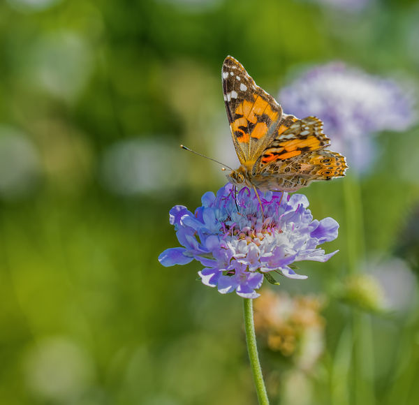
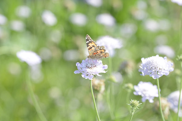
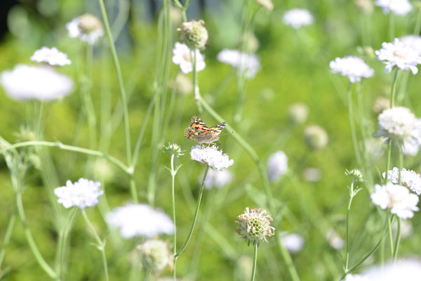
I'm trying to improve on my PP and composition skills.
Which of these two Butterfly shots do you prefer and why? Also, what might be done differently/better to either?
Thanks ahead, Bill
Which of these two Butterfly shots do you prefer and why? Also, what might be done differently/better to either?
Thanks ahead, Bill
Apr 12, 2015 05:28:06 #

Flyextreme wrote:
I'm trying to improve on my PP and composition skills.
Which of these two Butterfly shots do you prefer and why? Also, what might be done differently/better to either?
Thanks ahead, Bill
Which of these two Butterfly shots do you prefer and why? Also, what might be done differently/better to either?
Thanks ahead, Bill
I prefer no 1. The composition flows better. I like the graceful longer stem on the flower and the butterfly's pose. In no 2 I find the out of focus green stem running behind and above the butterfly to be distracting. Also the placement and pose of the butterfly give it a cramped feel.
I think no 1 is very good.
Apr 12, 2015 05:48:59 #

Flyextreme wrote:
I'm trying to improve on my PP and composition skills.
Which of these two Butterfly shots do you prefer and why? Also, what might be done differently/better to either?
Thanks ahead, Bill
Which of these two Butterfly shots do you prefer and why? Also, what might be done differently/better to either?
Thanks ahead, Bill
It seems like you shot these as jpegs. Your attempt to bring down the highlights, which do not have any information, result in tones of gray in both shots.
The first shot could use some background cleanup to remove the out of focus flower on the right of the butterfly, and the orange one behind the stem. Your lens does not generate smooth bokeh, so masking out the flower and butterfly, applying a gaussian blur or lens blur filter to the background would make the background less distracting.
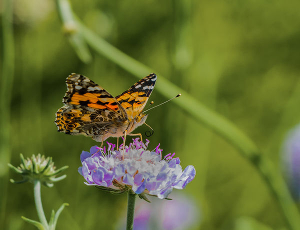
Second image is better - at least you focused on the butterfly and not the center of the flower, and there is no camera blur. A little work to remove the distracting stem behind the butterfly's wing, the flower on the bottom left, and a slightly tighter crop would improve this image.
Both could benefit from better microcontrast - if you don't use Lightroom, then use the unsharp mask and sharpen in two steps - first use a small amount of sharpening - 15% or so, and set the radius to a very high number - certainly over 100. And then make a second pass with a small radius and large amount. Color saturation and brightness could use a small boost as well.
Apr 12, 2015 09:03:40 #

It's so hard to follow around a flitting insect and hope to get an uncompeting background at the same time :)
#2 has the distracting stem as mentioned, but the flower behind the butterfly in #1 is a bit competing - in brightness, and balance too. Seems a bit heavy on the right side, though if the bigger oof flower were removed, might balance out nicely.
#2 has the distracting stem as mentioned, but the flower behind the butterfly in #1 is a bit competing - in brightness, and balance too. Seems a bit heavy on the right side, though if the bigger oof flower were removed, might balance out nicely.
Apr 12, 2015 10:45:12 #
Flyextreme, Excellent detail on both the downloads, way to go! I prefer number 1 because the stem in #2 is a little distracting but both are nice. John
Apr 12, 2015 13:00:24 #
I like the POV and the pose of the second better - also the stem behind bothers me less than the flash of color behind in the first. I tried butterflies once, disaster! They won't stay still at all.
Apr 12, 2015 15:53:31 #

Agree with Linda, and also agree with you that it's hard chasing an insect. Better to put a little sugar water on a bloom, focus on the bloom and wait for the insect to come to you instead.
Linda From Maine wrote:
It's so hard to follow around a flitting insect and hope to get an uncompeting background at the same time :)
#2 has the distracting stem as mentioned, but the flower behind the butterfly in #1 is a bit competing - in brightness, and balance too. Seems a bit heavy on the right side, though if the bigger oof flower were removed, might balance out nicely.
#2 has the distracting stem as mentioned, but the flower behind the butterfly in #1 is a bit competing - in brightness, and balance too. Seems a bit heavy on the right side, though if the bigger oof flower were removed, might balance out nicely.
Apr 12, 2015 16:50:25 #
Cwilson341 wrote:
I prefer no 1. The composition flows better. I like the graceful longer stem on the flower and the butterfly's pose. In no 2 I find the out of focus green stem running behind and above the butterfly to be distracting. Also the placement and pose of the butterfly give it a cramped feel.
I think no 1 is very good.
I think no 1 is very good.
Thank you, just the feedback I was looking for. :-)
Apr 12, 2015 17:03:20 #
Gene51 wrote:
It seems like you shot these as jpegs. Your attemp... (show quote)
Gene, you have a great eye. These are actually over exposed raw files that I was experimenting with to see just how much detail was still there. The jpegs were way, way beyond salvaging.
Much of what you mention is what I suspected might be issues but, thought I would post and see how much so.
I do use LR5 and PS but, only know the basics. I did consider subduing the background, if only I knew more about how to do it. It looks like it's time to learn about using my PP tools.
You have given me more critique than I expected or hoped for and it's greatly appreciated.
Thanks again, Bill :-)
Apr 12, 2015 17:04:30 #
john G SA wrote:
Flyextreme, Excellent detail on both the downloads, way to go! I prefer number 1 because the stem in #2 is a little distracting but both are nice. John
Thanks! I'm partial to the first one also, even without the bud in the second one.
Apr 12, 2015 17:12:36 #
Dixiegirl wrote:
Agree with Linda, and also agree with you that it's hard chasing an insect. Better to put a little sugar water on a bloom, focus on the bloom and wait for the insect to come to you instead.
I actually had my macro set up with me and spotted these and a few others on my way back to the car so, they are spur of the moment shots. The closest I could get was about 3ft away using my 150mm.
The other challenge was that the flowers were waving in the breeze and I am terrible at shooting in direct sunlight. I've also learned that my thumb is bumping the shutter speed wheel when I use the back button to focus, which is usually not an issue because I set my lens to 1:1 and leave it there for about 98% of my macro shooting.
Thank you :)
Apr 12, 2015 17:14:31 #
Linda From Maine wrote:
It's so hard to follow around a flitting insect and hope to get an uncompeting background at the same time :)
#2 has the distracting stem as mentioned, but the flower behind the butterfly in #1 is a bit competing - in brightness, and balance too. Seems a bit heavy on the right side, though if the bigger oof flower were removed, might balance out nicely.
#2 has the distracting stem as mentioned, but the flower behind the butterfly in #1 is a bit competing - in brightness, and balance too. Seems a bit heavy on the right side, though if the bigger oof flower were removed, might balance out nicely.
I'm going to give these suggestions a try. It's a good opportunity to learn more about how to use my PP software :wink:
Thanks! :-)
Apr 12, 2015 18:30:07 #
I concur with everyone else. Even with a few minor short comings, these are still good shots, though. :-) :-)
Apr 12, 2015 19:17:42 #
Here's the SOOC jpegs. The originals in the first post were PP from raw files.
I just noticed that my f-stop (f9) was higher and shutter speed slower than I thought it was at the time too.
All are welcome to make adjustments and post them here. :wink:
I just noticed that my f-stop (f9) was higher and shutter speed slower than I thought it was at the time too.
All are welcome to make adjustments and post them here. :wink:
Apr 12, 2015 19:44:15 #
Flyextreme wrote:
I'm trying to improve on my PP and composition skills.
Which of these two Butterfly shots do you prefer and why? Also, what might be done differently/better to either?
Thanks ahead, Bill
Which of these two Butterfly shots do you prefer and why? Also, what might be done differently/better to either?
Thanks ahead, Bill
Bill, both of these shots are lovely. My preference is #1 as I like that perspective better. It is way above my pay grade to offer critique or technical advice; but, hopefully, I learned a bit from the comments of others. Thanks for sharing these photos and the learning experience!
If you want to reply, then register here. Registration is free and your account is created instantly, so you can post right away.