WPC 1511 - Irish CRITIQUE
Mar 21, 2015 02:42:21 #
davefales' WPC Entry has been selected for the Photo Critique Forum* to find out what could have done to make it better.
Be nice, but be honest as this may help everyone with their craft. Thank you everyone!
From WPC 1511 - Irish RESULTS http://www.uglyhedgehog.com/photo_contest_ratings.jsp?pcnum=161
* If you are new to the Photo Critique Forum please read the Section Rules http://www.uglyhedgehog.com/t-279264-1.html
Be nice, but be honest as this may help everyone with their craft. Thank you everyone!
From WPC 1511 - Irish RESULTS http://www.uglyhedgehog.com/photo_contest_ratings.jsp?pcnum=161
* If you are new to the Photo Critique Forum please read the Section Rules http://www.uglyhedgehog.com/t-279264-1.html
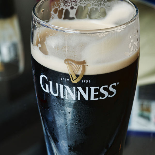
What Can Be More Irish...than a Guinness with Its Head Already Drunk? Shot at the Guinness Brewery in Dublin.

(Download)
Mar 21, 2015 05:58:00 #
St3v3M wrote:
davefales' WPC Entry has been selected for the Photo Critique Forum* to find out what could have done to make it better.
Be nice, but be honest as this may help everyone with their craft. Thank you everyone!
From WPC 1511 - Irish RESULTS http://www.uglyhedgehog.com/photo_contest_ratings.jsp?pcnum=161
* If you are new to the Photo Critique Forum please read the Section Rules http://www.uglyhedgehog.com/t-279264-1.html
Be nice, but be honest as this may help everyone with their craft. Thank you everyone!
From WPC 1511 - Irish RESULTS http://www.uglyhedgehog.com/photo_contest_ratings.jsp?pcnum=161
* If you are new to the Photo Critique Forum please read the Section Rules http://www.uglyhedgehog.com/t-279264-1.html
There are a few things that struck me about this photo. The first is that, for a shot like this, I would prefer to see the whole rim of the glass. I don't mind that the bottom is cut off. That is a choice the photographer made. The rim, however, should all be there in my opinion. I also think that I would have centered the logo since it is a big part of the composition and the perspective is straight on. Finally I would try to tone down the bright spots in the nicely oof background. They are still quite bright and distracting. What I like is the choice to show it partially consumed. It makes it more than a product shot. It gives the viewer the feeling that there is interaction going on here. It is a very pleasing shot with some room for improvement. Hope this critique was useful.
Mar 21, 2015 07:57:11 #
Thank you for your comments, Erich. I agree the lower right background should be toned down, but the light background does help to define the edge of the glass.
Please note I chose to crop square intentionally because my "story" is more the Guinness logo and harp than the glass of dark brew itself. I believe the combined name and harp are roughly centered.
I should also point out that I took a spur of the moment shot with no clear idea what my end product would be. It's somewhat amazing I could stand putting such a wonderful brew down long enough to take the shot. :) :)
Mar 21, 2015 10:18:16 #
davefales wrote:
Please note I chose to crop square intentionally because my "story" is more the Guinness logo and harp than the glass of dark brew itself. I believe the combined name and harp are roughly centered.
Please note I chose to crop square intentionally because my "story" is more the Guinness logo and harp than the glass of dark brew itself. I believe the combined name and harp are roughly centered.
Perhaps if you cut off the top of the glass - no brim - the image would emphasize your goals better, and you would still retain the feeling of someone drinking the brew. I'd like to know if this works for you. Thanks.
Mar 21, 2015 10:26:13 #
ediesaul wrote:
Perhaps if you cut off the top of the glass - no brim - the image would emphasize your goals better, and you would still retain the feeling of someone drinking the brew. I'd like to know if this works for you. Thanks.
Thanks for your comments, Edie. I think the foam remnants on the back of the glass rim are a secondary but still important part of the "story." I tried cropping as you suggested and felt I had lost part of my "story".
Mar 21, 2015 10:26:13 #
Mar 21, 2015 10:52:18 #
davefales wrote:
Thanks for your comments, Edie. I think the foam remnants on the back of the glass rim are a secondary but still important part of the "story." I tried cropping as you suggested and felt I had lost part of my "story".
Maybe you cropped too much. There would still be foam remnants on the glass. I guess I'm suggesting that, for the purpose you stated, you might not need the rim. If it doesn't work for you, then I'm wrong. Thanks for trying it out and letting me know.
Mar 21, 2015 13:59:07 #
davefales wrote:
Thank you for your comments, Erich. I agree the l... (show quote)
You are absolutely correct. I don't think I would have been able to put the brew down. It really looks inviting. I commend your restraint for the sake of art!
If you want to reply, then register here. Registration is free and your account is created instantly, so you can post right away.


