WPC 1509 - Collections CRITIQUE
Mar 8, 2015 04:09:51 #

lbrandt79's WPC Entry has been selected for the Photo Critique Forum* to find out what could have done to make it better.
Be nice, but be honest as this may help everyone with their craft. Thank you everyone!
From WPC 1509 - Collections RESULTS http://www.uglyhedgehog.com/photo_contest_ratings.jsp?pcnum=159
* If you are new to the Photo Critique Forum please read the Section Rules http://www.uglyhedgehog.com/t-279264-1.html
Mar 8, 2015 06:37:08 #
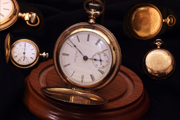
I like the composition and the colors are very nice. I did notice on my monitor in download the background is not quite uniformly dark. I might try to get the background completely black. One other area which is nit picking, is the wooden base has a "shadow" (very small) from the watch at 9:30 o'clock. I might not include the shadow. That would be completely a matter of personal preference, though.
Mar 8, 2015 14:39:06 #

ebrunner wrote:
I like the composition and the colors are very nice. I did notice on my monitor in download the background is not quite uniformly dark. I might try to get the background completely black. One other area which is nit picking, is the wooden base has a "shadow" (very small) from the watch at 9:30 o'clock. I might not include the shadow. That would be completely a matter of personal preference, though.
Thanks you are absolutely right, had not given any thought to that shadow. Something to remember for the future. I used existing light only.
Mar 8, 2015 21:35:59 #
[quote=lbrandt79]Thanks you are absolutely right, had not given any thought to that shadow. Something to remember for the future. I used existing light only.[/quot
I think that the shadows could be reasonably easily cloned out of the existing photo if you were so inclined. No need to re shoot just because of that. Besides, it is just a nit pick. I do really like the photo as it is.
I think that the shadows could be reasonably easily cloned out of the existing photo if you were so inclined. No need to re shoot just because of that. Besides, it is just a nit pick. I do really like the photo as it is.
Mar 9, 2015 09:41:03 #

I like the slight movement of the second hand of the main subject. It affords the viewer with knowing it is a working unit.
For consideration, removed the watch from the upper left corner of the photo, replacing it with black from the background. Add a slight Gaussian blur to all but the main subject. I know that you wanted to depict the features of the various watches, but this takes attention from the main subject.
For consideration, removed the watch from the upper left corner of the photo, replacing it with black from the background. Add a slight Gaussian blur to all but the main subject. I know that you wanted to depict the features of the various watches, but this takes attention from the main subject.
Mar 9, 2015 13:42:10 #

I find the wooden base an unnecessary distraction, I'd remove it completely and use a hidden prop if needed for the central watch and drop the lefthand central watch down a little to better balance the composition. I like the top left part-watch as is. All makes a nice image.
Mar 9, 2015 23:54:04 #

ebrunner wrote:
I like the composition and the colors are very nice. I did notice on my monitor in download the background is not quite uniformly dark. I might try to get the background completely black. One other area which is nit picking, is the wooden base has a "shadow" (very small) from the watch at 9:30 o'clock. I might not include the shadow. That would be completely a matter of personal preference, though.
SoHillGuy wrote:
I like the slight movement of the second hand of the main subject. It affords the viewer with knowing it is a working unit.
I agree mainly but found the textures don't match around the top left, top right and middle left watch images. I like the sharp details in all of the watch faces and backs. Better use of the selection tools and applying what ever effect black, navy, blur or whatever you choose at the same time will give you a better background. or reshooting with some better lighting (reflectors and studio lights?) especially if you want to use the real background folds.
I am not a photoshop wiz, I don't have the lights either, but learning. I love the composition. Definitely worth playing around with.
Mar 10, 2015 18:12:52 #

Other than on download you can see the fabric under the two upper shots I think this is a very well done composite. You added the shadow under the 9:00 image, correct? Nice touch. Makes it look like a smaller version of itself.
The title is "My Grandfather's Watch" singular.
The title is "My Grandfather's Watch" singular.
If you want to reply, then register here. Registration is free and your account is created instantly, so you can post right away.