Just Getting Started
Sep 23, 2011 12:57:35 #

I have always enjoyed photography, but recently have gotten more
involved. It looks like I can learn a lot here. Here are a couple of
pictures I took within the last couple of weeks.
involved. It looks like I can learn a lot here. Here are a couple of
pictures I took within the last couple of weeks.
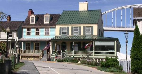
Chesapeake City, Md.
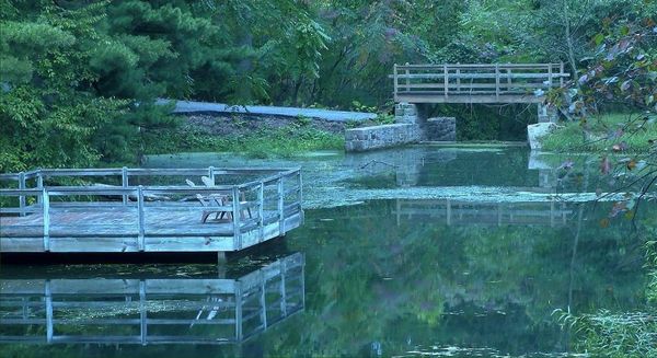
pond near Green Hills, Pa.
Sep 23, 2011 13:55:03 #
Not sure if you wanted comments or not - if not, read no further. The first one to me has nice colors, but I'm not sure what the subject is. If you meant to showcase the house and the bridge I would suggest a widder or not so close view for a mre pleasing perspentive. The second one looks very serene. It also appears too bluish. The wooden deck, the road, and the bridge footings for example have a color cast that I doubt is accurate. Guessing your white balance needed adjusted. I like the concept of both of these Thanks for sharing.
Sep 23, 2011 14:25:41 #
Sep 23, 2011 15:15:04 #

Sep 23, 2011 16:46:57 #
Sep 24, 2011 00:12:15 #

Hi larryh,
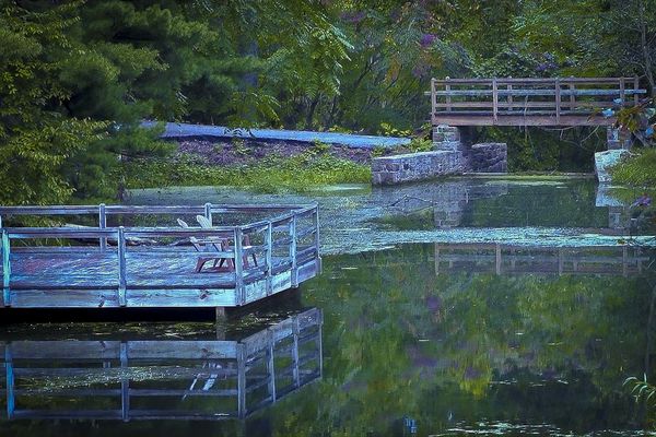
I played a little with the color balance, although the "correct" tone didn't feel right to me. I added a little more blue than was actually recorded, but for me it works. I hope you don't mind the slight cropping, it is a beautiful image, one that I wouldn't mind having on my wall!!! :-)
Gordon
I played a little with the color balance, although the "correct" tone didn't feel right to me. I added a little more blue than was actually recorded, but for me it works. I hope you don't mind the slight cropping, it is a beautiful image, one that I wouldn't mind having on my wall!!! :-)
Gordon
Sep 24, 2011 01:52:53 #
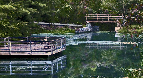
Here is another option - for those that enjoy an editing pogram such as Photoshop something to look at. I would not attempt to argue that any is any better then any others. and yes I could have done a nicer jos of making my selections if I had taken more time. I understand also that some use editing programs very little or not at all which of course is a personal choice. Thanks for sharing.
Sep 24, 2011 02:04:16 #

The original picture of the pond, even the with blue (blue is calming color, so is green) is a good. I like the shadows, the all merge to give the calmness of the situation.
Sep 24, 2011 07:53:20 #
Sep 24, 2011 07:55:52 #
If you want to reply, then register here. Registration is free and your account is created instantly, so you can post right away.