WPC 1504 - Cinematic Look CRITIQUE
Jan 30, 2015 23:59:34 #

punkmunky23's WPC Entry has been selected for the Photo Critique Forum* to find out what could have done to make it better.
Be nice, but be honest as this may help everyone with their craft. Thank you everyone!
From WPC 1504 - Cinematic Look RESULTS http://www.uglyhedgehog.com/photo_contest_ratings.jsp?pcnum=154
* If you are new to the Photo Critique Forum please read the Section Rules: http://www.uglyhedgehog.com/t-279264-1.html
Jan 31, 2015 09:50:49 #

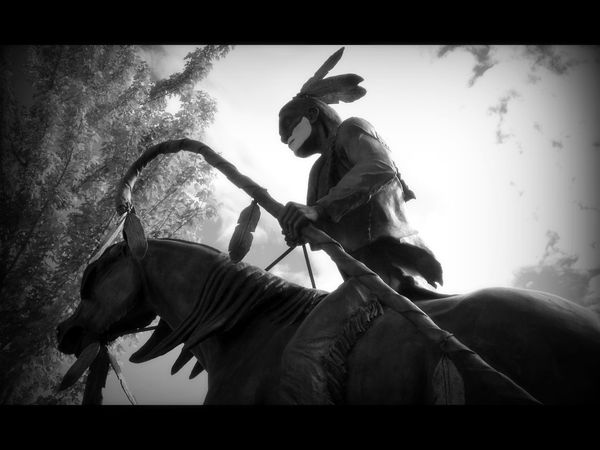
First of all, your picture is one of only a few that really understood what was needed to capture a cinematic look. A cinematic look is not a pretty, still picture with letter-box borders, nor is it a panoramic image. But, many folks who voted didn't understand this. For this reason, I would consider your picture to have been one of the winning shots.
That said, the semi-backlit Indian on horseback is well composed against the bright sky making his image stand out nicely. The vignetting also focuses one's attention on the figure. Good PP to achieve a cinematic look!
That said, the semi-backlit Indian on horseback is well composed against the bright sky making his image stand out nicely. The vignetting also focuses one's attention on the figure. Good PP to achieve a cinematic look!
Jan 31, 2015 16:29:57 #
St3v3M wrote:
punkmunky23's WPC Entry has been selected for the Photo Critique Forum* to find out what could have done to make it better.
Be nice, but be honest as this may help everyone with their craft. Thank you everyone!
From WPC 1504 - Cinematic Look RESULTS http://www.uglyhedgehog.com/photo_contest_ratings.jsp?pcnum=154
* If you are new to the Photo Critique Forum please read the Section Rules http://www.uglyhedgehog.com/t-159520-1.html
First, the section rules have disappeared but I will offer my opinion politely anyhow.
Were the shot mine, I would not have it so contrasty. Would have reduced the hightlights and opened up the shadows to allow more details of the horse and rider to be seen. Secondly, I would leave more room at the left in the direction of movement.
Jan 31, 2015 16:38:24 #

This is the link to the section rules.
http://www.uglyhedgehog.com/t-279264-1.html
But .. you did great without them! :thumbup:
http://www.uglyhedgehog.com/t-279264-1.html
But .. you did great without them! :thumbup:
Jan 31, 2015 19:27:58 #
Madman wrote:
First, the section rules have disappeared ...
I have updated the link. Thank you! S-
Jan 31, 2015 20:41:05 #
St3v3M wrote:
I have updated the link. Thank you! S-
:thumbup: :thumbup: :thumbup: :thumbup:
Feb 1, 2015 00:06:39 #

Thank you very much. :) And thank you for seeing my vision. You got exactly what I was trying to portray.
Feb 1, 2015 00:16:37 #
Thank you for your critique. I intentionally made it contrasted like that so the Indian would be the main focus and pop against the clouds. The vignetting definitely made it dark around the horses face and body but like I said I was more interested in the Indian. Thank you again for your thoughts though.
If you want to reply, then register here. Registration is free and your account is created instantly, so you can post right away.