Quite a bit of discussion about PP in photography this morning.
Jan 30, 2015 11:15:42 #

Apaflo wrote:
I edited with GIMP. The first change was a sligh... (show quote)
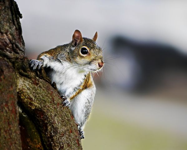
My question really focuses on why the changes have to be on the entire photo. For example, on the second set, the pp on #2 makes the squirrel really pop, and I like that. But why couldn't the pp have been done just to the squirrel and not to the entire photo? Is that because the program doesn't allow one to do so? I would really like #2 if the pp had been limited to the squirrel itself. Just my opinion, but would appreciate replies. Thanks very much. Again, very educational.
Jan 30, 2015 11:27:16 #

Papa Joe wrote:
Good PP practice but in this case even the original is a fine photograph. Good job.
Thanks Papa Joe for the visit and the nice comment. Really appreciated! :-D
Jan 30, 2015 11:31:49 #

i like the original
:thumbup:
jwt wrote:
To add to the discussion or create a new one, here is an image and two pp versions of same. What do you think; does PP aid to the beauty of the image? Posting three images. Please try the downloads.
:thumbup:
Jan 30, 2015 11:56:56 #
gemlenz wrote:
i like the original
:thumbup:
:thumbup:
So glad you enjoyed it Gemlenz; I really appreciate your visit and nice comment. Thank you! :-D :-D
Jan 30, 2015 12:33:33 #
mikeg1218
Loc: Port Charlotte Fl.
Adds to the beauty is a though qestion in this case. All three can stand on their own right so beauty would be pretty much depend on each viewers personal opinion.
Jan 30, 2015 13:04:15 #
mikeg1218 wrote:
Adds to the beauty is a though qestion in this case. All three can stand on their own right so beauty would be pretty much depend on each viewers personal opinion.
Thank you Mike; I really appreciate you taking time to visit and comment. This discussion has generated quite a bit of comment; I hope you're enjoying all the posts. :-D
Jan 30, 2015 14:10:10 #

ediesaul wrote:
My question really focuses on why the changes have to be on the entire photo. For example, on the second set, the pp on #2 makes the squirrel really pop, and I like that. But why couldn't the pp have been done just to the squirrel and not to the entire photo? Is that because the program doesn't allow one to do so? I would really like #2 if the pp had been limited to the squirrel itself. Just my opinion, but would appreciate replies. Thanks very much. Again, very educational.
That's a pretty good question! The answer is that if I were doing a production edit there would be a lot of other things that get done! But, alas.... this was just a demo to show that even very simple, easy, and quickly done edits have an effect.
The edit that hb3 did is very similar to what I did, with only some subtle differences. When I looked at his there was one "distraction" that really stood out, and my immediate thought was that I hadn't even considered that in my edit, so was it as distracting there too? When I looked at mine, it was there. It wasn't quite as glaring. It just wasn't the "topic" of this discussion...
My basic method of image editing is based on Gestalt Theory of Visual Perception. The sum is made up of all the parts. I look for the part that most needs adjustment, and fix it. Then the next. Eventually there is either the realization that the picture is not worth keeping, or there is an image with no major faults that can be corrected.
The next step that I would take with that image would be masking off the bit of the tree that the squirrel is standing on, and reduce it's contrast and give it a very slight blur. Then it would probably be made slightly dimmer. Then, to a different degree, the rest of the bark on the tree would get the same treatment.
Every individual "part" that you can identify as distinct from other parts would get scruitiny. I might not like one hair that is out of place, one twig that is too attractive, and each would get changed or removed as needed to allow the image to best convey the emotional impact that is desired.
Hmmm... here's another edit. I exaggerated it just a bit, but every part of this has been individually manipulated.
Jan 30, 2015 14:31:10 #
Jan 30, 2015 15:26:12 #
neco wrote:
#2 is slightly dark, but still my favorite.
Thanks Neco, glad you liked it. Thank you for your visit and for the nice comment. Much appreciated as always. :-D
Jan 30, 2015 16:35:31 #

I am not one for pp but you certainly did it justice in #3. Nice capture.
Jan 30, 2015 16:46:24 #

Jan 30, 2015 16:57:09 #
I like the original the best. Number two is too dark, in my opinion, and in the last I find the border to be very distracting.
You got the shot right the first time, nothing really needed to improve it.
You got the shot right the first time, nothing really needed to improve it.
Jan 30, 2015 17:18:38 #
Tresed47
Loc: Pennsylvania USA
jwt wrote:
To add to the discussion or create a new one, here is an image and two pp versions of same. What do you think; does PP aid to the beauty of the image? Posting three images. Please try the downloads.
I have to say that I like the original best
Jan 30, 2015 19:13:33 #
cannoneer35 wrote:
I am not one for pp but you certainly did it justice in #3. Nice capture.
Thank you Cannoneer; I really appreciate your visit and the nice comment. :-D
Jan 30, 2015 19:14:14 #
sailorsmom wrote:
The first one is my favorite, Jim! Cute little squirrel! :)
Thank you Sue, so glad you stopped by and commented. Your visits are always appreciated. :-D
If you want to reply, then register here. Registration is free and your account is created instantly, so you can post right away.