Quite a bit of discussion about PP in photography this morning.
Jan 29, 2015 10:41:00 #

Moxie wrote:
The original, in my opinion, is the best picture of the set.
Thank you Moxie, really appreciate your visit and your comment. FYI the first one is pretty much right out of the camera. :-D :-D
Jan 29, 2015 11:02:06 #

Everyone has their own preferences and opinions. I'm no different. I like them all. Number 1 is a great photo. Number 2 has a little more clarity. Number 3 is a little more artsy but, not over done. Each one has its own qualities. Keep up the good work, have fun, and have a GREAT DAY!
Jan 29, 2015 11:06:06 #
pixbyjnjphotos wrote:
Everyone has their own preferences and opinions. I'm no different. I like them all. Number 1 is a great photo. Number 2 has a little more clarity. Number 3 is a little more artsy but, not over done. Each one has its own qualities. Keep up the good work, have fun, and have a GREAT DAY!
Thanks Pixbyjnphotos, I agree completely with your assessment about people's preferences and I thank you for your visit and very kind comment. I really appreciate it. Regards Jim
Jan 29, 2015 11:26:03 #

jwt wrote:
To add to the discussion or create a new one, here is an image and two pp versions of same. What do you think; does PP aid to the beauty of the image? Posting three images. Please try the downloads.
An interesting image! The basic picture is very nice, and well worth putting in the effort with post processing the get the most out of it.
I personally just do not like the distraction added in the 2nd PP version.
The first PP version comes very close though and with a few suggestions can be made much better. First, start again with the original, and in whatever editor you have the first thing to do is correct for the under exposure! Maybe 1-1/2 stops? Look at the histogram. What it actually lacks is contrast.
When adjusting, be careful though, as you don't want any area that has detail to end up with tone values greater than 245. Values from 245 to 255 will be washed out, either on a print or viewed on a properly adjusted monitor. Hence, increase contrast but not so much that the histogram actually goes all the way to the right edge. Keep it back a little. (Different editors do slightly different things with "contrast" and "brightness", try both. What you want is to move the right side of a luminance histogram closer to the right edge.)
And make sure that the left side of the histogram doesn't push up against that edge too much either. If the darkest tones are about 20, you'll be fine. But it is also perfectly fine if you like it a little darker, with the graph going all the way to the left edge and even climbing up the side a little.
Note that when you apply sharpening of any kind there will be edges that go all the way to a value of 255, which is okay. That is hard to evaluate on the histogram, so get the brightness and contrast right before you do any sharpening.
This is an image where framing is significant, but it doesn't fit some of the more commonly used "Rule of Thumb" guidelines. The tree on the left side is essential to the balance of the image, as is the empty space on the right. It works best, in my opinion, when the face is just about centered horizontally, but is about 1/3rd down from the top. That puts the black area on the right just about centered vertically. (I personally like the image cropped to a 5:4 aspect ratio.)
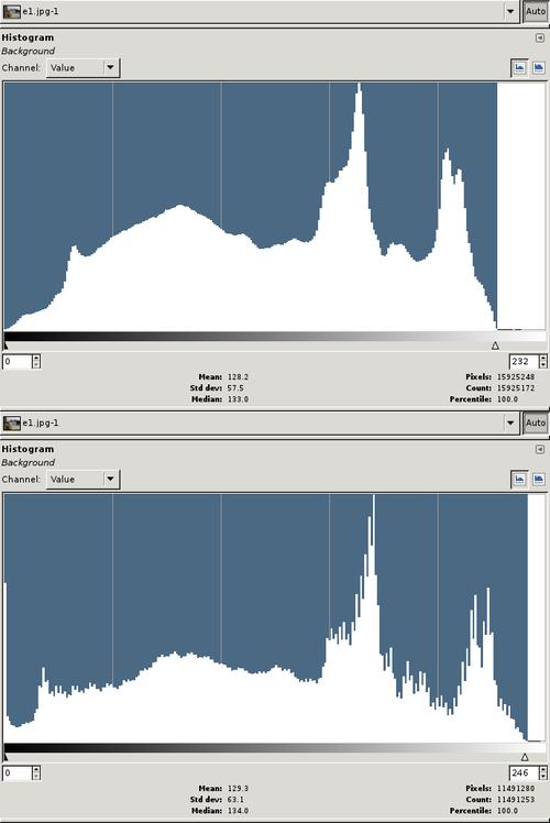
Here is a before and after histogram to demonstrate. The top graph is the original, the bottom graph is after I adjusted brightness and contrast. I've pulled the sliders back so that the blue background area of each histogram stops on the right side at essentially the maximum white value. In the original that is 232. In the image I adjusted it is 246.
Histograms: Before (top) and After (bottom
Jan 29, 2015 11:28:26 #

I like the original Jim and also the rich tones in 2. As Linda said maybe just a little bit lighter. Love the shot.....good work. :-)
Jan 29, 2015 11:33:23 #
Thanks Apaflo, this is a very instructional and well thought out reply. I am just now learning to use these histograms in adjustments so this is very useful to me. I really appreciate your visit and the instructional reply. Thanks again. Regards Jim :-D :-D
Jan 29, 2015 11:34:05 #
Sylvias wrote:
I like the original Jim and also the rich tones in 2. As Linda said maybe just a little bit lighter. Love the shot.....good work. :-)
Thanks Sylvia, really appreciate your visit and comment as always. :thumbup:
Jan 29, 2015 11:52:42 #
jwt wrote:
Thanks Apaflo, this is a very instructional and well thought out reply. I am just now learning to use these histograms in adjustments so this is very useful to me. I really appreciate your visit and the instructional reply. Thanks again. Regards Jim :-D :-D
I'm glad it is helpful!
Histograms are very useful, but it perhaps is not obvious exactly how to use them. So it can be very helpful at the start to get some hints! Even at the intermediate level there are really useful tricks to learn by comparing notes.
Jan 29, 2015 12:06:17 #

In my opinion, you nailed it in the original shot. :thumbup: :thumbup: In #2 I feel the colors are a bit dark, and #3 is a fun shot, but I appreciate #1 more.
Jan 29, 2015 12:10:12 #

jwt wrote:
To add to the discussion or create a new one, here is an image and two pp versions of same. What do you think; does PP aid to the beauty of the image? Posting three images. Please try the downloads.
color me quaint but I like what was actually there so I do very little PP on my stuff. I think your original stands for itself. Nice shot.
Jan 29, 2015 12:25:38 #
jimmya wrote:
color me quaint but I like what was actually there so I do very little PP on my stuff. I think your original stands for itself. Nice shot.
The original is certainly a great starting point, but it clearly can be improved with a little help in post processing. That is true of most images.
The problem is that "a little help" requires a lot of experience. Learning to just whip it out doesn't happen over night! I would encourage anyone to do a lot of post processing. Not just on your own work either, but on images posted here! Try things, see what can be done.
If Jim will give permission I'd be happy to post an additional example of what post processing his image can look like. Not to say that everyone would necessarily like it better, but it could show the difference is the most basic changes that should be made to the original.
Jan 29, 2015 13:30:42 #

Nice work on them all, Jim. Each has its good points. Saw the PP discussion, can't understand the argument against doing so. The non-processed image doesn't exist, it's all a matter of degree. Composites, that's another matter entirely, but as long as it's done honestly, with no intent to defraud, that's fine too. Makes some fascinating images!
And anyway, it's all eye of the beholder, isn't it?
And anyway, it's all eye of the beholder, isn't it?
Jan 29, 2015 13:37:46 #
jimmya wrote:
color me quaint but I like what was actually there so I do very little PP on my stuff. I think your original stands for itself. Nice shot.
Thank you Jimmy; I appreciate you visit and the nice comment. :-D
Jan 29, 2015 13:39:08 #
Apaflo wrote:
The original is certainly a great starting point, ... (show quote)
You have my permission Apaflo; Please show us what can be done.
Jan 29, 2015 13:41:43 #
Treepusher wrote:
Nice work on them all, Jim. Each has its good points. Saw the PP discussion, can't understand the argument against doing so. The non-processed image doesn't exist, it's all a matter of degree. Composites, that's another matter entirely, but as long as it's done honestly, with no intent to defraud, that's fine too. Makes some fascinating images!
And anyway, it's all eye of the beholder, isn't it?
And anyway, it's all eye of the beholder, isn't it?
Absolutely Randy, a good example of that is how any work displays on any given monitor. On my monitor the 2nd one isn't dark albeit somewhat saturated. So far I don't attempt composites per say, but I could understand how some may find that objectionable. Thanks Randy for your visit and nice comment and you can bet I will just keep on keeping on!
If you want to reply, then register here. Registration is free and your account is created instantly, so you can post right away.