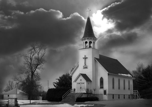
WPC 1502 - Church CRITIQUE
Jan 16, 2015 22:55:46 #

JJPhoto's WPC Entry has been selected for the Photo Critique Forum* to find out what could have done to make it better.
Be nice, but be honest as this may help everyone with their craft. Thank you everyone!
From WPC 1502 - Church RESULTS http://www.uglyhedgehog.com/photo_contest_ratings.jsp?pcnum=152
* If you are new to the Photo Critique Forum please read the Section Rules http://www.uglyhedgehog.com/t-159520-1.html
Jan 17, 2015 08:48:04 #
A very nice photo indeed! I like the sharpness of the church against the soft clouds. Good fix on the vertical perspective. And, good balance and tonal range from blacks to whites. If this is HDR, it was done very tastefully. The only changes I might suggest are cropping out some of the left portion of the image since the sign and white shack seems to draw one's attention from the main subject and cloning out the telephone pole.
I would also add that this photo received as many votes as the first place winner (20) and should have placed in the top three.
I would also add that this photo received as many votes as the first place winner (20) and should have placed in the top three.
Jan 17, 2015 17:14:30 #

Jan 17, 2015 18:35:30 #

Looks like a well managed HDR shot in the main.
The problems lie with a large area of blown sky and ghosting/movement in the tree branches. The halo effect around the tree and bushes needed more control.
B/W conversion will have exacerbated this problem and needed eliminating in the color version.
The bushes on the right side of the church steps appear to have had some heavy PP applied maybe cloning out something but it shows up quite badly on download.
Nice subject and in my humble opinion the composition works just fine. Where it falls down is on attention to the detail which makes the difference between a nice shot and a great shot.
Jan 17, 2015 19:41:09 #

JJPhoto
I like it too! I see the angel, but if you look at the dark clouds on the right of the angel, I see something Demonic. Balance of Good and Evil perhaps?
I like it too! I see the angel, but if you look at the dark clouds on the right of the angel, I see something Demonic. Balance of Good and Evil perhaps?
Jan 17, 2015 21:33:09 #
I find it an extremely interesting "church shot." I think it was a very good choice to do black and white.
I would consider cropping out the sign. However, that would put the steeple dead center in the image. To get closer to the "rule of thirds" you would need to crop the right side a little too, but then you run the risk of having it cropped too tight IMO. Decisions, decisions.
Also, wonder if you can retrieve anything out of the blown highlights of the sky?
I'd be interested in what PP you did? The sky right above the left roof slope looks like it was "dodged" a little too much. Is the sky halo around the tall tree natural in the photo?
All these are tiny criticisms of a great shot.
St3v3M wrote:
JJPhoto's WPC Entry has been selected for the Photo Critique Forum* to find out what could have done to make it better.
Be nice, but be honest as this may help everyone with their craft. Thank you everyone!
From WPC 1502 - Church RESULTS http://www.uglyhedgehog.com/photo_contest_ratings.jsp?pcnum=152
* If you are new to the Photo Critique Forum please read the Section Rules http://www.uglyhedgehog.com/t-159520-1.html
Be nice, but be honest as this may help everyone with their craft. Thank you everyone!
From WPC 1502 - Church RESULTS http://www.uglyhedgehog.com/photo_contest_ratings.jsp?pcnum=152
* If you are new to the Photo Critique Forum please read the Section Rules http://www.uglyhedgehog.com/t-159520-1.html
Jan 17, 2015 21:37:32 #

Tack sharp shot with plenty of DOF. I like the angle, I love, love, love the light. It's great that the bright spot of light is right at the church's steeple. I would clone out the back stair railing and the sign. I wouldn't want to crop the image as I think a structure like this needs room. I like the little back building.
Jan 17, 2015 22:43:46 #

Nightski wrote:
Tack sharp shot with plenty of DOF. I like the angle, I love, love, love the light. It's great that the bright spot of light is right at the church's steeple. I would clone out the back stair railing and the sign. I wouldn't want to crop the image as I think a structure like this needs room. I like the little back building.
Cloning out kind of goes against the "rule" of "Post Processing is fine but keep it to a minimum".
Jan 18, 2015 03:32:31 #
Jan 18, 2015 03:33:43 #
Nightski wrote:
Tack sharp shot with plenty of DOF. I like the angle, I love, love, love the light. It's great that the bright spot of light is right at the church's steeple. I would clone out the back stair railing and the sign. I wouldn't want to crop the image as I think a structure like this needs room. I like the little back building.
Thank you
Jan 18, 2015 14:44:54 #

I like this but it does need a couple of things attending to, firstly the blown patch of sky needs judicious cloning in of clouds but still retaining some of the brightness in that area. Next, I think the church is a bit flat, lacking in contrast. Boost the contrast and make the white church really sing out and grab the eye. If you make the church the star of the show the other minor issues pointed out will pale into insignificance.
Graham
Graham
Jan 18, 2015 14:56:26 #
Graham Smith wrote:
I like this but it does need a couple of things attending to, firstly the blown patch of sky needs judicious cloning in of clouds but still retaining some of the brightness in that area. Next, I think the church is a bit flat, lacking in contrast. Boost the contrast and make the white church really sing out and grab the eye. If you make the church the star of the show the other minor issues pointed out will pale into insignificance.
Graham
Graham
Yes sir
Jan 18, 2015 15:09:13 #
JJPhoto wrote:
Yes sir
You can drop the "Sir", Her Majesty the Queen hasn't Knighted me... yet. Until that happens Graham will do just fine :-D
Jan 18, 2015 20:07:27 #
I like the image but it has an unfinished quality about it. It looks like the cloudy sky was added due to the halos around the church and trees. The concept is wonderful but just needs a bit of cleaning up.
Jan 19, 2015 00:22:02 #
Graham Smith wrote:
You can drop the "Sir", Her Majesty the Queen hasn't Knighted me... yet. Until that happens Graham will do just fine :-D
no disrespect Graham
If you want to reply, then register here. Registration is free and your account is created instantly, so you can post right away.