Portrait
Feb 20, 2012 19:41:59 #

Feb 20, 2012 19:45:25 #

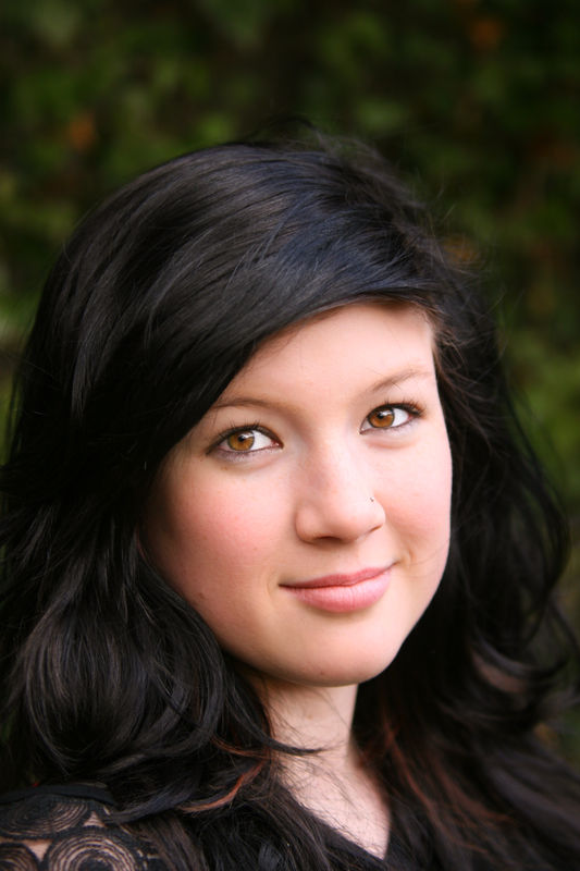
I like #1 the best. No. 2 is ok, but the lighting looks harsh. No. 3 is too close up.
Feb 20, 2012 20:53:44 #
flytyer57 wrote:
I like #1 the best. No. 2 is ok, but the lighting looks harsh. No. 3 is too close up.
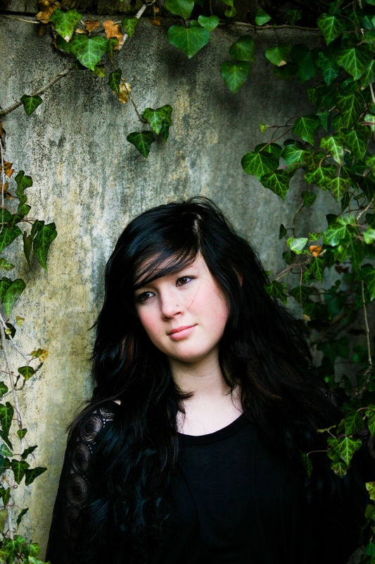
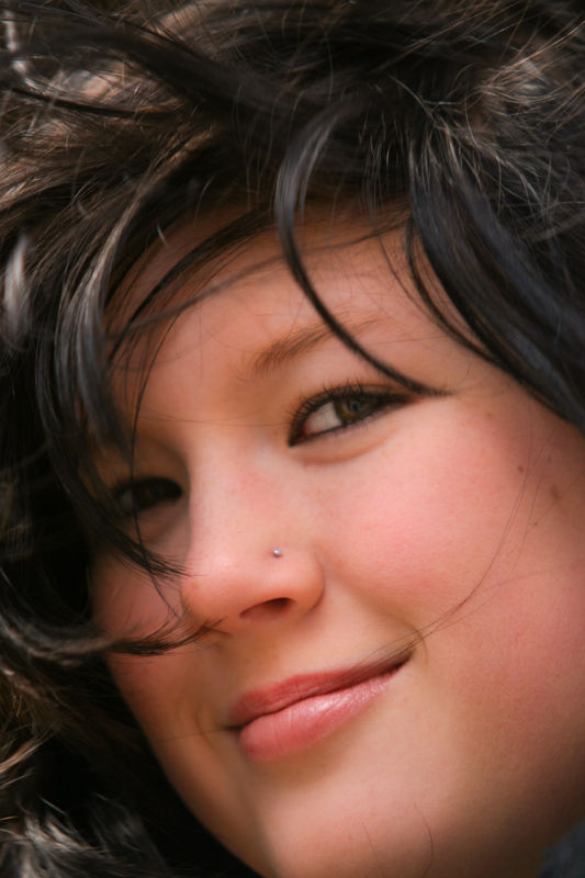
1 is also the one I like the best. 2 she want a "Twilight" the movie look. 3 not normal but she loves her eyes so I took one with the eyes of the subject. Thanks for the comments
Feb 20, 2012 21:08:21 #

#1 is nice - I might have tried blocking the top light to get a bit more direction to the light coming from the right. Maybe.
I really like #2 the best. There is a bit too much image above her head for my taste, but I like the expression and the light.
I agree that #3 is too close and the near eye is soft- not in focus. Her lips and nose appear to be sharp, but not the eye.
I really like #2 the best. There is a bit too much image above her head for my taste, but I like the expression and the light.
I agree that #3 is too close and the near eye is soft- not in focus. Her lips and nose appear to be sharp, but not the eye.
Feb 20, 2012 21:10:54 #
77firebird wrote:
Comments welcome
#2 is the winner but all three are good, placement of the eyes on the diagonal is excellant
Ian
Feb 20, 2012 21:27:59 #
CaptainC wrote:
#1 is nice - I might have tried blocking the top light to get a bit more direction to the light coming from the right. Maybe.
I really like #2 the best. There is a bit too much image above her head for my taste, but I like the expression and the light.
I agree that #3 is too close and the near eye is soft- not in focus. Her lips and nose appear to be sharp, but not the eye.
I really like #2 the best. There is a bit too much image above her head for my taste, but I like the expression and the light.
I agree that #3 is too close and the near eye is soft- not in focus. Her lips and nose appear to be sharp, but not the eye.
Thanks Captain I love the work you do with your Portrait's and I will keep your comment in mind next time I get the chance to do another shot. Again Thanks
Feb 20, 2012 21:30:22 #
ianhargraves1066 wrote:
#2 is the winner but all three are good, placement of the eyes on the diagonal is excellant
Ian
77firebird wrote:
Comments welcome
#2 is the winner but all three are good, placement of the eyes on the diagonal is excellant
Ian
Thanks I really appriciate the comments from you and Captain that mean's that I am making some progress on my photo skills. I have learned so much from the UHH members Thanks to All.
Feb 21, 2012 00:10:53 #

#1 is my favorite captures the spark in her eyes, ironically the close up her eyes are dark and not really visible in the same manner as #1. Besides that all very nice, and a beautiful model.
Feb 21, 2012 07:18:44 #

#1 is good but suggest toning down the light just a bit.
#2 is believe is best perhaps a little tighter cropping
# 3 has filled the screen just a little too much and I see some softness.
Remember that shadows make for depth and in the photo and keep you from looking like a point and shoot. Shadows are your friend. Continue practicing and don't be afraid to experiment with reflectors both to add and subtract light.
Feb 21, 2012 09:34:48 #

#2 for me, crop a tad tighter maybe to the first leave above her head proportionately.
Feb 21, 2012 09:38:55 #

Good shots,
#1: Focus a bit of; her eye or eyes aren't tack sharp. It would have been nice to provide a "hair light" to separate her dark hair from the background.
#2: I like the overall shot but the same applies; her eyes are soft.
#3: Ahh...I can take it or leave it..there are no catchlights in her eyes.
That is NOT to say that this isn't a good effort....it is! These are just my observations.
Feb 21, 2012 10:18:07 #
Thanks for the comments. Here on UHH I learn every time I make a post. I Have been working with my lighting and I think I am getting closer I just have to tie this all together and remember to focus on the eyes. Thanks UHH members
Feb 21, 2012 10:20:44 #
77firebird wrote:
Thanks for the comments. Here on UHH I learn every time I make a post. I Have been working with my lighting and I think I am getting closer I just have to tie this all together and remember to focus on the eyes. Thanks UHH members
Not trying to be nosey but can you elaborate on your statement "working on my lighting.."?
I've also been trying to improve my lighting so I'm wondering what you are doing/working on.
Feb 21, 2012 13:23:44 #

I like the first one best, but I think all of them are good shots...... now I am going to nip pick them, the only thing I don't like about them are the strands of hair on the left side of her face going near her nose and mouth...
Feb 21, 2012 14:48:50 #
#2 is the winner for me as well, I would crop just above the 3 ivory leaves above her head. I think it would make the image just that much more powerful.
As mentioned before you have some stray hairs that need to be cleaned up, in the first one there are some wisps that are under her chin. #2 has a stray hair crossing over her face and #3 has a few hairs traveling up her nose. :)
the eye in number #3 is a little soft, if you are going to crop this close it has to be tack sharp.
If you want to reply, then register here. Registration is free and your account is created instantly, so you can post right away.