PP "Misty" for me.
Nov 19, 2014 14:59:19 #

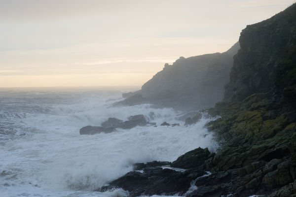
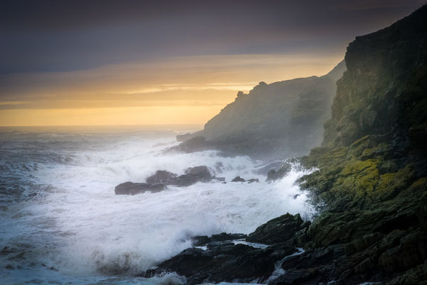
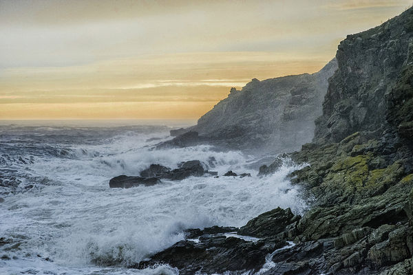
Mist is an elusive subject to PP. It's easy enough to thicken or thin it, but deciding what's best for a shot can be tricky. It's also easy to saturate/desaturate it or to change its tint (mist isn't always blue/grey), but again it's a case of deciding what's best for a shot.
Having said that, this shot has spray rather than mist, but the same things apply. I'd be very interested to see your general approach to editing this shot, and in particular what you consider an enhancement for the mist/spray in this shot.
JPG here, DNG to follow.
-
Having said that, this shot has spray rather than mist, but the same things apply. I'd be very interested to see your general approach to editing this shot, and in particular what you consider an enhancement for the mist/spray in this shot.
JPG here, DNG to follow.
-
Nov 19, 2014 15:00:41 #
Nov 20, 2014 03:18:48 #

R.G. wrote:
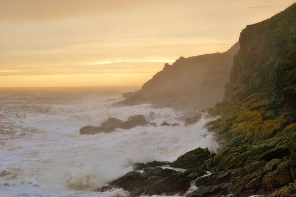
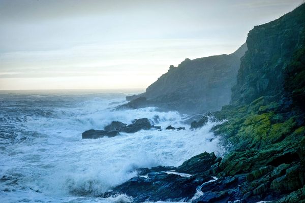
DNG version.
-
-
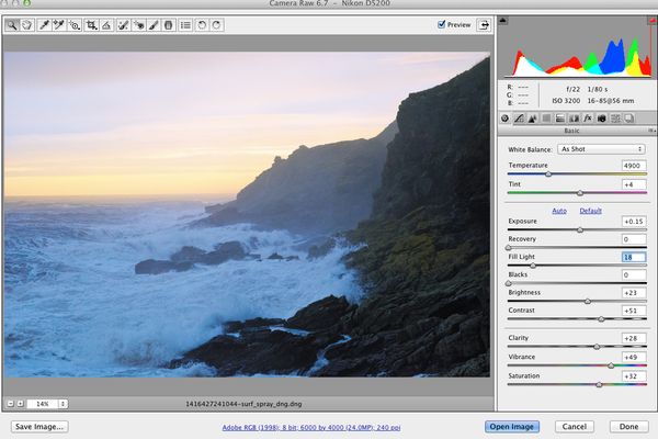
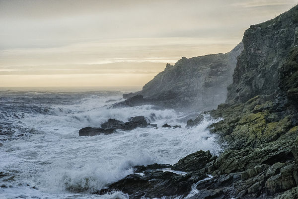
I like the shot - played with this one in ACR a bit. It seems like a "gentle" PP touch is required to avoid overcooking in a number of possible ways. As a fellow fan of misty land and seascapes, I had to try some tweaks...
Nov 20, 2014 07:10:44 #
Dr.db wrote:
I like the shot - played with this one in ACR a bit. It seems like a "gentle" PP touch is required to avoid overcooking in a number of possible ways. As a fellow fan of misty land and seascapes, I had to try some tweaks...
Thanks for posting the workspace screenshot, Dr.db. I'd say it's been well boosted without looking overcooked. I'm surprised that more of the mist wasn't "dispersed" with the amount of contrast and clarity that you used. Maybe the Lightroom values aren't a direct equivalent. And I see you lightened a bit too. I find that lightening mist strengthens it, whereas darkening (lowering highlights) weakens it. So maybe the contrast/lightening partly countered each other.
I know what you mean about yellow. It definitely needs to be kept in check in most shots. And I find that using a lot of sat (and to a lesser extent vibrance) boosts - or possibly even adds - yellow. But I see you kept it well in check. Thanks again for your contribution.
Nov 20, 2014 08:35:21 #

R.G. wrote:
Mist is an elusive subject to PP. It's easy enoug... (show quote)
Billys attempt
Camera Raw>Photoshop Threshold adjustment using channels and blend modes>NIK filter to extract detail and final flourish with Alien Skin Exposure. Copy and paste used to patch parts of far cliff.
Nov 20, 2014 09:10:34 #

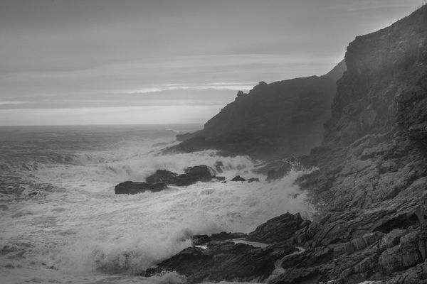
I am not a big fan of b&w but I wonder if this one might be better that way. Here is my attempt. The large dynamic range coupled with low contrast prevented me from getting what I wanted. Everything was done in LR with radial filters and a linear gradient. I exported as jpg to save space.
I think the colors in the original interfered with making this a more interesting picture.
I think the colors in the original interfered with making this a more interesting picture.
Nov 20, 2014 10:01:11 #
In lightroom, warmed up wb slightly. Used graduated filter to darken sky and add Blue with WB adj for filter. Did some dodge and burn using radials and brush (these adjustments altered lighting, added clarity and sharpness and exposure up/down to pop it. Finally did an overall sharpening and a bit of post crop vignette
Nov 20, 2014 10:21:34 #
lloydl2 wrote:
In lightroom, warmed up wb slightly. Used graduated filter to darken sky and add Blue with WB adj for filter. Did some dodge and burn using radials and brush (these adjustments altered lighting, added clarity and sharpness and exposure up/down to pop it. Finally did an overall sharpening and a bit of post crop vignette
Well done. You got what I tried to get in my b&w version. Although I use negative vignetting a lot, I would not use it here. I would also work the shadows more. The important things are that you fixed the colors and made the sky and waves glow. However, I still do not like the softness.
Nov 20, 2014 10:27:47 #
R.G. wrote:
Mist is an elusive subject to PP. It's easy enoug... (show quote)
Loved playing with this shot, R.G. Thanks for posting.
Here's my version.
Nov 20, 2014 10:28:22 #
Billyspad wrote:
Billys attempt
Camera Raw>Photoshop Threshold adjustment using channels and blend modes>NIK filter to extract detail and final flourish with Alien Skin Exposure. Copy and paste used to patch parts of far cliff.
Camera Raw>Photoshop Threshold adjustment using channels and blend modes>NIK filter to extract detail and final flourish with Alien Skin Exposure. Copy and paste used to patch parts of far cliff.
With a bit of color in the sky
Nov 20, 2014 11:32:59 #
Billyspad wrote:
Billys attempt
Camera Raw>Photoshop Threshold adjustment using channels and blend modes>NIK filter to extract detail and final flourish with Alien Skin Exposure. Copy and paste used to patch parts of far cliff.
Camera Raw>Photoshop Threshold adjustment using channels and blend modes>NIK filter to extract detail and final flourish with Alien Skin Exposure. Copy and paste used to patch parts of far cliff.
I see your intention was to bring out more detail in the cliffs, but not lose all the mist. Your edit has definitely got it looking a bit more cold and stormy. Of your two edits I prefer the first, probably because the sky's closer to how I remember it. Thanks for your efforts.
Nov 20, 2014 11:40:39 #
abc1234 wrote:
I am not a big fan of b&w but I wonder if this one might be better that way. Here is my attempt......
An interesting variation, abc1234. I can imagine that the mist was problematic in the conversion. It's most prominent in a part of the scene that's close to being dark, so what to do - lighten and lose the drama in the cliffs or darken and lose some of the mistiness.
I think for B&W I'd be tempted to select the sky and increase the drama somehow - possibly more contrast, or just darken.
I'm not sure how I'd deal with the cliffs. I'd probably try to find a way to have the drama and the mist :-) (easier said than done.... ). Thanks for posting.
Nov 20, 2014 11:48:31 #
R.G. wrote:
An interesting variation, abc1234. I can imagine ... (show quote)
I do not think the mist interfered with the conversion. I think you were cursed with bad lighting and are trying to make the best of it. Thanks for the opportunity to work on it. I wished I had been more successful but some of those color edits do look good.
Nov 20, 2014 11:49:18 #
rborud
Loc: Minnesota
R.G. wrote:
Mist is an elusive subject to PP. It's easy enoug... (show quote)
R.G.
My effort is colored "pun intended" by being a prairie lander, and not being by the sea. It is a sensual shot.
RBorud
Nov 20, 2014 11:57:41 #
rborud wrote:
R.G.
My effort is colored "pun intended" by being a prairie lander, and not being by the sea. It is a sensual shot.
RBorud
My effort is colored "pun intended" by being a prairie lander, and not being by the sea. It is a sensual shot.
RBorud
Nothing wrong with the colours at my end, rborud. And I think you've done much as I would with the mist - thin it just enough to make more cliff details visible. Thanks for posting.
If you want to reply, then register here. Registration is free and your account is created instantly, so you can post right away.