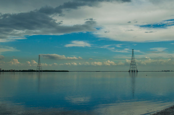
Which crop works best?
Nov 12, 2014 16:36:54 #

I can't make up my mind. If you like one better can you explain why?
Thank you.
Thank you.

Nov 12, 2014 16:54:15 #

I like the first the best. The progression of three towers makes it more interesting. In the second, the two towers are about the same distance from the edges. That is more static.
Just my opinion of course. The image could stand a little brightening.
The second would be better with some of the left edge cropped away, putting the smaller tower further from the center than the right tower, a matter of balance.
Just my opinion of course. The image could stand a little brightening.
The second would be better with some of the left edge cropped away, putting the smaller tower further from the center than the right tower, a matter of balance.
Nov 12, 2014 17:00:57 #

Nov 12, 2014 17:06:18 #
I prefer the second image.
Firstly, it's more simplified. The parts that have been cropped out don't really add anything important to the overall image.
Also, I find the second composition tonally more evenly balanced; there's less predominance of darkness on the left side of the image.
You may perhaps be able to improve the image by brightening up the highlights a touch, and also strategically apply some mild dodging to select areas to make the tonal balance even stronger.
Nov 12, 2014 17:27:53 #
Nov 12, 2014 17:34:57 #
lorenww wrote:
Thanks, keep it coming.
Now that you mention it, brightening will help.
Now that you mention it, brightening will help.
A little lighting to number one and you've got a keeper. Just my opinion of course.
Nov 12, 2014 23:48:15 #

I like #1, with the three towers. Odd numbers of things often make a more pleasing design. :) Very pretty!
Nov 13, 2014 05:09:38 #

The second photograph would have been better had the third tower been included and the shore-line in the bottom right corner excluded.
Nov 13, 2014 06:13:09 #
I like the contrast setting in the first, crop doesn't make that much difference.
Nov 13, 2014 09:58:13 #

Nov 13, 2014 16:20:08 #

rook2c4 wrote:
I prefer the second image. br br Firstly, it's m... (show quote)
I agree completely with the Rook. 8-)
Nov 13, 2014 19:20:52 #
KK, I will go for #1 with a little brightening, gotta love raw.
I appreciate your comments and for me it is a difficult decision. I want to enter this in a free newspaper photo of the day and it will be a first for me.
I really appreciate your input and want to thank all of you.
Hope it gets published.
I appreciate your comments and for me it is a difficult decision. I want to enter this in a free newspaper photo of the day and it will be a first for me.
I really appreciate your input and want to thank all of you.
Hope it gets published.
Nov 14, 2014 13:56:06 #
[quote=lorenww]I prefer 2. I cropped and made brighter. I will show you if you like. David
If you want to reply, then register here. Registration is free and your account is created instantly, so you can post right away.