WPC 1442 - Survive CRITIQUE
Oct 25, 2014 00:04:02 #

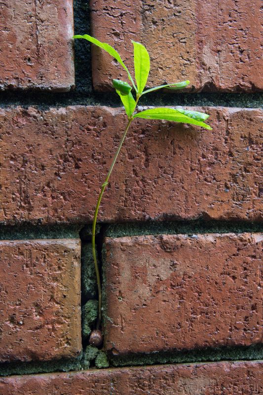
jimvanells has volunteered their WPC Entry to the Photo Critique Forum* to find out what could have done to make it better. Be nice, but be honest as this will help everyone with their craft. Thank you everyone!
From WPC 1442 - Survive RESULTS http://www.uglyhedgehog.com/photo_contest_ratings.jsp?pcnum=140
* If you are new to the Photo Critique Forum please read the Section Rules http://www.uglyhedgehog.com/t-159520-1.html
From WPC 1442 - Survive RESULTS http://www.uglyhedgehog.com/photo_contest_ratings.jsp?pcnum=140
* If you are new to the Photo Critique Forum please read the Section Rules http://www.uglyhedgehog.com/t-159520-1.html
Oct 25, 2014 07:32:39 #

I like this very much, Jim. The placement of the weed growing out of the brick is good ... maybe a bit more room at the top ... not much. I think post processing could make a world of difference in this shot. A little selective dodging and burning to set the subject apart. Very subtle changes.
Oct 25, 2014 08:37:07 #

It certainly fits the theme, probably better than many that scored above it. I agree with Nightski a little more room at the top, but that is minor. Maybe brighten it and i say maybe because UHH messes with that quite a bit.
Oct 26, 2014 10:18:51 #

I don't look at the competition entries or the winners, so I can't compare it to others in the contest. I like the simplicity of the image and it certainly fits the theme well. I know this was shot at an angle, but there's something about the perspective that keeps me studying. It seems the top is straight, but the bottom isn't. Is that my astigmatism working against me?
If you're wondering why you didn't win, it might be the mere simplicity of it. Lots of folks like busier images. I'm not one of them.
If you're wondering why you didn't win, it might be the mere simplicity of it. Lots of folks like busier images. I'm not one of them.
Nov 24, 2014 19:03:47 #

Thanks for your comments. I was crowded in between a boxwood shrub and had about 24" between the lens and tree. It is actually a red oak and I have no idea how that acorn got into the space between the mortar.
If you want to reply, then register here. Registration is free and your account is created instantly, so you can post right away.