Bokeh?
Oct 6, 2014 10:34:44 #
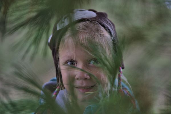
Is this photo considered to be bokeh?
Any other comments are welcome'
thx
Jerry
Any other comments are welcome'
thx
Jerry
Oct 6, 2014 10:50:39 #

You captured a playful moment that's very appealing! She has beautiful eyes and a natural smile, and the setting is unique. I like this shot a lot.
If you do a UHH or internet search for topics on bokeh, you will find many opinions and definitions. The description I like best is "a pleasing out of focus background that adds to the overall composition." And yours qualifies, for me :)
If you do a UHH or internet search for topics on bokeh, you will find many opinions and definitions. The description I like best is "a pleasing out of focus background that adds to the overall composition." And yours qualifies, for me :)
Oct 6, 2014 11:00:04 #
Oct 6, 2014 14:11:14 #

Bokeh is the quality of the out of focus areas of a photograph. So you can say that a photo has good bokeh or poor bokeh depending on how pleasing it is to the eye and how well it enhances the overall image. One cannot say a photo IS bokeh, rather one should say a photo HAS bokeh. Technically all photos with out of focus areas have bokeh, some good, some not so good. I would say that this wonderful photo has excellent bokeh. It is soft and smooth and very much enhances the photo. Some of it is even in front of the subject, and we don't see that very often. Frame this masterpiece.
Oct 6, 2014 17:23:49 #
Oct 7, 2014 10:59:51 #

I really like these "hide and seek" photos, especially with children as the subject. I'd like to see more color in this one, or a little more contrast maybe, because it does look a little washed out. But I like the different framing a lot.
Oct 7, 2014 21:30:51 #
thx for the comments. this is a new area of photography I'm experimenting with.
Oct 8, 2014 01:25:48 #

Jerry Banse wrote:
Is this photo considered to be bokeh?
Any other comments are welcome'
thx
Jerry
Any other comments are welcome'
thx
Jerry
This image is testimony to the danger of conflating all variations on the theme of O.F.F. under the rubric of "bokeh".
There's mere out-of-focus, which characterizes (IMO and to my eye) the distracting obstruction of my view of the child's delightful face and expression on the one hand, and the tasteful suggestion of the variety of background densities to be found beyond the DOF in this otherwise laudable image.
Just a reminder; such a difference of opinion as this is, in no way, an expression of right versus wromg!
It's just opinion.
Vive la difference!
Dave in SF
Oct 8, 2014 14:25:32 #
Thanks for the comments.
But being new to this type of photography, I'm not familiar with O.F.F. and IMO.
I wasn't really sure where I should go from here.
thx
Jerry
But being new to this type of photography, I'm not familiar with O.F.F. and IMO.
I wasn't really sure where I should go from here.
thx
Jerry
Oct 9, 2014 16:01:40 #
Jerry Banse wrote:
Thanks for the comments.
But being new to this type of photography, I'm not familiar with O.F.F. and IMO.
I wasn't really sure where I should go from here.
thx
Jerry
But being new to this type of photography, I'm not familiar with O.F.F. and IMO.
I wasn't really sure where I should go from here.
thx
Jerry
O.F.F. is really O.O.F (or OOF) Out of Focus areas.
IMO is In my opinion.
IMHO is In my honest opinion.
Just ways to abbreviate common terms. There is a listing somewhere here on UHH that tells you all of the most common abbreviations.
Oct 9, 2014 17:49:54 #

Jerry Banse wrote:
Is this photo considered to be bokeh?
Any other comments are welcome
Any other comments are welcome
All the comments on bokeh are correct, or close enough. None of them will make that picture worth printing as it is though! And it does have some extremely nice potential. It just plain looks nice! The green, the hide and seek look of a cute little kid... what else is there?
Well, it just doesn't have "pop". It lacks contrast and it lacks compositional drama. As has been hinted at, the subject is obscured, and even the text of your post recognizes that by first asking about the out of focus areas (which are so dominant they obscure the subject) and only second do you as about "any other comments"! Interesting, eh?
Here's a statement by the late Rudolf Arnheim that pretty much explains composition. It is from the introduction to his 1971 essay
Entropy and Art:
"Order is a necessary condition for anything the human mind
is to understand. Arrangements such as the layout of a city or
building, a set of tools, a display of merchandise, the verbal
exposition of facts or ideas, or a painting or piece of music
are called orderly when an observer or listener can grasp their
overall structure and the ramification of the structure in some
detail. Order makes it possible to focus on what is alike and
what is different, what belongs together and what is segregated.
When nothing superfluous is included and nothing indispensable
left out, one can understand the interrelation of the whole and its
parts, as well as the hierarchic scale of importance and power by
which some structural features are dominant, others subordinate."
One way to edit an image is to consider the last paragraph of that quote, and first determine what is superfluous or not, and remove things either by cloning or cropping as appropriate. Take a critical look at your image... and there isn't actually anything in it that should be removed! Hmmm... It's not what is there, it's which parts are dominant and which are subordinate.
The child should dominate, everything else should be subordinate. That can be changed in many ways. Cropping to move the child off to the right helps. Making things blurred or darker reduces dominance, but in this case nothing needs changing. Making things brighter or sharper makes thing dominant, and that is what should be done with the child. In this case using a curves tool to put an S curve into the gamma curve works. That is, make the brighter areas a little brighter and the darker areas a little darker, which reduces contrast in those areas but causes a steeper curve at the center. The center also happens to be almost exclusively the child's face! I also selected areas around both eyes and applied sharpening just to the eyes.
The result is of course very subjective, and not everyone will like it. I thought the difference was exactly the compositional drama needed to make that a wall hanger! I could post it if you'd like to see what the difference is.
Oct 9, 2014 19:59:24 #
Oct 10, 2014 02:32:05 #
I offered to post an edited image to show what my critique was about, and Jerry gave permission. It was posted, and Jerry did comment that he liked the difference. Unfortunately posting a second image is against the stated rules for this forum, and a kind moderator quite naturally removed the edit and our discussion of it.
In this case I do think the edited image serves a very significant purpose in helping to understand my previous comments about Jerry's posted image. It may be easy enough for those with experience to read such a description and realize what it means, but that may not be the case for people learning about that significance.
For that reason I'm going to post a link to the image. That isn't exactly what Jerry said was okay, so if he wants I will kill the link immediately. Until then, clicking on the link is exactly the same as clicking on the "download" button that was under the posted and removed image.
Edited Version of Jerry Banse's Posted Image
Oct 10, 2014 14:13:55 #
Oct 10, 2014 14:39:50 #
Apaflo wrote:
I offered to post an edited image to show what my ... (show quote)
Yikes... I noticed in your edit that the eyes and mouth have excess noise in them now. Not sure if this was something you did. Perhaps you tried some selective sharpening. Regardless, this didn't help in my opinion. I liked your original idea of just changing the tone curve.
If you want to reply, then register here. Registration is free and your account is created instantly, so you can post right away.