WPC 1439 - Museum Day CRITIQUE
Oct 3, 2014 22:14:14 #

VYP has volunteered their WPC Entry to the Photo Critique Forum* to find out what could have done to make it better. Be nice, but be honest as this will help everyone with their craft. Thank you everyone!
From WPC 1438 - Museum Day RESULTS http://www.uglyhedgehog.com/photo_contest_ratings.jsp?pcnum=137
* If you are new to the Photo Critique Forum please read the Section Rules http://www.uglyhedgehog.com/t-159520-1.html
From WPC 1438 - Museum Day RESULTS http://www.uglyhedgehog.com/photo_contest_ratings.jsp?pcnum=137
* If you are new to the Photo Critique Forum please read the Section Rules http://www.uglyhedgehog.com/t-159520-1.html
Oct 4, 2014 03:07:42 #
lighthouse
Loc: No Fixed Abode
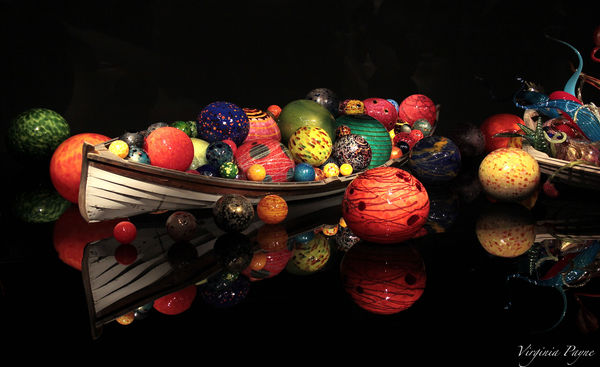
Beautiful clarity and use of colour VYP.
Maybe could be a fraction "cooler" though, and a fraction more saturated.
Nice black background control to isolate the items.
I do notice one thing though and I'm not quite sure what the cause is.
It may be a join in the mirrors, or it may be a stitch in the photo. It is about along the bottom thirds line but on a slight diagonal.
I'd like it to be less noticeable.
Oct 4, 2014 13:02:22 #

It is a beautiful photo. I do think it would be better without a part of the second boat on the right -- leave the ball on the right though.
Oct 4, 2014 13:19:57 #

A well exposed, colorful, properly focused photograph with an interesting subject and reflection. 8-)
Oct 4, 2014 13:41:01 #

Virginia, this is beautifully done. As lighthouse said, the clarity and colors are wonderful. That reflection is just so sharp, crisp, clear. I like the warmth of it .. but that's personal preference. The lighting is lovely as well. Thank you for sharing this in the Photo Critique Section. :-)
Oct 4, 2014 13:45:20 #
VYP
Loc: Boxborough, MA
Thank you, lighthouse, for your kind words and feedback. Could you please elaborate a bit on what you mean by "a fraction cooler"?
Interesting that you noticed "something" on the bottom third of the pic. I didn't do any stitching to the pic. The glass artworks are actually displayed on a large glass-type table. Perhaps what you see is just the way the lights from the ceiling shine on the glasswork, creating some kind of shadow or reflections?
Interesting that you noticed "something" on the bottom third of the pic. I didn't do any stitching to the pic. The glass artworks are actually displayed on a large glass-type table. Perhaps what you see is just the way the lights from the ceiling shine on the glasswork, creating some kind of shadow or reflections?
lighthouse wrote:
Beautiful clarity and use of colour VYP.
Maybe could be a fraction "cooler" though, and a fraction more saturated.
Nice black background control to isolate the items.
I do notice one thing though and I'm not quite sure what the cause is.
It may be a join in the mirrors, or it may be a stitch in the photo. It is about along the bottom thirds line but on a slight diagonal.
I'd like it to be less noticeable.
Maybe could be a fraction "cooler" though, and a fraction more saturated.
Nice black background control to isolate the items.
I do notice one thing though and I'm not quite sure what the cause is.
It may be a join in the mirrors, or it may be a stitch in the photo. It is about along the bottom thirds line but on a slight diagonal.
I'd like it to be less noticeable.
Oct 4, 2014 13:51:22 #
VYP
Loc: Boxborough, MA
Thank you, RJNaylor, for you nice comment and suggestion. I actually did take another one at a little closer range, and omitted the second boat on the right. ;-) But somehow I chose this one as the entry for the weekly Photo Contest - perhaps for the more interesting composition? See attached for the other photo.
RJNaylor wrote:
It is a beautiful photo. I do think it would be better without a part of the second boat on the right -- leave the ball on the right though.
Oct 4, 2014 13:56:42 #
VYP
Loc: Boxborough, MA
Thank you so much, bmac and nightski, for your kind words and feedback! This is the first time that my photo got chosen to be part of the "Critique" forum at UH. I feel extremely honored!
Oct 4, 2014 14:44:21 #

Very nice work and well chosen subject material. The lighting is very appropriate to the subject material, but I suppose that was how you found it rather than how you set it up. I prefer your original composition as it includes some of the curvy abstract work that is more representative of Chihuly's work than the round balls, but I would crop the right edge to remove that disjointed red squiggly on the right edge. The joint/stitch that lighthouse mentioned is surely a joint between two sheets of reflective table top. evidence of it is in the jog in the reflection of the front of the boat and the sudden change in colour/shade of the reflection of the yellow ball on the right.
Impact: 4/5
Technical: 4.5/5
Composition: 4/5
Impact: 4/5
Technical: 4.5/5
Composition: 4/5
Oct 4, 2014 21:10:29 #
VYP
Loc: Boxborough, MA
Thank you, mcveed, for your kind and encouraging feedback. You're right, there are so many different amazing displays from Chihuly in the Glass Museum. This round-balls display is just one of his many breathtaking artwork. Good suggestion to crop out the little bit of red on the right edge! Thanks for clarifying what lighthouse observed on the bottom third of the pic. Many thanks as well for including your "ratings" at the bottom of your message. They are very helpful and encouraging!
mcveed wrote:
Very nice work and well chosen subject material. T... (show quote)
Oct 5, 2014 01:19:17 #
VYP wrote:
I did attach a new jpg, and saw it below my reply. But then it somehow got deleted. I am attaching it again here.
Tut-tut. Nightski will get you for that. This is a critique section not a counselling section. You are only allowed one version per post unless one is a black and white conversion. That's why the other one disappeared.
Oct 5, 2014 03:27:34 #
lighthouse
Loc: No Fixed Abode
mcveed wrote:
Tut-tut. Nightski will get you for that. This is a critique section not a counselling section. You are only allowed one version per post unless one is a black and white conversion. That's why the other one disappeared.
Not nightski, it was lighthouse that deleted both reposts now.
Oct 5, 2014 12:17:00 #
Nobody is counseling anyone -- others put two or more photos in one post. I just wanted to see what it looked like without the second boat. Did someone getup in a bad mood?
mcveed wrote:
Tut-tut. Nightski will get you for that. This is a critique section not a counselling section. You are only allowed one version per post unless one is a black and white conversion. That's why the other one disappeared.
Oct 5, 2014 12:58:14 #
RJNaylor wrote:
Nobody is counseling anyone -- others put two or more photos in one post. I just wanted to see what it looked like without the second boat. Did someone getup in a bad mood?
RJ, welcome to the Photo Critique Section. I truly appreciate your input, but we do have a rule that prohibits more than one photo per thread. There are several reasons for it, and if you'd like me to articulate, please pm me. Here is a link to the Critique section rules.
http://www.uglyhedgehog.com/t-159520-1.html
I hope to see you again.
Nightski
Oct 5, 2014 13:25:45 #
VYP
Loc: Boxborough, MA
Sorry all, I didn't know that I am not supposed to post more photos in the Critique forum. This is my first time featured in this forum. My apologies.
If you want to reply, then register here. Registration is free and your account is created instantly, so you can post right away.