Check out The Dynamics of Photographic Lighting section of our forum.
please help
Feb 9, 2012 17:25:08 #


Feb 9, 2012 17:28:01 #

Feb 9, 2012 18:07:55 #

Mr Pass Port wrote:
let me know what i could have done better please
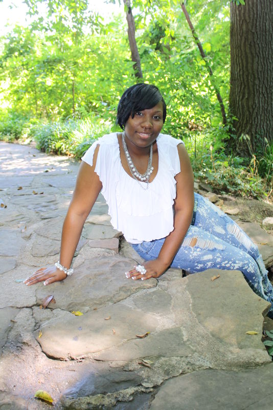
For #1, pretty decent, but she looks pretty stiff on that arm she is resting on. I would crop tighter - too much nothing above and below her. The light, however is pretty good.
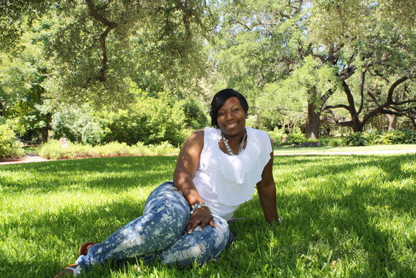
For #2, you emphasized her leg size by having her head away from the camera and her lower body close. NEVER do that to a woman. NEEEVER. Ever. The sun hitting her face and the side of her nose is not good. Either get the subject in the shade, or use a translucent scrim to soften that sun.
#3 Has sun speckles on her face/body. I know it is tough under trees, but you just have to find an area that is in FULL shade. Nice background, but use a more open aperture to soften it a bit. It appears just about as sharp as her face.
It looks like you have a case of "centeritis." The face is dead center - or close to it - in all the images. Focus on the eyes, then recompose to move the face UP in the frame.
Check out Software and Computer Support for Photographers section of our forum.
Feb 9, 2012 18:12:30 #

MT Shooter wrote:
I think fill-flash could have improved all 3.
Fill-flash was used, look at the shadows. One thing that would help is to use a longer lens and a wider aperture to throw the background out of focus.
Fill light could be done with a big piece of white foam-core held by a friend. Try not to shoot at noon.
Feb 9, 2012 18:18:50 #
My photography teacher many many many years ago spoke at length on the correct exposure and dress for dark skinned subjects. Often times exposing for the subject would blow out the highlights as shown in your photos. I would suggest a less contrasting garment in a pleasing shade. As for the poses I agree with Captain C. You will note that in the third photo the shade helps the overall appearance of the photo because it cuts down on the white tops influence in the shot. A carefully placed reflector illuminating only the subjects face would have made the shot much better.
Feb 9, 2012 23:22:19 #

Feb 9, 2012 23:33:37 #

#1 - her white shirt is blown, you have a tree growing out of her head. You've also cut off her feet, the crop should be higher up on her leg or include her feet. I think the pose would work if she didn't have so much weight on her one arm.
#2 - Whites are blown again. Her feet are cut off again. You also have a hot spot on her face/forhead. Captain C already mentioned the pose.
#3 - whites are blown and her toes are cropped off. Dappled sunlight is not your friend when doing portraits and should be avoided most of the time. I do like this pose. She looks very relaxed.
She is a very pretty lady, your lucky to have such a wonderful model to work with.
Check out Digital Artistry section of our forum.
Feb 10, 2012 09:46:08 #

Feb 10, 2012 13:59:19 #

I am an old geezer so I look at things a little differently. I really hate those pants that are ripped and worn out looking. That is the first thing that caught my eye. The tech. aspects were pretty well covered by others.
Feb 10, 2012 14:00:52 #
PATRIOT wrote:
I am an old geezer so I look at things a little differently. I really hate those pants that are ripped and worn out looking. That is the first thing that caught my eye. The tech. aspects were pretty well covered by others.
I agree with you but it seems to be in fashion to wear "broken-in" clothing. My daughter does it too.
Feb 10, 2012 14:10:56 #

Lots of valid suggestions here.
One tip; Youtube has LOTS of good instructional videos for posing, exposure, clothing, tips, tricks...the whole thing.
You can learn a LOT by just typing: "portrait posing tips" in Youtube!
One tip; Youtube has LOTS of good instructional videos for posing, exposure, clothing, tips, tricks...the whole thing.
You can learn a LOT by just typing: "portrait posing tips" in Youtube!
Check out Infrared Photography section of our forum.
Feb 10, 2012 17:16:17 #
Wow thank all of you for the all the constructive feed back I really need this to help me on my way. @ RPAVICH thanks for the you tube offer however I love the feed back I'm getting here on Ugly Hedghog from the real people thanks
Feb 10, 2012 20:38:30 #

I'm new here, but one thing I've already learned is.........Listen to the Captain.
Larry
Larry
If you want to reply, then register here. Registration is free and your account is created instantly, so you can post right away.