Same Ugly Model - Different Day
Sep 2, 2014 12:37:12 #
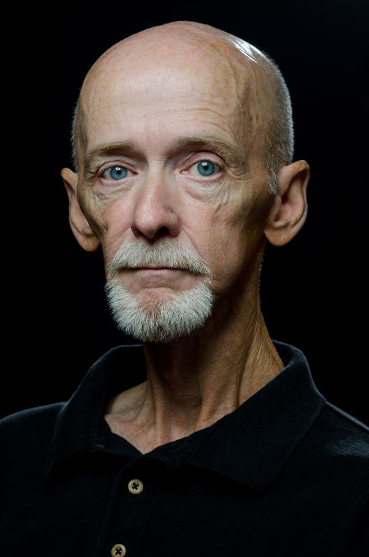
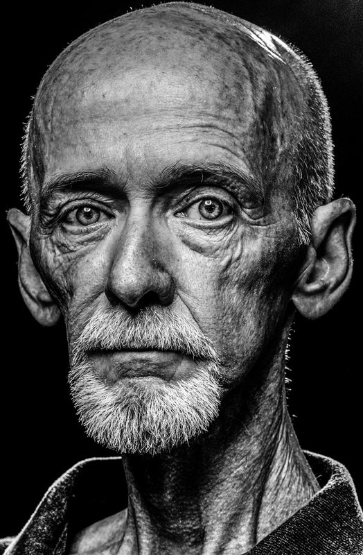
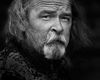
Continuing to practice. Similar lighting to the previous setup, but the main light is almost directly above. Second shot is a close crop of same image in high-contrast B&W. I believe it helps to emphasize every line, wrinkle, age mark and scar, carefully earned during a life well lived. Feel free to tell me what I've done poorly, and how to improve.
Sep 2, 2014 12:59:58 #
Sep 2, 2014 13:18:01 #
Rick,
Some things to help number 1.
1) you need to remove the hot spot from the top of the head.
2) next time I would offset the above light slightly to get a less(beauty lighting.) I do like the lighting you have. To see the way lighting can be done better in these types of portraits you should google Luke Fontana. You will notice from the catch lights in his subjects eyes that the lights are offset slightly.
3) I do recommend a deep gray(thunder gray) background if your wearing a black shirt. It helps with the separation and looks better than the separation you have with the rim lighting around the shoulders. Again, see Luke Fontana for superb thunder gray background portraits.
Shooting on thunder gray will also give you a stronger base for the head.
The first portrait is still fairly well done and better than most could do.
I am real picky about B&W portraits and how contrast is added in a portrait.
I am not a fan of the second shot. The crop is too tight. Contrast is too edgy for my taste. It looks over processed. When B&W photos are over processed it makes the viewer feel uninvited. You want your processing to draw you in.
I know this may some a little vague, however portraiture is really a feel thing as much as anything. Matching your processing to your expression makes a ton of difference in creating a portrait that has mood.
Another plus is you have a super subject that's ready when you are.
Regards,
Russ
Sep 2, 2014 14:13:53 #
riada22 wrote:
I prefer #2, did you really need a light.
Thank you for commenting.
Yesterday, I was trying to mix ambient and flash. Today, I started with an ambient light image that was completely black. From there I added light to the subject for a low-key shot that had separation from behind. Even though the light behind me was snooted, it was not adjusted properly and the highly reflective bald head shows the result. So, for what I was trying, I did need light.
Sep 2, 2014 14:31:03 #
PalePictures wrote:
Rick,
Some things to help number 1...
I am real picky about B&W portraits and how contrast is added in a portrait.
I am not a fan of the second shot. The crop is too tight. Contrast is too edgy for my taste. It looks over processed....
Regards,
Russ
Some things to help number 1...
I am real picky about B&W portraits and how contrast is added in a portrait.
I am not a fan of the second shot. The crop is too tight. Contrast is too edgy for my taste. It looks over processed....
Regards,
Russ
Thanks for the critical viewing and the suggestions Russ. I will research Luke Fontana's work. As I continue to spend more time learning to work with all my pretty flash toys, I want to establish a firm confidence that I have become proficient with portrait basics before I attempt anything too creative.
I'm beginning to feel confident in my re-touching abilities for most post-processing, but have no confidence at all with B&W images. I guess the second pass with the Clarity slider was a bit much. I continue to practice, learn, and hopefully improve.
Again, Thank you.
Sep 3, 2014 00:26:33 #
Sep 3, 2014 05:42:33 #

Rick36203 wrote:
Continuing to practice. Similar lighting to the previous setup, but the main light is almost directly above. Second shot is a close crop of same image in high-contrast B&W. I believe it helps to emphasize every line, wrinkle, age mark and scar, carefully earned during a life well lived. Feel free to tell me what I've done poorly, and how to improve.
I like no 2, it is just a wee bit tight on the crop for me, gives it a whole new look from no 2.
Sep 3, 2014 09:52:09 #
Rick,
I agree with Russ on a couple points he mentioned. The B&W is over processed such that it is too stark and abrupt for my viewing. The lighting needs to flow a bit better across the image. I feel the beard needs to be burned down a little since my attention goes to it quite readily competing with the eyes which should draw the viewer's attention first. The eyes are quite clear and sharp and are almost the same brightness with the camera right eye only a bit brighter than the camera left eye. Tweak the Iris in the camera left eye just a tad to make it equal.
The crop is too tight. Notice that there is no support from the neck and shoulders to hold up that head. That is what makes the image appear to me like an alien being (in my opinion) and honestly not meant as an insult. Also, without shoulders showing more, the head looks huge compared to what the rest of the body would be like in one's mind. The hot spot on the top of the head (camera right) as well as the brightness of the short hair on the sides of the head and camera right neck also seems to detract from the image and the eyes.
As Russ said, the separation needs to be a bit more subtle which can be overcome by using a Thunder Grey background or just don't burn the background as much, or lighten it (dodge) using a curves later and selectively do it using a brush.
Just my thoughts trying to give some pointers for improvement. Thanks for posting and sharing. The color image is done quite well and the brightness of the hair and the beard is not near as noticeable or distracting as in the B&W.
Best Regards,
Tom
Sep 3, 2014 10:09:43 #
SharpShooter wrote:
Rick, confess, that's a self-portrait, Right?? :lol:
SS
SS
Yes sir. I confess. :wink:
Sep 3, 2014 10:13:01 #
nanaval wrote:
I like no 2, it is just a wee bit tight on the crop for me, gives it a whole new look from no 2.
Thank you.
Sep 3, 2014 10:26:39 #
I'll just comment on the color version . . . the intense blue eyes are clear, sharp and feel like they are staring back at the viewer, the facial structure with the very pronounced zygomatic arch makes for a strikingly interesting face, and with the lighting set up the way you have, the shadows emphasize this feature even more than it probably would be in real life, so maybe placing a reflective panel under the face, out of camera view would help de-emphasize the extremely gaunt look, also consider turning the head a few degrees to the right, so the right ear can't be seen and the left ear isn't quite so prominent will help focus the interest back on the face, without the distraction of the ears, and we can begin to see the interesting life stories that are reflected in this man's amazing face.
Sep 3, 2014 10:51:57 #
Thank you trc for your time and suggestions. If you think the long un-supported neck and head look alien to you, just wait till it turns its head the other direction. This is his "good" side. And, believe it or not it has a significant other (spouse) that has stayed with it for 36 years. But, she too, has always said he had a bad case of "big head".
I'm not offended, and I really do appreciate all honest opinions.
I'm not offended, and I really do appreciate all honest opinions.
Sep 3, 2014 11:46:07 #
jonsommer wrote:
I'll just comment on the color version . . . the i... (show quote)
Jon
I was trying a slightly different lighting setup for this image, as I usually begin with a key light at about 45 degrees to one side and 45 degrees above.
I also was avoiding using a background, so I shot without ambient light in this mix. This made the crop a little tight with my 85mm because of limited space in the room. But, in all honesty, until it was mentioned, I did not think it was a significant problem. I see now, that with long necks more room is needed for shoulders.
I know "beauty" lighting is normally not used on men, but I'm fairly confident in my gender identification, and wanted to see how the differences would appear.
The pronounced zygomatic arch, and the gaunt appearance, have been honestly earned in the past 10 years or so. Not so much by suffering and hunger, as is sometimes inferred by definition, but by normal aging and a little help from a scalpel here and there. I fear that no amount of supplemental lighting will help. And, I'm sure, with the right model, your suggestion will improve image detail.
But, ignoring the rim light, I definitely noticed how shadows differ in this type of key lighting. Thank you, for taking the time to express your thoughts on this photo. I learn much more from the thoughts of others than I ever will just staring at my own work.
Sep 3, 2014 11:48:07 #
Rick36203 wrote:
Thank you trc for your time and suggestions. If you think the long un-supported neck and head look alien to you, just wait till it turns its head the other direction. This is his "good" side. And, believe it or not it has a significant other (spouse) that has stayed with it for 36 years. But, she too, has always said he had a bad case of "big head".
I'm not offended, and I really do appreciate all honest opinions.
I'm not offended, and I really do appreciate all honest opinions.
Rick,
Thanks for not taking offense. One of our sons has a very large head, such that when he was an infant about 32 tears ago, my wife and I were so concerned that we took him to a doctor and he monitored his head size for some time. Now, he is a doctor and has a 1 year old of his own who's head size looks a little large, but not as large as his father's. Kids/friends always harassed him about his head size. He still gets comments about his head size!
I think Jon's suggestion may be good about turning 'your' head a few degrees. I am not sure he is talking about camera right ear or actual right ear. It would seem that by doing so it would then magnify the camera left ear - Hmmmm? The reflector may help a little or it may accentuate the length of the neck more? You could try to shoot with the camera just a little bit above the eye level (effect would be to shorten the length of the neck) and not directly at or below the eye level - can't remember the technical name for that right now. Once again, just suggestions.
Best Regards,
Tom
Sep 3, 2014 12:20:51 #
jonsommer wrote:
... this man's amazing face.
Oh, and Jon,
Back to the pronounced cheekbone and gaunt appearance. Well, who am I kidding...?
I've lost over 80 pounds, and I'm hungry.... Can you spare a sam-ich?.... please!
I'll shove it through that little tube they gave me....Some idiot installed a "No Thru Traffic" sign in my mouth. :) :lol:
If you want to reply, then register here. Registration is free and your account is created instantly, so you can post right away.