some interesting pictures
Aug 30, 2014 21:28:53 #
Your comments are greatly appreciated....as they say, the only way to really know, is to ask!
Aug 30, 2014 22:21:52 #
They are indeed interesting :) They are all beautiful shots. But 1,2,3 are most interesting to me. 1&2 because they are simple and yet tell a story. And 3 because it is artistic.
Aug 30, 2014 22:34:59 #
Aug 31, 2014 12:14:43 #
Aug 31, 2014 12:19:23 #
Aug 31, 2014 13:07:11 #
Ive Fallen wrote:
Wowsa! Great, but don't forget, do not pet the kitty!
Funny...not a friendly kitty! thank you for watching....much appreciated
Aug 31, 2014 13:08:29 #
Aug 31, 2014 16:14:26 #
bito wrote:
Your comments are greatly appreciated....as they say, the only way to really know, is to ask!
I liked the B&W work a lot! #1 is classic. I might have cropped bottom and left some but I can't argue with your composition, either.
Aug 31, 2014 17:34:58 #
bito wrote:
Your comments are greatly appreciated....as they say, the only way to really know, is to ask!
I think you are asking for critique, but if you are not I apologize.
1) First of all you have a good eye for composition. This appears to be a somewhat difficult shot to take given the light conditions. You have a strong back light coming through window which is bleeding over the chair (your subject) making it somewhat soft and washed out. If you had used some exposure compensation of maybe -1 EV and bought up the shadows in post your subject would have more presence. I am undecided whether the post hanging down in the top right adds anything to the scene, however you have captured the shadows it is casting adding a bit of dimension. (Was there a window behind you?)
2) Another difficult shot with shooting into the sun but with it being diffused by the clouds you made it work. Even with the diffusion the sun is too hot, it tends to draw the eye away from your subject, easily fixed in PP to bring it down just a tad. I would have made your subject a little less centred, I would also take out the power line above the buildings on the right hand side (just a minor point). I really like this picture, the download is great as is the contrast. Well done.
3) Great in your face shot. Should be given more room to camera left and less on camera right so that your subject is looking into the scene as opposed to out of it.
4) The first impression I get is the picture is over saturated but overall the exposure is great. You captured the light being bounced up into the gentleman's face showing his great smile. I think the picture would have been better if you had captured the 2 men just a tad further back to the left thus showing them walking into the frame and not just about to leave it but obviously this is a candid capture and overall a nice picture. I would have taken out the object in the bottom right of the frame.
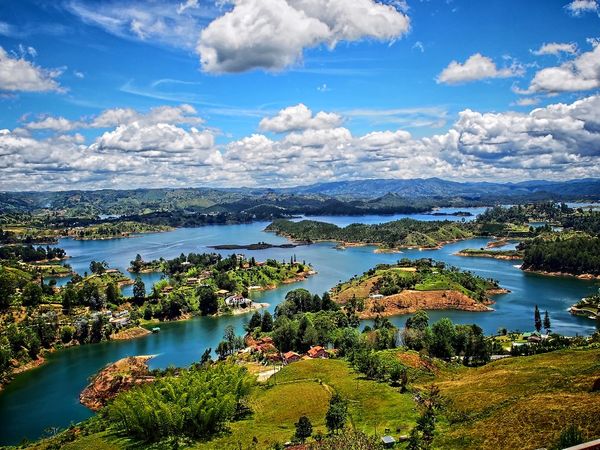
5) I like this, it is a very nice landscape scene, however again this picture is over saturated. When composing your frame think about the rule of thirds. In your scene the sky and the landscape fill the screen in a 50/50 ratio, for a more atheistically pleasing look you should choose what is the focus of your picture and make that 2 thirds of your composition. In this case removing the top part of the clouds where they are less dense and showing 2 thirds of the landscape would produce a better shot. Watch out for your horizon line it is sloping down to the left.
6) Nice simple shot. Having captured the bird flying into the scene really adds to it, well done.
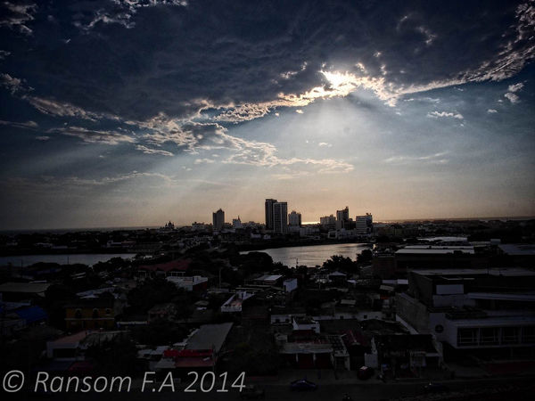
7) Here you are using the rule of thirds, well done. You captured the setting sun behind the clouds adding to the spread of light which clearly is the focus of the scene. This is just a personal preference but for me I would have totally underexposed the details of the wall and the girl leaving this part totally silhouetted, again easily fixed in PP. Your horizon appears to be sloping down to the left but I suspect that could be from the angle you are standing at, if you decide to make the lower 3rd a silhouette it will change the angle perspective and you will need to straighten the horizon.
8) I love the lighting in this scene, well done. Once again, rule of thirds and your horizon is sloping to the left.
Overall, very nice pictures. Cheers, Mark
Aug 31, 2014 20:23:16 #
Thank you for the great review Mark, this is exactly what I am looking for! I appreciate you taking the time to look over them, and your points are well taken. I will pay more attention to the small details you pointed out and improve in those areas!
I appreciate your time and your review! Ransom
I appreciate your time and your review! Ransom
Aug 31, 2014 20:39:11 #
Thank you for watching, really glad you like! Photography is a hobby for now, but I dream of mastering it some day. I see it as art, and it is to me an expression and has message.
thank you again for watching...Ransom
thank you again for watching...Ransom
Aug 31, 2014 21:23:42 #
Aug 31, 2014 21:39:47 #
If you want to reply, then register here. Registration is free and your account is created instantly, so you can post right away.


