Waterfall and Duck - Composition critique requested
Aug 10, 2014 10:55:49 #

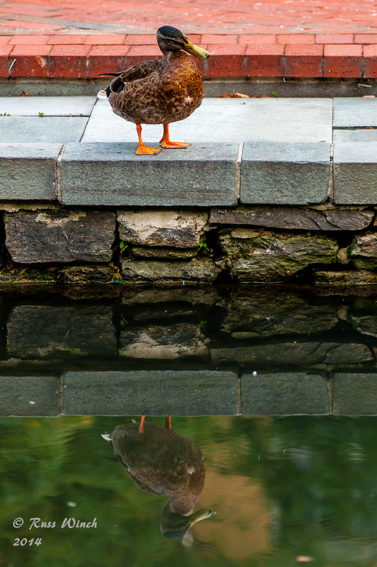
Hello, first time posting in this section. Would like feedback on the attached pics. Pic #1 is a duck of course, but attempted a mirroring composition. I like it, but your opinions please.
Pic #2, same area later in the evening, is a waterfall into the canal. I was going for symmetry, the interesting aspect of an "upward" flowing waterfall, movement leading into the center, etc. Again, your opinions. Thanks!
Pic #2, same area later in the evening, is a waterfall into the canal. I was going for symmetry, the interesting aspect of an "upward" flowing waterfall, movement leading into the center, etc. Again, your opinions. Thanks!
Aug 10, 2014 12:30:30 #

I like the concept. I would like to see the image straightened a bit, but I think the real problem is the distance between the duck and his reflection. I almost think I would like it better if you weren't in so tight, so more water is visible. I really like the stone reflected in the water but i wish the red pavers behind the duck weren't there or were in the reflection in the water to balance it out. Unfortunately I don't know as they are close enough to the water to be included in the reflection.
Aug 10, 2014 12:43:46 #
Country's Mama wrote:
I like the concept. I would like to see the image ... (show quote)
Thanks for the critique! I am attaching the same picture straightened...don't know why I did not do this the first time...it is usually Step#2 of my workflow after cropping.
Can't help the red pavers...I asked the duck to move, but she just looked at me funny!!! It would be impossible to get them in the reflection...they are simply too far back. However, I will use these ideas for my next outing to see if I can capture a better moment.
Aug 10, 2014 13:36:19 #

I was going to say the same thing as Judy about the straightening before I scrolled down and saw her comment. No, you can't make the duck move, but you can move .. change your angle to get a different shot. I am reading an excellent book on composition and light by Art Wolfe. The name of the book is The New Art of Photographing Nature. It's new because he also has an older book out on the same subject. I would recommend this book to you.
The thing that bothers me the most about this image however is that the stone wall below the duck seem to be the place of your sharpest focus. Also the duck has it's head turned in a way that makes it hard to see her eye. I think it's important to see the eye or eyes of any living thing you photograph. There is also a little chromatic aberration on the head of the duck, but I had to do some pixel peeping to see that, so I think it's not that important except that it may be contributing to the slightly soft look of the feathers there.
Having said all that, you have exposed nicely for this shot an the colors are very attractive ... especially in the reflection.
Aug 10, 2014 13:38:16 #
and rw ... only one image per thread in the critique section so I deleted the original since we don't need to rehash the straightening thing anymore. :-)
Aug 10, 2014 23:33:04 #
Nightski has made some pertinent comments. You could have minimized the red brick background by shooting from a much lower angle. That would have squashed the reflection and seemingly moved it closer to the subject and nearly put you at eye level with the duck. Yes, have patience and wait for the duck to position its head so you can see its eye...even, perhaps, to get a catch light in it. As humans, we seem to need to see the eye to relate to the subject but an eye without a catch light seems dead.
As to composition, with everything centered this is a very static picture. with a lower viewpoint, this could have been taken in a horizontal format with the duck off center, possibly at the 1/3 mark and looking into the open side of the frame. That would have been more dynamic. A shallow depth of field would have separated the duck from the background.
As to composition, with everything centered this is a very static picture. with a lower viewpoint, this could have been taken in a horizontal format with the duck off center, possibly at the 1/3 mark and looking into the open side of the frame. That would have been more dynamic. A shallow depth of field would have separated the duck from the background.
Aug 11, 2014 16:23:09 #
I agree that normally one would like to see the eyes but,to me,the duck appears to be looking down at its reflection,directing one's attention there and mitigating the distance between the two.
Aug 11, 2014 17:30:03 #
iDoc wrote:
I agree that normally one would like to see the eyes but,to me,the duck appears to be looking down at its reflection,directing one's attention there and mitigating the distance between the two.
Thanks You! It was what I was thinking when I took the shot. Although the points made above are valid when trying for that perfect shot, I also had to act on what was available. The duck was not static, and I had no means of changing elevations to minimize the height of the block wall (I was standing on the other side of the canal). Also, moving left/right would have no effect. In this case it was a matter of snapping at the best time!
Aug 11, 2014 21:52:00 #

Hey Russ, this is a great photo (IMO).
I don't normally comment in this section as I don't feel qualified to critique others work but in this case I feel compelled to comment.
Yes, it is always (at least almost always) important to have the eye visible AND sharp but in this case............
The ducks head tilted, looking at her reflection IS the story.
If this has been cropped, you might experiment a little.
I think the image is over-sharpened a little.
Also, I would reduce contrast & saturation just a tad.
All in all a really great shot.
If you want to reply, then register here. Registration is free and your account is created instantly, so you can post right away.