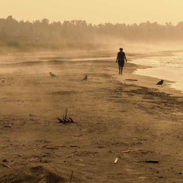
A Foggy and Early Morning Stroll on the Beach, Manitoulin Island
Aug 7, 2014 14:50:54 #
David Popham
Loc: French Creek, British Columbia
Once again I am requesting a critique of a picture. As usual, all comments, critics and suggestions are welcomed.
Thanks in advance for your comments.
David
Thanks in advance for your comments.
David
Aug 7, 2014 15:32:50 #

I can't see anything that jumps out at me as being wrong, except maybe the seagull on the left that's too close to the edge of the frame. Good choice of tint.
Aug 7, 2014 15:33:23 #

I'm usually not a fan of sepia, but it works here. A little vignetting would hold the eye more to the center of the shot. Foreground focus is very soft, but I don't mind it that much in this kind of a shot, in fact it sort of plays into the mood.
Aug 7, 2014 15:34:01 #

What if it was a cooler color temperature? It seems a bit warm for early morning.
Aug 7, 2014 18:02:55 #

I like the color. We have really golden mornings around here so it looks good to me in sepia. What bothers me is the composition. I want to bring her down and to the left so she is in the foreground with someplace to go. Or reduce the amount of foreground, I like the birds that probably flew away as she walked through and now are back to their business.
Aug 7, 2014 19:21:55 #

I really like this image, and I also think that the warm sepia color works well for this shot. What I would change is the foreground. It is too messy and distracting, and I would clean it up. This is just a personal preference.
Aug 7, 2014 22:37:51 #

David Popham wrote:
Once again I am requesting a critique of a picture. As usual, all comments, critics and suggestions are welcomed.
Thanks in advance for your comments.
David
Thanks in advance for your comments.
David
I love it! All of it.
Why?
My critique is totally emotional and thus of little use to you, but...Its immediate effect is to make me feel like I did back in the early 1940s when leafing through an old family album of my grandfather's photographs.
I'll leave it there.
Dave
Aug 7, 2014 22:39:19 #

I want to like this picture but I see too many inconsistencies. The whole picture is blurry from foreground to background. The sepia tone makes the sand in foreground look more like mud. If it was a true sepia picture, the bushes at upper left would not be green! The composition has the lady in the right place but that places too much real estate to the left and not enough to the right, i.e., I would like to see more water and less bushes. I just feel if the shot was taken from about 20' to the left it would have been better.
Aug 8, 2014 04:17:47 #

I like the colour, tone and mood of this picture. It is a bit soft, but the mood is a bit soft so that's OK. I think the foreground is working against you here. The composition should be arranged to enhance your main subject and not provide any avoidable distractions. The bits and pieces in the foreground are distracting and contribute nothing. I would crop the bottom 40% off so that the bottom edge falls somewhere between the dark bird on the right and the root in the centre.
Aug 8, 2014 07:38:40 #
Love the tonal range here. I like where the subject lies but do agree there is too much debri in foreground. Clone some out and dodge and burn a bit and you'll be set.
Aug 8, 2014 13:15:35 #
David Popham
Loc: French Creek, British Columbia
Thank you all for your very valuable comments. What I do is collect them as aides-memoirs. In this instance the comments are diverse, suggesting to me that I was close to making that memorable shot. My intuition suggested that here was a picture here, but I had to move fast to capture it. Almost but not quite. Again, than you all.
David
David
If you want to reply, then register here. Registration is free and your account is created instantly, so you can post right away.