I have some specific questions about this image.
Aug 5, 2014 20:21:36 #

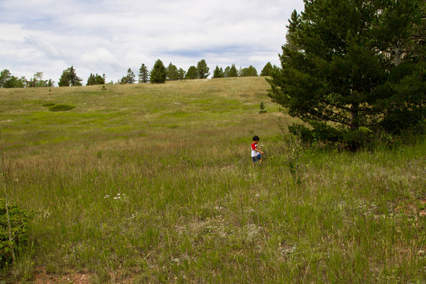
I know there are problems with this image. There's lots of empty space, but I sort of like empty space. I wish the little boy had been looking out towards the meadow, but he wasn't, so I couldn't change that. They sky was grey, so that didn't help. I loved that he was out there in that huge meadow all by himself picking flowers.
My specific questions are about getting the color/density right. I worked the CR image in LR3: Clarity, brightness, upped the blacks, then toned down the yellows A LOT! The sky color just has to go as is, as there wasn't anything there to work with. Is it too dark? Is it too yellow? Too green?
My specific questions are about getting the color/density right. I worked the CR image in LR3: Clarity, brightness, upped the blacks, then toned down the yellows A LOT! The sky color just has to go as is, as there wasn't anything there to work with. Is it too dark? Is it too yellow? Too green?
Aug 5, 2014 20:38:58 #

AzPicLady wrote:
... My specific questions are about getting the color/density right. ...
There is really not much wrong with the color and contrast. The problem here, please forgive the phrase, you just can't make a silk purse out of a sow's ear. The image simply does not have enough going for it to warrant improvement. It's a bit empty, the child is facing in the wrong direction and the scene is simply not eye catching.
Try converting it into B&W and you will see more clearly what it lacks in terms of composition and content.
What you should think about is a composition and subject that looks OK or good in B&W that becomes better by including color.
Aug 5, 2014 22:48:36 #
lighthouse
Loc: No Fixed Abode
For me I think that all of the colours except the sky are fine.
Regarding the sky, I actually don't think it is blown.
I think there is a lot more information there than you give it credit for.
It is just a matter of knowing how to process it, how to bring it out. Select just the sky, darken it and increase the contrast with a curve. Obviously this is easier with a raw image but still may work with a jpg (if that is how you have taken it.
Regarding the composition, it could be cropped to a 3x2 ratio with the boy at the bottom left "thirds" intersection for a more "standard" composition. He will then be looking and walking "in" to the image.
Or you could "mirror" the boy to turn him around and then crop to a thirds intersection with him looking left.
He would then be in the bottom right intersection.
And once those things are done, then I would work on the grasses to make them more contrasty and detailed without overdoing it.
Subtle and realistic is the key.
Will you be able to make a silk purse out of a sows ear? Probably not, but you might end up with a much more pleasing image that any parent will cherish.
Aug 6, 2014 03:05:31 #

I think this really belongs in the Photo Analysis section. You are asking for advice not critique.
Aug 6, 2014 06:56:15 #

I agree partially with Scotty about the composition. The picture as presented is not very interesting. I do agree with lighthouse that some judicious editing may improve the shot. And that is what I did. Set the color balance on the shirt, cropped, up the blue luminance and saturation to get a little more out of the sky, decreased the green and yellow luminance to get the boy to pop, increased the clarity a bit to improve the "sharpness" and added a little negative vignette. Overall, the result is an improvement and maintains that Wyatt-esque quality of the picture.
I would be glad to post my version if you wish and if this forum permits it.
I would be glad to post my version if you wish and if this forum permits it.
Aug 6, 2014 09:30:01 #
abc1234 wrote:
I agree partially with Scotty about the compositio... (show quote)
It's OK with me, if it's OK with the admin of this section. I've already run the clarity up pretty high. The yellow is down over 50%. I don't recall what I did with the green. When I worked on the sky, it got muddy and grainy really fast, which I didn't like.
Aug 6, 2014 09:42:19 #
I adjusted everything globally in LR. Masking may help with the sky but I did not want to get that involved. I will post it and if necessary, ask for forgiveness later.
https://www.dropbox.com/s/pr6nesk30c1h6l8/1407284495647-_48e9179_4_flowers_for_mommy_4x.jpg
https://www.dropbox.com/s/pr6nesk30c1h6l8/1407284495647-_48e9179_4_flowers_for_mommy_4x.jpg
Aug 6, 2014 13:31:58 #
K7DJJ
Loc: Spring Hill, FL
I reversed the boy and made some changes and wonder if posting are allowed here.
Aug 6, 2014 13:56:40 #

K7DJJ wrote:
I reversed the boy and made some changes and wonder if posting are allowed here.
May I direct my learned friend to rule 3? :-)
http://www.uglyhedgehog.com/t-159520-1.html
Aug 6, 2014 15:01:45 #

Yes, he is a VERY little boy. Even on download he gets lost in the abundance of space in the shot. You could try leaving the width as is and cropping a little bit of the top and a bit more off the bottom. Hopefully that would retain some of the feeling of open space while bringing the boy in a bit closer.
I think it's a pity that his face is so dark. Anything you can do to lighten it would be an improvement. I'm left wondering why you lifted the blacks. A more common procedure would be to lighten the shadows a fair bit, then lower the blacks to the point where you were just starting to get black-out in the darkest bits. That process would be more likely to leave his face a bit more visible - and therefore more readable.
You say the sky went a bit grainy and muddy. That is probably due to the fact that you reduced yellow by so much. If you did that for the sake of the grass, you might have been able to use green as well, meaning that the toning down wasn't all done using yellow. And instead of killing off the yellow, another possibility may have been to shift its tint slightly towards the orange end. If you did indeed have some yellow in the sky, having it go slightly orange wouldn't be a big deal.
Doing a combination of things like that might have saved you from the negative consequences of reducing yellow as much as you did.
If the sky continues to be a problem, try selecting it and using negative clarity to soften it. If it was mine I'd probably try lowering the luminosity of blue a bit and desaturating if it became too strong.
Aug 6, 2014 17:55:35 #
lighthouse
Loc: No Fixed Abode
I had a play with this image.
The sky is totally recoverable, even in its jpg form.
And the composition is as well.
And the grass can be given more "pop".
If you wanted to post the image in the post processing forum, I could show you what I came up with when I get to my other computer.
The sky is totally recoverable, even in its jpg form.
And the composition is as well.
And the grass can be given more "pop".
If you wanted to post the image in the post processing forum, I could show you what I came up with when I get to my other computer.
AzPicLady wrote:
I know there are problems with this image. There'... (show quote)
Aug 6, 2014 18:55:06 #
abc1234 wrote:
I adjusted everything globally in LR. Masking may help with the sky but I did not want to get that involved. I will post it and if necessary, ask for forgiveness later.
https://www.dropbox.com/s/pr6nesk30c1h6l8/1407284495647-_48e9179_4_flowers_for_mommy_4x.jpg
https://www.dropbox.com/s/pr6nesk30c1h6l8/1407284495647-_48e9179_4_flowers_for_mommy_4x.jpg
Yours is certainly a more interesting image! Thanks. I'll continue working on it.
Aug 6, 2014 18:55:50 #
lighthouse wrote:
I had a play with this image.
The sky is totally recoverable, even in its jpg form.
And the composition is as well.
And the grass can be given more "pop".
If you wanted to post the image in the post processing forum, I could show you what I came up with when I get to my other computer.
The sky is totally recoverable, even in its jpg form.
And the composition is as well.
And the grass can be given more "pop".
If you wanted to post the image in the post processing forum, I could show you what I came up with when I get to my other computer.
I'll try doing that maybe tomorrow. I'm not a "member" of that forum, so it might take me awhile.
Aug 6, 2014 19:18:05 #
Graham Smith wrote:
May I direct my learned friend to rule 3? :-)
http://www.uglyhedgehog.com/t-159520-1.html
http://www.uglyhedgehog.com/t-159520-1.html
If you look at my version, you will see it is close to the rule of 3. That was strictly coincidental.
Aug 6, 2014 22:24:21 #

AzPicLady wrote:
I'll try doing that maybe tomorrow. I'm not a "member" of that forum, so it might take me awhile.
You don't need to be a member you just need to post a photo in that section and you will get lots of help. I think that would be a better place to get the help you are looking for.
If you want to reply, then register here. Registration is free and your account is created instantly, so you can post right away.