Any suggestions?
Sep 19, 2011 13:01:27 #

I am putting a few random pics on the bottom of this post as I like all of them but I feel the lighting and/or color is off on them. Any suggestions, tips etc? Feel free to edit the images and thank you!


Sep 20, 2011 02:55:09 #
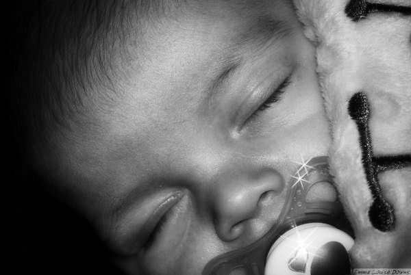
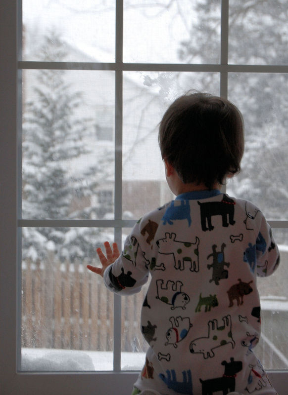
I think they are really great! The color looks good to me on all of them. Artwise I love the first 3 photos. The sweet poochie shot is cute but not so appealing to me. I love the little starbursts in the first photo. The second photo I love the composition and the colors. The third photo has such lovely soft focus and the perfect pajamas!
Sep 20, 2011 08:10:53 #
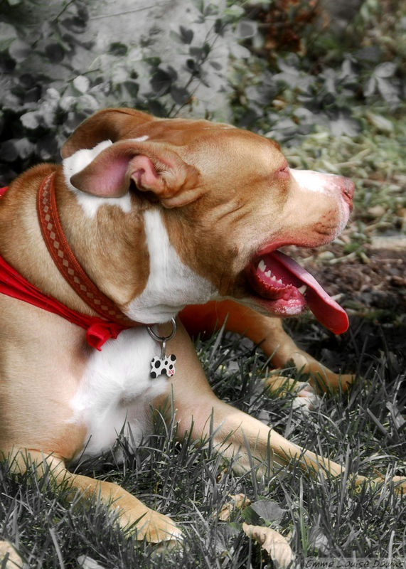
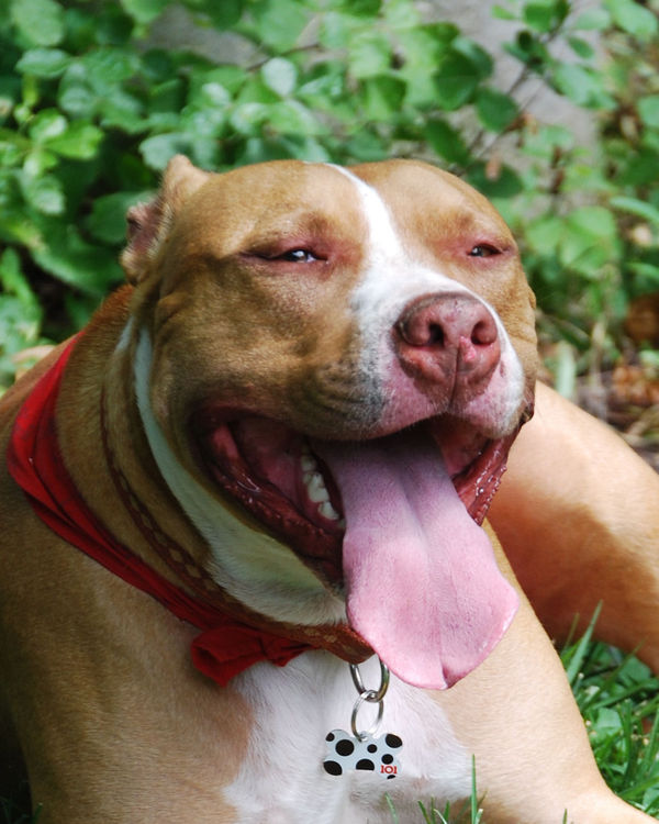
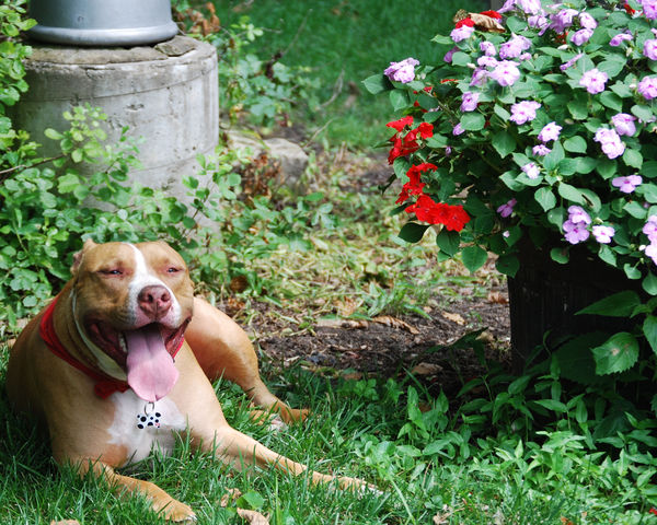
Thank you mommy115! When I was taking the shot of the pooch (his name is Mellow) he was actually staring straight at me and right as I pressed the button he turned his head!! I got one of him looking at me with his long tongue hanging out with was cute but had camera shake on it so didn't come out so well. I love the second shot but I wanted it to "pop" more color wise. I did play with it a bit but to me it still didn't come out right. To hear you say you like the colors makes me feel a bit better. I think to me it's the "shadow" parts that don't look right? Maybe it's me being picky LOL!!!
Sep 20, 2011 14:55:51 #
emmyweez wrote:
Thank you mommy115! When I was taking the shot of... (show quote)
I like it with the contrasting color of the shadows. If you want to try decreasing the shadows and have PSE go to 'enhance-lighting-shadows and highlights' and you should find an adjustment to decrease the shadow.
Sep 20, 2011 15:11:28 #
I really like the snowy day picture! Such a sweet moment to capture! I would like to see those footed PJ feet though to really show that little guy on his knees looking at snow.
the tropical pic makes me wish i was on vacation! Only thing I find distracting is the white cloth on the far left side- kinda want to push it away to see the rest of the bed. But still... wish I was there! Which is what a great pictures does, right?
the tropical pic makes me wish i was on vacation! Only thing I find distracting is the white cloth on the far left side- kinda want to push it away to see the rest of the bed. But still... wish I was there! Which is what a great pictures does, right?
Sep 20, 2011 15:27:55 #
I cropped the feet out as the carpet by that door is bright red and it looked awful!! The tropical one was a friends wedding, she had the tables lined along a marina with the white netting covering some hideous poles!! It was in the Dominican and such a beautiful wedding!!
Sep 20, 2011 18:17:24 #

I'm loving Mellows picture- handsome Pit- nice and sharp even with him moving! What kind of gear are you using? Did you do anything to the background? He really jumps out of that shot!
(I lived in Falls Church for three years or so).
(I lived in Falls Church for three years or so).
Sep 20, 2011 18:23:28 #

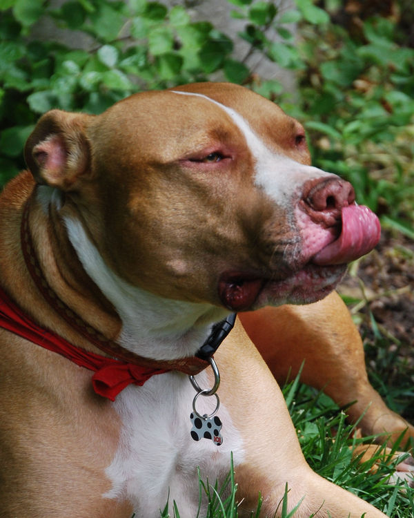
I love high(er) contrast black and white images. It makes the lights and darks richer. This is how I would edit...
Sep 20, 2011 18:25:39 #
My camera is a nikon D60, can't for the life of me remember which lens I used that day!! I use corel paint shop pro X2 and X3, believe I used x2 on this picture. There is an effect on there in the film and filters section which allows you to mute or enhance your reds, I enhanced the reds on that shot, tweaked here and there and decided to leave it as above. I just wish he was looming at me. I will try and find the one shot of him looking at me as his eyes are so dreamy!! Glad you like it :0))
Sep 20, 2011 18:28:08 #
bekapoe wrote:
I love high(er) contrast black and white images. It makes the lights and darks richer. This is how I would edit...
I'm still trying with black and white and can NEVER seem to get it right, I always go just too light or too dark. Thank you for the edit :0)
Sep 20, 2011 18:28:08 #
bekapoe wrote:
I love high(er) contrast black and white images. It makes the lights and darks richer. This is how I would edit...
I'm still trying with black and white and can NEVER seem to get it right, I always go just too light or too dark. Thank you for the edit :0)
Sep 20, 2011 18:29:06 #
[quote=emmyweez]
Not sure why that posted twice!!
bekapoe wrote:
I love high(er) contrast black and white images. It makes the lights and darks richer. This is how I would edit...
Not sure why that posted twice!!
Sep 20, 2011 20:08:59 #
RParker wrote:
I'm loving Mellows picture- handsome Pit- nice and sharp even with him moving! What kind of gear are you using? Did you do anything to the background? He really jumps out of that shot!
(I lived in Falls Church for three years or so).
(I lived in Falls Church for three years or so).
These are a few more I took of Mellow but didn't come out quite as well as the first one (original post), even with his head turned!!
:(

Sep 20, 2011 20:17:05 #

emmyweez wrote:
I am putting a few random pics on the bottom of this post as I like all of them but I feel the lighting and/or color is off on them. Any suggestions, tips etc? Feel free to edit the images and thank you!
Except for the window being slightly slanted out of vertical the third shot is perfect. Good job!
Sep 20, 2011 20:31:06 #
bobmielke wrote:
Except for the window being slightly slanted out of vertical the third shot is perfect. Good job!
emmyweez wrote:
I am putting a few random pics on the bottom of this post as I like all of them but I feel the lighting and/or color is off on them. Any suggestions, tips etc? Feel free to edit the images and thank you!
Except for the window being slightly slanted out of vertical the third shot is perfect. Good job!
Is this better? I played with it a bit.
If you want to reply, then register here. Registration is free and your account is created instantly, so you can post right away.