Boardwalk
Jul 28, 2014 21:43:36 #

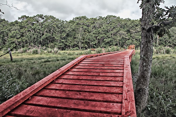
Really trying to learn this PP. Seeing what wins the monthly competition at the club so I need something that stands out. Thoughts please.
Jul 29, 2014 00:34:26 #

Victor S wrote:
Really trying to learn this PP. Seeing what wins the monthly competition at the club so I need something that stands out. Thoughts please.
Welcome to the Critique Section! Hope you'll share your photos and your opinions with us here. Learning PP is a never-ending story, but it's fun. I enjoy fooling with PP almost as much as I enjoy taking photos. I hope you've also discovered the excellent PP section on UHH, which has members from expert to novice level who also enjoy this stuff.
You'll also get more feedback in this section if you click the box that says "store original" right beside the box you click to upload. That allows a larger version of your picture to be downloaded by those critiquing it, so they can comment on details we can't see in the thumbnail version.
Now for my humble opinion about your photo: I like the boardwalk itself, it is a great leading line and an interesting/arresting color. I wish it were taking us to something exciting - a lake, a cabin, a sunset, a person. I like what your processing has done to the boardwalk by making it grungier, and I like what it has done to the clouds making them dramatic. I don't much care for what it has done to the foliage which looks kind of dried up and dead even though the color tells you it isn't. If it were mine, I'd stack the processed version with an unprocessed version in Photoshop or Elements or any layers program and begin masking out the processed part of the foliage a bit at a time till I got more life back into it.
Thanks for sharing your photo here...
Jul 29, 2014 00:47:41 #

Welcome and listen to minniev. You will get good advice there.
As for me, I think we sometimes become lost in our work and let it take on a life of it's own, where at times we stop seeing it for what it was and only believe in what it has become. If I may suggest, go back and look at the photo before you started fiddling with it and look at it now. If you like it then great, game on, story over, but if you look at it with open eyes I think you will see where you turned right when you meant to turn left.
Cheers and thank you for posting! Steve
Jul 29, 2014 09:19:54 #

On my monitor the color, or lack of it, is a problem. The picture looks like it is half black and white and half color. Neither being done well. I think you started with a good idea as far as composition goes but it looks over processed to me. I changed it to black and white, increased the contrast, and it became a whole different picture - really very nice! That's a start - let's see some more!
Jul 31, 2014 10:19:26 #
minniev wrote:
Welcome to the Critique Section! Hope you'll share... (show quote)
Thank you for response.
Jul 31, 2014 10:20:27 #
SonyA580 wrote:
On my monitor the color, or lack of it, is a problem. The picture looks like it is half black and white and half color. Neither being done well. I think you started with a good idea as far as composition goes but it looks over processed to me. I changed it to black and white, increased the contrast, and it became a whole different picture - really very nice! That's a start - let's see some more!
Thank you for your opinion/critique.
If you want to reply, then register here. Registration is free and your account is created instantly, so you can post right away.