Please compare these two pix
Jul 27, 2014 16:49:15 #
dickhrm
Loc: Spingfield, IL
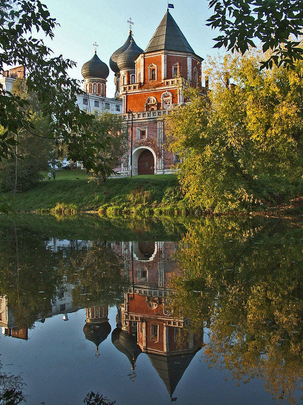
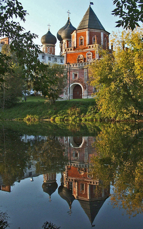
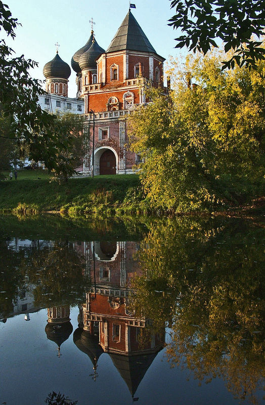
I would appreciate opinions on which of these two pix are most liked. They are the very same pic, yet I cropped the initial one to eliminate the extraneous foliage on the right and thus better direct the view of the reader to the church and its reflection. Yet that cropping results in a somewhat elongated pic, which to my eye anyway, isn't as pleasing as the more customary shape. Please help me with this dilemma - thanks!
More customary shape
Elongated shape
Jul 27, 2014 17:17:43 #
dickhrm wrote:
I would appreciate opinions on which of these two pix are most liked. They are the very same pic, yet I cropped the initial one to eliminate the extraneous foliage on the right and thus better direct the view of the reader to the church and its reflection. Yet that cropping results in a somewhat elongated pic, which to my eye anyway, isn't as pleasing as the more customary shape. Please help me with this dilemma - thanks!
I like the second one as the best one. Emphasizes
The building and it's reflection.
Jul 27, 2014 17:30:55 #

The 2nd one definitely focuses your attention on the subject better. Properly matted and framed it would look fine, IMO.
Jul 27, 2014 17:42:39 #

Well, just so it's not a complete rout, I like number one better. I had no problem picking out the main subject, but I happen to like the full tree as a framing device.
Jul 27, 2014 17:50:54 #
dickhrm
Loc: Spingfield, IL
Thanks. When I took the pic, I couldn't crop at all, as I was barely able to get flag at the top in as well as its reflection, as it was, since my back was up against a fence while taking it!
LFingar wrote:
The 2nd one definitely focuses your attention on the subject better. Properly matted and framed it would look fine, IMO.
Jul 27, 2014 18:09:34 #
Jul 27, 2014 18:58:10 #

I would pick neither and go back to PP again as there is too much banding, too much noise and over processing in the reflective water which led to halos over the building edges.
Sorry, my opinion.
Sorry, my opinion.
Jul 27, 2014 18:58:53 #

dickhrm wrote:
I would appreciate opinions on which of these two pix are most liked. They are the very same pic, yet I cropped the initial one to eliminate the extraneous foliage on the right and thus better direct the view of the reader to the church and its reflection. Yet that cropping results in a somewhat elongated pic, which to my eye anyway, isn't as pleasing as the more customary shape. Please help me with this dilemma - thanks!
Lower the camera 5 feet.
Correct the perspective.
Do not crop sides.
Jul 27, 2014 19:52:54 #
Jul 27, 2014 20:01:13 #
I much prefer the first one.
For me, the second image has too much of a condensed, claustrophobic feel to it, and it seems to yell out, "I've been aggressively cropped!"
But in the first image, I think the subject and its reflection fill out enough of the frame to capture the viewer's attention as the subject, yet still retain plenty of surrounding space to properly illustrate the architecture's calm, idyllic setting.
Jul 27, 2014 20:05:17 #

Jul 27, 2014 20:07:50 #
lighthouse
Loc: No Fixed Abode
I prefer the composition of the first one.
Reflections quite often look better if they are more symmetrical, more centralised, ie, if they are not lined up as "thirds".
First image is central, second image is "thirds".
If anything, I would leave the right side as it is and crop a little off the left to centralise it better.
Reflections quite often look better if they are more symmetrical, more centralised, ie, if they are not lined up as "thirds".
First image is central, second image is "thirds".
If anything, I would leave the right side as it is and crop a little off the left to centralise it better.
Jul 27, 2014 20:52:23 #
I like the original but have to agree with Rongnongno. It is over processed.
Jul 27, 2014 21:45:02 #
dickhrm
Loc: Spingfield, IL
I tried your idea of cropping on the left, altho a bit less so as to not make the pic seem so elongated. Here's the result. I think it's improved, but what do you all think? I also tried to reduce the noise that was noted in another comment, but there didn't seem to be any difference. If I could go back to the scene, I'd look into lowering the camera five feet, per another comment, altho as I recall, there was brush in front of me which precluded that. In any event, I appreciate all the feedback.
lighthouse wrote:
I prefer the composition of the first one.
Reflections quite often look better if they are more symmetrical, more centralised, ie, if they are not lined up as "thirds".
First image is central, second image is "thirds".
If anything, I would leave the right side as it is and crop a little off the left to centralise it better.
Reflections quite often look better if they are more symmetrical, more centralised, ie, if they are not lined up as "thirds".
First image is central, second image is "thirds".
If anything, I would leave the right side as it is and crop a little off the left to centralise it better.
Jul 27, 2014 22:43:29 #

Is this an HDR photograph?
dickhrm wrote:
I would appreciate opinions on which of these two pix are most liked. They are the very same pic, yet I cropped the initial one to eliminate the extraneous foliage on the right and thus better direct the view of the reader to the church and its reflection. Yet that cropping results in a somewhat elongated pic, which to my eye anyway, isn't as pleasing as the more customary shape. Please help me with this dilemma - thanks!
If you want to reply, then register here. Registration is free and your account is created instantly, so you can post right away.