WPC 1426 - Rights CRITIQUE
Jul 4, 2014 22:28:05 #

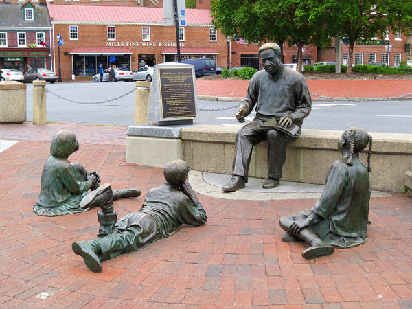
louelke has volunteered their WPC 1426 - Rights entry to the Photo Critique Forum* to find out what could have done to make it better. Be nice, but be honest as this will help everyone with their craft. Thank you louelke and thank you everyone!
From WPC 1426 - Rights RESULTS http://www.uglyhedgehog.com/photo_contest_ratings.jsp?pcnum=124
* If you are new to the Photo Critique Forum please read the Section Rules http://www.uglyhedgehog.com/t-159520-1.html
From WPC 1426 - Rights RESULTS http://www.uglyhedgehog.com/photo_contest_ratings.jsp?pcnum=124
* If you are new to the Photo Critique Forum please read the Section Rules http://www.uglyhedgehog.com/t-159520-1.html
Jul 4, 2014 23:49:27 #

The statues are meaningful, moving, even provocative. But the talent lies primarily with the sculptor. Perhaps if the photographer added some glow, vignetting, or artistic lighting, like the winners, it would have attracted more votes.
Jul 5, 2014 00:07:19 #

St3v3M wrote:
louelke has volunteered their WPC 1426 - Rights entry to the Photo Critique Forum* to find out what could have done to make it better.
A wonderful subject, and a great choice for the that specific contest. For me the subject has tremendous impact, but while the photo is nice it didn't convey the impact that it just seemed it should. It took some looking and thinking to realize what would bring out the visual message that is hiding there.
I always just start with "What's the subject", and adjust framing for best definition of the subject. Then I start working on distractions.
But in this case that order didn't work! And it wasn't until the distractions were reduced that I could see two things that would more dramatically focus a viewer's attention on the subject. It needs to be framed tighter, but re-shooting with a slightly different perspective would help greatly.
A little closer, allowing a wider angle lens, and a little more elevation of the camera to remove the store front and other distractions from the background would help greatly. Then using a very wide aperture to blur as much of the background as possible would help too.
I liked it cropped to a 5:4 aspect ratio. And I'd rather see it framed tightly enough that the girl to the left is just barely trimmed along the left side, and the boy in the center can lose some body parts at the bottom. But I didn't think that worked with the girl on the right, as her braids didn't work without both of them completely there.
Then in post processing I would perhaps blur the background more if the lens didn't do it well enough. And I'd remove every blemish from the bricks the kids are on. No white spots of any kind. And I'd use unsharp mask to make the writing on plaque stand out as much as possible. (Ideally on a large print it might be possible to make most of it readable too.) I would not sharpen the kids or any of the brick surfaces at all, and might even blur them just very slightly. The statue of the man is not really the subject as such, but it is the core of the subject. It should be sharpened too, but probably with a high pass sharpen filter, not with USM.
Jul 5, 2014 04:29:35 #

Apaflo wrote:
A wonderful subject, and a great choice for the th... (show quote)
I agree with everything you said. We were visiting with company and lots of people milling about and there was little chance to set up a decent shot.
However, you are right that with some PP skills you could make it a little better. I am still learning and really appreciate the tips.
I tried one with the tighter crop, which it really needed, but don't have the knowledge on how to blur the background after the fact. I also tried 2 different vignettes (new to those too). I'll post them to see if if that improves the original somewhat. I think it does, but I am sure other can do better.
Jul 5, 2014 04:35:36 #
Mmmm, now that the pictures are posted I see very little difference in the vignettes. #2 is a little bigger and darker than #1 on my monitor at home.
Jul 5, 2014 07:09:58 #

The mistake too often made by people taking pictures is that they see something of possible interest and simply raise their camera to their eye and take the picture just as they saw it. This limits their point of view to that as seen by most adults. This places their results in the "so what?" category which is where they will remain as long as that is the the limit of their creativity.
"Street View" works for Google, not photography.
This shot is just an observation, a documentation of a static display. There is nothing much about it to hold any interest outside of its existence.
Suggestions? Shoot a wide angle tight over the man's shoulder, framing the side of the man's head and the book, as well as the prone children. Or perhaps arrange to have real kids lying amongst the statues in similar poses.
Rob.
Jul 5, 2014 09:11:05 #

The background, especially the liquor store, kills it for me. If you can't remove the letters, at least blur the background some so the figures become the subject.
Jul 5, 2014 10:00:52 #
SonyA580 wrote:
The background, especially the liquor store, kills it for me. If you can't remove the letters, at least blur the background some so the figures become the subject.
That's pretty much what I was thinking too... Except one possible valid intension might dwell less on a dramatic view of just the statues, and be more a bit of Street Photography with a view towards just how we are in some ways rather disgusting!
The significant philosophical statement of idealism represented by the work of art, juxtapositioned with the significant reality of life represented by a liquor store.
However, if editing the Street aspect out is difficult, editing to make it more pronounced to the point of obvious intent seems vastly more difficult!
Jul 5, 2014 11:18:13 #

Another perspective would be like that of the boy lying down; I.e. with the camera on the ground. I loved my Nikon D5100 for that type of shot:it has a fully articulated screen so you can literally set the camera on the ground and, using live view, frame such a shot.
In any case that might have eliminated the distracting background.
In any case that might have eliminated the distracting background.
Jul 5, 2014 13:09:10 #

The picture and the title are both strong, but they don't seem like a perfect match. To me the picture isn't saying "Here's someone exercising their rights". It's saying "Here's someone enjoying being entertaining and nurturing", which is obviously commendable, and it speaks of a very human quality which crosses cultural and racial boundaries, but it's not the "story" that the picture should be telling.
From a technical point of view, I'd have liked to see clearer detail in the story-teller's face. It would have been a worthy focal point of the scene.
From a technical point of view, I'd have liked to see clearer detail in the story-teller's face. It would have been a worthy focal point of the scene.
Jul 8, 2014 19:54:41 #

This is just a snapshot of someone else's art and creativity. I do not see any attempt to take this from an interesting angle or to minimize the distracting background. All this talk about what the image means belongs to the sculptor, not the photographer.
If you want to reply, then register here. Registration is free and your account is created instantly, so you can post right away.