People Pics
Jan 23, 2012 13:50:29 #
Jan 23, 2012 14:47:53 #
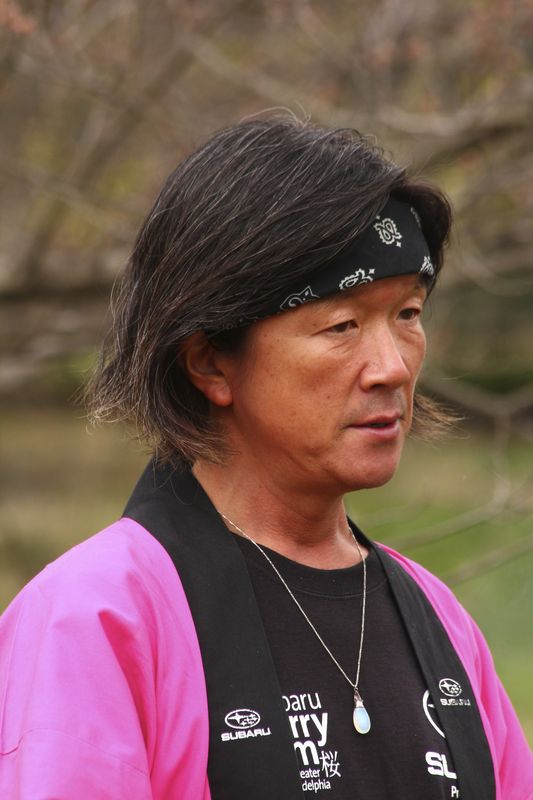
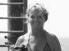
I like the third image, as it is a true candid where subject was not aware of photo. It is a good character study. Maybe keep proportions, but crop a bit tighter to eliminate distracting words on shirt?
Jan 23, 2012 14:53:47 #
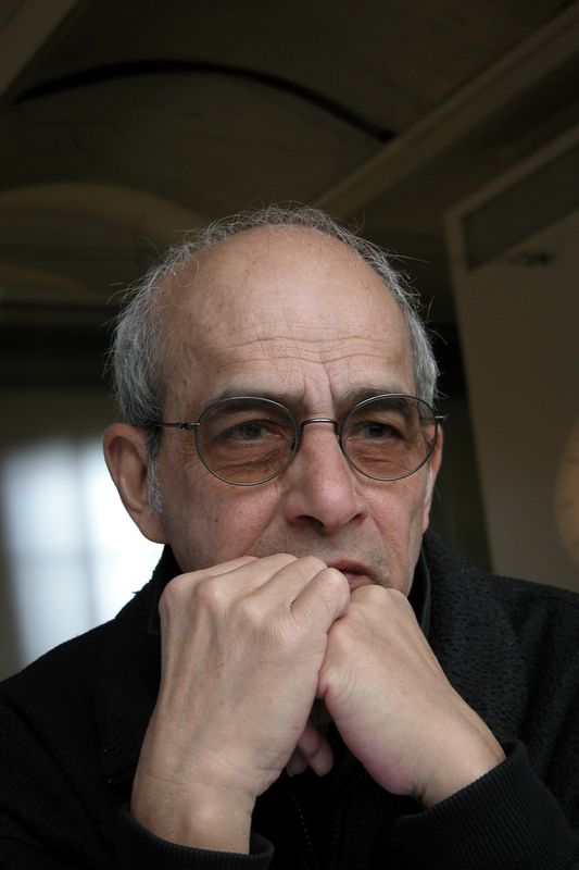
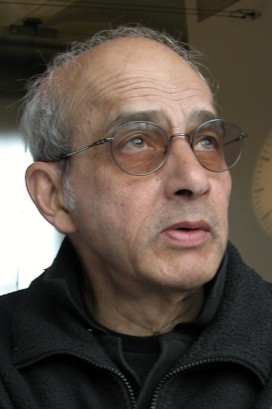
I really like #2, it's simple yet nicely done. I wish there was some light in his eyes but it looks like he is wearing tinted lens and of course that keeps the light out.
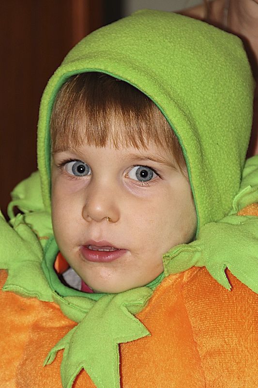
#1 - the booger is bugging me. I want to wipe it off (It's the Mum in me, sorry). It's a cute halloween shot.
#3 - it's a nice candid. Focus is good. #2 just edges it out somehow for me.
#1 - the booger is bugging me. I want to wipe it off (It's the Mum in me, sorry). It's a cute halloween shot.
#3 - it's a nice candid. Focus is good. #2 just edges it out somehow for me.
Jan 23, 2012 15:29:39 #
Nikonian72 wrote:
I like the third image, as it is a true candid where subject was not aware of photo. It is a good character study. Maybe keep proportions, but crop a bit tighter to eliminate distracting words on shirt?
Thanks for the comment about the words on the shirt. Photographers are supposed to "see" stuff like that. To tell you the truth, I didn't even see them while taking the picture or in PP. I guess I'll have to keep taking snap shots until I'm able to see like a photographer.
Jan 23, 2012 15:29:54 #
Pepper
Loc: Planet Earth Country USA
I really do like the third shot. I agree with Nikonian72 in that you might consider a little tighter crop but even as it is it is a great shot. Congrats!
Jan 23, 2012 15:34:44 #
Jan 23, 2012 21:05:26 #

Number 3 - is a really nice image! However I do agree the writing should have been cropped or Photoshopped out.
Number 2 - I like but wish the hands were not covering his mouth and face area - pic shows he was in deep thought (that I like).
Number 1 - Although he is as cute as a button, the runny nose really pops out at me!
Number 2 - I like but wish the hands were not covering his mouth and face area - pic shows he was in deep thought (that I like).
Number 1 - Although he is as cute as a button, the runny nose really pops out at me!
Jan 23, 2012 21:47:32 #
#1 suffers from the flash. Harsh shadow behind, face seems overexposed. What did you do to startle him?
I like t#2 you captured character in it. Too bad, as noted, the eyes come across a bit dull.
#3 is also excellent. The lettering doesn't bother me so much, and if you crop them out, you also lose the chain and pendant.
I like t#2 you captured character in it. Too bad, as noted, the eyes come across a bit dull.
#3 is also excellent. The lettering doesn't bother me so much, and if you crop them out, you also lose the chain and pendant.
Jan 24, 2012 09:56:26 #

Pepper wrote:
I really do like the third shot. I agree with Nikonian72 in that you might consider a little tighter crop but even as it is it is a great shot. Congrats!
If you crop out her chest that will take away from the whole photo. I don't think the words are distracting, myself. I'm looking at the women and her necklace, if you crop out the words her necklace will be cut off. You might can clone out the words.
Jan 24, 2012 17:49:29 #
I may be wrong Pepper but I believe #3 is a man & I tend to agree with you on that photo that the words are part of the story. I wonder what impact would it have had without them? Photo opt the letters & keep the chain. But I like #2 & #3 with notations already made.
RowdyBlue wrote:
If you crop out her chest that will take away from the whole photo. I don't think the words are distracting, myself. I'm looking at the women and her necklace, if you crop out the words her necklace will be cut off. You might can clone out the words.
Pepper wrote:
I really do like the third shot. I agree with Nikonian72 in that you might consider a little tighter crop but even as it is it is a great shot. Congrats!
If you crop out her chest that will take away from the whole photo. I don't think the words are distracting, myself. I'm looking at the women and her necklace, if you crop out the words her necklace will be cut off. You might can clone out the words.
Jan 24, 2012 19:22:20 #
Boy, every grabbed the Same thoughts I was having, just 1 more little thing... #2 seems to have some extra negative space above his head...#3 is my favorite, Keep shooting!!!
Jan 24, 2012 20:14:13 #
Bunny-Jean wrote:
Boy, every grabbed the Same thoughts I was having, just 1 more little thing... #2 seems to have some extra negative space above his head...#3 is my favorite, Keep shooting!!!
Yes, there's space above #2's head, but the arch in the ceiling is lined up with him, it actually draws you in the same direction that he's looking. I think it's kind of subtle this way.
Jan 24, 2012 21:02:40 #
RMM wrote:
Yes, there's space above #2's head, but the arch in the ceiling is lined up with him, it actually draws you in the same direction that he's looking. I think it's kind of subtle this way.
Bunny-Jean wrote:
Boy, every grabbed the Same thoughts I was having, just 1 more little thing... #2 seems to have some extra negative space above his head...#3 is my favorite, Keep shooting!!!
Yes, there's space above #2's head, but the arch in the ceiling is lined up with him, it actually draws you in the same direction that he's looking. I think it's kind of subtle this way.
Yes I guess it does ..what about eliminating the lighter area on the right side (window? doorway?????
Jan 24, 2012 22:31:51 #
Bunny-Jean wrote:
Yes I guess it does ..what about eliminating the lighter area on the right side (window? doorway?????
Doesn't do much for the current cropping to his shoulders. Maybe a different angle on a reshoot, if a reshoot is even possible.
Jan 24, 2012 23:57:28 #
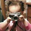
It would be hard to take another shot of Hugh since he is in london and i'm in Philadelphia. However, here's another pic of him. which do you like best?
Hugh 2
If you want to reply, then register here. Registration is free and your account is created instantly, so you can post right away.