Steam Engine Lad
Jun 23, 2014 08:08:05 #

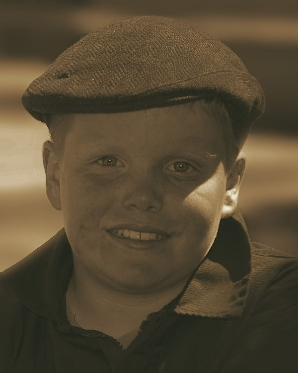
I took this picture at our local Murdoch Day and am thinking of entering it into the camera clubs portrait competition. I changed it to b/w and added a browns filter from Topaz restyle. I used on camera flash as we were in mostly shade.
Jun 23, 2014 12:13:19 #

nanaval wrote:
I took this picture at our local Murdoch Day and am thinking of entering it into the camera clubs portrait competition. I changed it to b/w and added a browns filter from Topaz restyle. I used on camera flash as we were in mostly shade.
Excellent tack-sharp focus on the eyes, but the whole image is more than a little flat, to the extent that the merits or otherwise of the Sepia tint are hard to evaluate.
The model's cap along with the Sepia give a very 1920s - 1930's caché to the image.
I'm hoping some of the better portrait gurus here will jump in with strong, pointed corrective thoughts.
impact: 3
tech:2.5
comp.3
8.5/15
Dave in SD
Jun 23, 2014 16:02:58 #
Uuglypher wrote:
Excellent tack-sharp focus on the eyes, but the whole image is more than a little flat, to the extent that the merits or otherwise of the Sepia tint are hard to evaluate.
The model's cap along with the Sepia give a very 1920s - 1930's caché to the image.
I'm hoping some of the better portrait gurus here will jump in with strong, pointed corrective thoughts.
impact: 3
tech:2.5
comp.3
8.5/15
Dave in SD
The model's cap along with the Sepia give a very 1920s - 1930's caché to the image.
I'm hoping some of the better portrait gurus here will jump in with strong, pointed corrective thoughts.
impact: 3
tech:2.5
comp.3
8.5/15
Dave in SD
Hi Dave Thanks for your comments. The hat belonged to his Mom's Granddad so it is an old hat. I do not know what to do to make it less flat, I have the original picture that I can post and link to this one to see if it is better.... Val
Jun 23, 2014 17:49:18 #

nanaval wrote:
I took this picture at our local Murdoch Day and am thinking of entering it into the camera clubs portrait competition. I changed it to b/w and added a browns filter from Topaz restyle. I used on camera flash as we were in mostly shade.
Well, I am not a portrait person but I took a photo of my grandson last week in almost identical lighting so I do have recent experience wrangling with this dilemma. I think it is adorable photo. It's sharply captured, with no distractions thanks to blurred background, the model is appealing and there is a bit of a theme (thanks to the hat). For my taste, the photo is too dark. If I wanted to keep it in sepia (which surely fits that hat!) I would brighten it first, then deal with the flatness by upping contrast, clarity and blacks. Then I'd wrestle with the over-light ear, the whites of the eyes and the teeth with careful/slight local adjustments. I might experiment with other tones of sepia to see what works best. There's a few little "things" that may have been caused by the lighting and may be just as well to leave alone but might merit experiments as they show more once the photo is brightened - what looks like a black eye beneath one eye, and an odd shadow under the other, the triangle of bright white on the face & ear, a dark spot to the left of the mouth and another beneath that spot. Of course any change would work better from your original file. I think you've got a photo worth entering, but I don't think the overly dark treatment does it justice.
Jun 23, 2014 18:49:26 #

Val my friend,I think this a fine shot and the hat with the sepia work very well,though like the previous comment maybe a tad too dark...you might be able to do some dodge and burn work to correct some lighting transitions or add some noise to take it back further in time!! With that said I like the shot!!
Jun 23, 2014 19:04:05 #
minniev wrote:
Well, I am not a portrait person but I took a phot... (show quote)
Hi minniev Thanks for your comments, I will try what you suggest, the marks that are dark on his face is oil and dirt where he has rubbed his face. Lewis has helped his Dad since he was very small with the engines and gets stuck in. Lewis was on a small engine which I think is his and he was keeping it running.
Jun 23, 2014 19:09:54 #
nanaval wrote:
Hi minniev Thanks for your comments, I will try what you suggest, the marks that are dark on his face is oil and dirt where he has rubbed his face. Lewis has helped his Dad since he was very small with the engines and gets stuck in. Lewis was on a small engine which I think is his and he was keeping it running.
In that case the marks are good things that enhance the story and may need to be emphasized once you've got it brightened a bit. Dodge and burn are your friends! It's a really charming shot that shows so much personality.
Jun 24, 2014 08:10:12 #
Jun 24, 2014 08:12:09 #
rlaugh wrote:
Val my friend,I think this a fine shot and the hat with the sepia work very well,though like the previous comment maybe a tad too dark...you might be able to do some dodge and burn work to correct some lighting transitions or add some noise to take it back further in time!! With that said I like the shot!!
Thanks rlaugh my friend, I have posted a new edited version :D
Jun 24, 2014 08:35:46 #
nanaval wrote:
I took this picture at our local Murdoch Day and am thinking of entering it into the camera clubs portrait competition. I changed it to b/w and added a browns filter from Topaz restyle. I used on camera flash as we were in mostly shade.
It would help to know: are starting with a JPEG, or do you have access to the original RAW capture? If you've access to the RAW data, you have many options for tonal adjustments.
Dave in SD
Jun 24, 2014 08:40:53 #
Uuglypher wrote:
It would help to know: are starting with a JPEG, or do you have access to the original RAW capture? If you've access to the RAW data, you have many options for tonal adjustments.
Dave in SD
Dave in SD
I shoot in raw and have the original picture. I have edited it and added a link.
Jun 24, 2014 14:57:09 #

I am not a portrait photographer but based upon my experience, I would call this merely a snapshot. The posing is what kills it for me: head on. Furthermore, the tight cropping removes any other compositional elements that could have helped the boy. Two excellent examples of effective head-on posing are Kharasch's portrait of Churchill and Hemingway.
I do not like the lack of contrast and how the shadow falls across the face. The rework posted separately was a leap in the wrong direction.
I encourage to submit this to your camera club so that you can get more advice on how to approach portraiture in general and this shot in particular.
I do not like the lack of contrast and how the shadow falls across the face. The rework posted separately was a leap in the wrong direction.
I encourage to submit this to your camera club so that you can get more advice on how to approach portraiture in general and this shot in particular.
Jun 24, 2014 16:01:30 #

Well, ABC ... here I go again .. being contrary. I love this kid! He looks like a actor out of a wholesome 1950's sitcom. I think the pose is perfect. Nothing fancy, just a head shot of a good looking kid, typical of that time period. Now I know this Murdoch day is celebrating an inventor from the late 1700's but this kid could be right out of a Charles Dickens novel as well.(Maybe a bit too well fed for that time period, but so be it.) So for me the impact of this shot is excellent.
That being said the technical really suffers. If you're going to submit it, you've got to get rid of the shadow-light thing on his face. The fill flash you used did not do it's job. I saw your second post where the shadow has been lightened, but you lost contrast and the light is still there. I am sure this could be fixed in post by someone who is very skilled. I would definitely ask for help in the Post Processing Section.
That being said the technical really suffers. If you're going to submit it, you've got to get rid of the shadow-light thing on his face. The fill flash you used did not do it's job. I saw your second post where the shadow has been lightened, but you lost contrast and the light is still there. I am sure this could be fixed in post by someone who is very skilled. I would definitely ask for help in the Post Processing Section.
Jun 24, 2014 17:27:35 #
abc1234 wrote:
I am not a portrait photographer but based upon my... (show quote)
Thanks abc1234 for your comments. It did indeed just start out as a picture taken on Murdoch Day. I cropped it to print and give to the parents. As there was a lot going on in the background I zoomed in to get rid of most of it. (He was sat on a small steam engine) At the end of the day his parents loved the picture, not this version as I am just trying to work on this one to improve it if I can. If not I will bin it and try again.
Jun 24, 2014 17:34:34 #
Nightski wrote:
Well, ABC ... here I go again .. being contrary. I... (show quote)
Thank you Nightski for your advice. I will post the original also in the Post Processing Section and ask their advice. I am glad you liked the basics of the shot. Later we have a pasty day and Lewis will be there with his steam engine so I can try and get some better shots.
If you want to reply, then register here. Registration is free and your account is created instantly, so you can post right away.