HDR Software
Jun 3, 2014 17:54:44 #
mooselover75 wrote:
What software do you recommend for achieving spectacular HDR results that is also easy to use?
Depends on what you consider "spectacular". My personal taste is for a result that doesn't look like a HDR but just an impossibly good exposure as in "wow you must be loaded to afford eleventyleven fill strobes".
My favorite soft ware is LR/enfuse which more of and auto merge program rather than HDR. I always try it first. My second choice is NIK HDR Effex because the default result is a very bland low contrast image that I can process with LR to get an non-HDR looking final result (sometimes).
Jun 4, 2014 05:39:42 #

mooselover75 wrote:
So, I downloaded a free trial of Photomatix and messed around with a photo I'd taken in Acadia last year of The Bubbles. It wasn't bracketed, so I just adjusted the original exposure and this is what I got. I'd love some critique. Thanks!
The image is very nice IMO, though a bit oversaturated for my taste. The main problem is haloing in the sky. Try more highlight smoothing or the Contrast Optimizer tonemappers. That kind of haloing is the major weakness of Photomatix's Details Enhancer tonemapper.
Jun 4, 2014 05:42:07 #
Fishnwish wrote:
Honestly, no disrespect, and to each his own. I don't care for those images. The blacks all look crunchy and the mid-tone grays look like a long exposure waterfalls void of details. The dynamic range of contrast was exaggerated too far beyond what was there when the picture was taken.
Again, no disrespect, that is just my personal taste and I am very aware of a large audience that would be very appreciative of them. Composition is awesome!
Kind regards,
Again, no disrespect, that is just my personal taste and I am very aware of a large audience that would be very appreciative of them. Composition is awesome!
Kind regards,
No problem, different strokes...with Photomatix it would also have been easy to have made them less crunchy using less micro smoothing.
Jun 4, 2014 06:17:11 #

mooselover75 wrote:
What software do you recommend for achieving spectacular HDR results that is also easy to use?
LR/Enfuse, SNSHDR, Photoshop, Oloneo Photo Engine, Photomatix, Nik, etc- I would try them all. Each produces different results -
Jun 4, 2014 06:25:25 #

Are any of the new Canon Cameras going to include an automatic setting to take a series of shots for HDR beyond what the older cameras had? I believe they could only take three shots, one plus exposure, one minus, and one normal.
Jun 4, 2014 06:31:55 #
I have not done much HDR, but it appears to have great possibilities. But one thing I notice in most HDR shots is that I can immediately identify them as HDR. That is, at least in my editing opinion, they lack sufficient blacks and darker tones. Is this true with most of the software available, or is it just a result of the way folks do their adjustments and editing?
Jun 4, 2014 06:34:57 #
psychusa wrote:
I have not done much HDR, but it appears to have great possibilities. But one thing I notice in most HDR shots is that I can immediately identify them as HDR. That is, at least in my editing opinion, they lack sufficient blacks and darker tones. Is this true with most of the software available, or is it just a result of the way folks do their adjustments and editing?
I can speak for myself - I strive for accurate results, so I apply tonemapping and fusion sparingly. Or I will manually merge images using tone masks in photoshop. But there are many styles, and many more possibilities.
Jun 4, 2014 06:47:26 #

Can one hand hold instead of tripod and get decent results ? I would like to try HDR with underwater images.
Jun 4, 2014 07:30:56 #

Critter-Hunter wrote:
Can one hand hold instead of tripod and get decent results ? I would like to try HDR with underwater images.
If it proves impossible, try making a fake HDR with layers. Search Youtube for fake HDR for your photo editing software.
Jun 4, 2014 07:35:34 #

Critter-Hunter wrote:
Can one hand hold instead of tripod and get decent results ? I would like to try HDR with underwater images.
All the time. Set your camera to bracket and put it on high speed burst. You'll need to rely on the software to auto align it. You'll also likely need to crop part of the image (outer edges). I'll see if I can find some examples.
Jun 4, 2014 07:41:12 #

mooselover75 wrote:
What software do you recommend for achieving spectacular HDR results that is also easy to use?
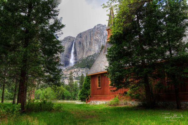
After reading many reviews, I chose Photomatix Pro. The interface is easy to learn. It has pre-set rendering options in several categories, and you can create and name your own settings. It is relatively inexpensive for the features it offers, and I get very satisfying results. This image is a composite of seven, with one properly exposed, 1,2,&3 stops overexposed, and 1,2,3 stops underexposed
Jun 4, 2014 08:10:44 #
MMC wrote:
Photomatix.
Yes. Very easy to use and results are quite good IMO.
:thumbup: :thumbup: :thumbup:
Jun 4, 2014 08:15:53 #
Probably one of my favorite HDR's, 5 shot handheld...Olympus E-5, 8mm
http://douthittfamily.smugmug.com/2011Photos/September-2011/i-WQbjSm4/0/XL/Bay_HDR2-cropped-XL.jpg
http://douthittfamily.smugmug.com/2011Photos/September-2011/i-WQbjSm4/0/XL/Bay_HDR2-cropped-XL.jpg
Jun 4, 2014 08:16:19 #

mooselover75 wrote:
What software do you recommend for achieving spectacular HDR results that is also easy to use?
I have not seen anyone mention Fusion. It is absolutely free and constantly being updated. It's a great way to get your feet wet in HDR, and, may be all you need.
Jun 4, 2014 08:43:22 #

Photomatix. Free trial as long as you want but they put a watermark on your photos. Still you can get a good feel for it before you purchase. Good basic version $99.
If you want to reply, then register here. Registration is free and your account is created instantly, so you can post right away.