For My Wife
May 30, 2014 15:11:14 #
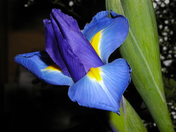
Took this in 2005 with an Olympus C3020Z (3.2mp). Part of an arrangement I made for my wife in May 2005 (her BD, 2 of the kids BD, Mother's Day, Wedding Ann. all in May) Used it for PP practice to make her a print for the wall (she said don't spend money on flowers now that we live on my pension) Original I started with and final???
Any hints help etc. I have LR5, PSE12 and PaintShop Pro X6 Ultimate to work with, used X6 and LR on this.
Any hints help etc. I have LR5, PSE12 and PaintShop Pro X6 Ultimate to work with, used X6 and LR on this.
May 30, 2014 15:49:16 #

I think the original is quite worthy. The green stalks are worth including, but I 'd probably want to get rid of the distracting bright spots and light areas in the background.
May 30, 2014 16:43:13 #
The spots are 'babies breath', my wife loves them, so does the cat, to eat.
I was trying for a suspended in space look. Half the gang at the senior citizens center camera club wanted some green left in also.
I was trying for a suspended in space look. Half the gang at the senior citizens center camera club wanted some green left in also.
May 31, 2014 08:15:45 #

Nice work,I like the way your darkened the background.
:thumbup: :thumbup:
:thumbup: :thumbup:
May 31, 2014 09:34:28 #

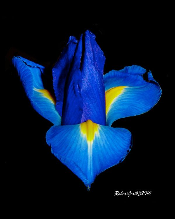
Two different feelings here. The first is more lively, with a diagonal composition and color contrasts, and placed in real space. The second is more quiet, sitting right in the center, floating in black.
May 31, 2014 10:20:43 #

This is how I like my flowers: bright, intense, sharp. You did a good job here. Now, the complaints. As R.G. observed, I agree about the white spots. I hate when people sign their pictures but I understand that you want to have the illusion of copyright protection and maybe a little boost to the ego. I do not like the second one because it is just floating out in the middle of nowhere.
Now for the really big complaint: that direct flash. Do you see the shadows? I can do without those. I urge you to use some kind of flash modifier. You will retain those nice, saturated colors while avoiding the shadows and getting some nice modeling.
Now for the really big complaint: that direct flash. Do you see the shadows? I can do without those. I urge you to use some kind of flash modifier. You will retain those nice, saturated colors while avoiding the shadows and getting some nice modeling.
May 31, 2014 14:33:40 #
Thanks for the comments.
As I said the shoot was in May 2005 on a 3.2mp olympus C3020Z with no flash shoe. So direct flash was all I had. The white spots were babies breath. Years ago I did a print in which I turned the shot to portrait and cropped it so the green became the right edge, then I got rid of the other white spots with the clone tool. Gave that one to my optometrist (and friend) with a framed prayer when her father died in Hawaii. Had it hanging in her office until she retired.
I like the floating on a plain background look, it is what I was after. Members of my photo club also wanted some green left. I will try that and also experiment with different colors behind the flower.
As to the signing, old habit, I used to decorate my classroom with a mix of commercial stuff (calendar shots etc.) and my own work, usually in themes of the four seasons. Poetry quotes etc. Trying to get students to think outside their East LA, So Cal box. I signed all my own stuff to let them know what was what, just added the copyright symbol and date lately. I'm used to IDing and giving credit, academic world has a lot of ripping off of other people's work.
May 31, 2014 22:30:25 #

I do like the flower by itself with the black background, BUT... I am not all that thrilled with the position being smack dab in the middle, with no tilt on it. I would have liked to have seen you keep the tilt, perhaps move it a little to the upper left,(rule of thirds position),and then keep that green that appears to be the stem of the flower. I believe the overall photo would then have some of that "BAM" to it.
May 31, 2014 23:36:10 #
May 31, 2014 23:44:23 #
robertjerl wrote:
Took this in 2005 with an Olympus C3020Z (3.2mp). Part of an arrangement I made for my wife in May 2005 (her BD, 2 of the kids BD, Mother's Day, Wedding Ann. all in May) Used it for PP practice to make her a print for the wall (she said don't spend money on flowers now that we live on my pension) Original I started with and final???
Any hints help etc. I have LR5, PSE12 and PaintShop Pro X6 Ultimate to work with, used X6 and LR on this.
Any hints help etc. I have LR5, PSE12 and PaintShop Pro X6 Ultimate to work with, used X6 and LR on this.
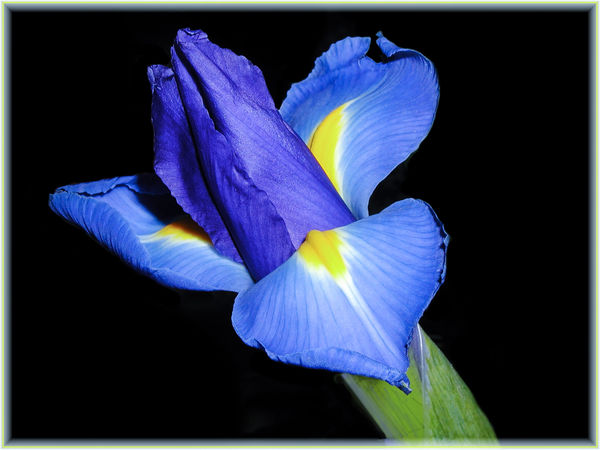
Robert, I took the liberty of working on the original, seeing as how you put the "download" on it, and attempted to do to it like I described above. It you would like me to post it I will, if you would rather I send it to you in a PM, I will do that. And, if you do not want me to post it anywhere, then you will not respond to this message, and I will send my version to the recycle bin. It is a great picture as shot, but just a little tweaking here and there would make it really outstanding IMHO.
Jun 1, 2014 01:01:17 #
Jun 1, 2014 01:32:54 #
robertjerl wrote:
Post away. I have a revision also.
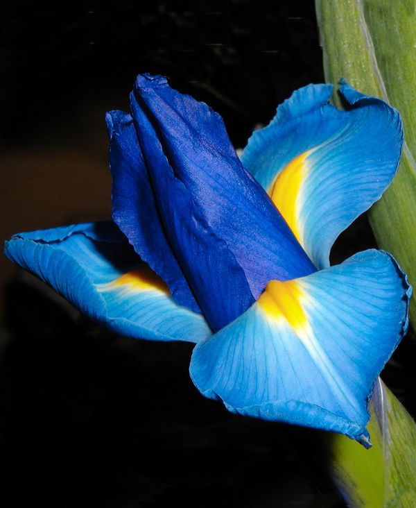
Better than the original except cropped to tightly for my taste.
Jun 1, 2014 15:55:49 #
robertjerl wrote:
Post away. I have a revision also.
Not quite as good as yours. I can see that leaving all the greenery in the photo makes it really come alive, and I don't feel that it is too crowded at all. It fills the frame, it has pop, and it holds my interest for a long time. All good things.
Jun 1, 2014 16:07:28 #
actually I surprised my self on the revision, I set PSP X6 for 8x10 format and then had to use clone to fill in the extra space at top and bottom, including the stems on the right side.The new green almost looks real. almost
CajonPhotog wrote:
Not quite as good as yours. I can see that leaving all the greenery in the photo makes it really come alive, and I don't feel that it is too crowded at all. It fills the frame, it has pop, and it holds my interest for a long time. All good things.
If you want to reply, then register here. Registration is free and your account is created instantly, so you can post right away.