What Bothers You About This Photo?
May 30, 2014 13:06:15 #

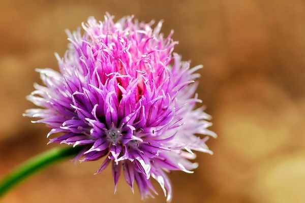
There is something that bothers me enough about this image that it may be destined for the trash bin. I am primarily interested in what you find to be negative regarding this photograph and how much it effects the overall image. By the way, be as harsh as you like as long as it's honest, I have no emotional stake in the picture.
Additional comments, critique or suggestions welcomed. Thanks for your time. 8-)
Additional comments, critique or suggestions welcomed. Thanks for your time. 8-)
May 30, 2014 13:12:54 #
dls1
Loc: Massachusetts
nothing really bothers me. It is a fine photo. There just isn't anything particularly special about it--that makes it jump out at you.
May 30, 2014 13:17:49 #
Don't know what it is but it looks like an eye, about a third in from the left and a third up from the bottom.
That spoils it for me.
That spoils it for me.
May 30, 2014 13:21:08 #

I like the flower photo but think a different color background would work better.
May 30, 2014 13:25:11 #

A couple of things: About 1/3 of the photo -- the area to the right of the flower is negative space that adds nothing to the shot of the flower. While I see what you are trying to do: isolate the one little flower within the larger flower, I would have focused on one of the flowerets more in the center of the large bloom rather than at the edge. Nothing seems to be in perfect focus however the center of the floweret you focused on is fairly sharp. I would have liked to see more in focus with maybe just the far reaches of the bloom beginning to fade from focus. I'm not sold on the purple with a brownish/gold background. Black would have made a world of difference and made the lavender of the bloom really pop. There are positives as well: Good stem angle with it coming close but not bisecting the 90 degree angle of the frame, the color of the flower is nice, the concept is nice -- just needs a little work.
May 30, 2014 14:20:05 #
dls1 wrote:
nothing really bothers me. It is a fine photo. There just isn't anything particularly special about it--that makes it jump out at you.
Yes you are right, kind of a humdrum type shot. But that's not jumps out at me and being a typical photograph doesn't necessarily mean the garbage dump for my images. Heck, probably most of them are ordinary and I can't delete everything! :mrgreen:
May 30, 2014 14:40:44 #
Andy-j wrote:
Don't know what it is but it looks like an eye, about a third in from the left and a third up from the bottom. That spoils it for me.
Fair enough, thanks for the feedback. 8-)
May 30, 2014 16:32:29 #
ecobin wrote:
I like the flower photo but think a different color background would work better.
You could be right but I actually thought the background was a plus for the image. :)
May 30, 2014 17:22:59 #

Bmac wrote:
There is something that bothers me enough about this image that it may be destined for the trash bin. I am primarily interested in what you find to be negative regarding this photograph and how much it effects the overall image. By the way, be as harsh as you like as long as it's honest, I have no emotional stake in the picture.
Additional comments, critique or suggestions welcomed. Thanks for your time. 8-)
Additional comments, critique or suggestions welcomed. Thanks for your time. 8-)
In download it appears to have several raisins floating around,also an out of focus object.
May 30, 2014 17:32:16 #

Bmac wrote:
There is something that bothers me enough about this image that it may be destined for the trash bin. I am primarily interested in what you find to be negative regarding this photograph and how much it effects the overall image. By the way, be as harsh as you like as long as it's honest, I have no emotional stake in the picture.
Additional comments, critique or suggestions welcomed. Thanks for your time. 8-)
Additional comments, critique or suggestions welcomed. Thanks for your time. 8-)
I have to agree with dis 1.
May 30, 2014 18:01:43 #

May 30, 2014 18:42:23 #

I am writing my reply without looking at others' input. The lighting seems a bit harsh and the colors don't compliment each other.
On the other hand, if you hadn't posted your query the way you did, and if I'd only given a quick glance, I'd have said it was quite pretty :)
On the other hand, if you hadn't posted your query the way you did, and if I'd only given a quick glance, I'd have said it was quite pretty :)
May 30, 2014 19:05:14 #

Bmac wrote:
There is something that bothers me enough about this image that it may be destined for the trash bin. I am primarily interested in what you find to be negative regarding this photograph and how much it effects the overall image. By the way, be as harsh as you like as long as it's honest, I have no emotional stake in the picture.
Additional comments, critique or suggestions welcomed. Thanks for your time. 8-)
Additional comments, critique or suggestions welcomed. Thanks for your time. 8-)
I'll comment before reading the other replies, that way be unbiased.
It's a nice photo but hmmm yes my gut tells me something is not right. It's not nice when looking close.
The background color perhaps not ideal, the tips of the pedals center frame are wilted, it's not a perfect specimen. The depth of field could be wider. About 1/3 from the bottom left of center there is a star type structure that is interesting but it is out of focus. The lighting is pretty harsh and some of the highlights are blown out.
Not to worry about 80% of my creative images seem to end up in this "nice but not great" category. What to do with them is probably a subject for another thread.
You can always go back an try again, but do something different. In fact, I'd recommend that.
May 30, 2014 22:50:07 #

Bmac, this isn't a bad shot. The color is wonderful, the clover head is an interesting subject and appears crisp on the download.
If there's a problem, I think it's the conflicted orientation more than anything else. First, it needs a touch more space at the bottom, as the flower is crowded almost against the border, and a flower shouldn't hug the ground. But the major issue is that something reaching for the sky ought to work best in a vertical crop, but because the stem is canted so hard to the right here, it's a bit awkward. The landscape orientation really doesn't work well, but a vertical crop would also be difficult with that stem. You could maybe try a square crop, or possibly even clone out the stem and then try your vertical or square crop in a close-up of the flower, see if that works any better.
If there's a problem, I think it's the conflicted orientation more than anything else. First, it needs a touch more space at the bottom, as the flower is crowded almost against the border, and a flower shouldn't hug the ground. But the major issue is that something reaching for the sky ought to work best in a vertical crop, but because the stem is canted so hard to the right here, it's a bit awkward. The landscape orientation really doesn't work well, but a vertical crop would also be difficult with that stem. You could maybe try a square crop, or possibly even clone out the stem and then try your vertical or square crop in a close-up of the flower, see if that works any better.
May 30, 2014 22:55:21 #
Eagle2352
Loc: Oxford, Ga
What hits me is the stem is out of focus completely, it looks awkward that way.. At least for me.. The negative space several have commented. On also.
If you want to reply, then register here. Registration is free and your account is created instantly, so you can post right away.