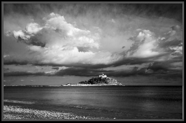
New St Michaels Mount.
May 26, 2014 17:39:55 #

May 26, 2014 19:28:24 #

Love it my friend...the expanse of it,and contrast makes me want to sail out to it and explore..a perfect crop from shore,across the expanse,and the unknown island and finally an omnious sky..really nice work!!
May 26, 2014 20:30:28 #
May 26, 2014 20:46:13 #

nanaval wrote:
I have altered the contrast and lightened the sea.
Much improved and a wonderful image! Good fortune that brightly lit St. Michaels was backed by that dark cloud! Good on ya t'get such Cosmic cooperation!
Now, were it my decision, which, I realise, it is not, I would attempt to improve this gorgeous image by cropping from the right side to eliminate half of the water's horizon between the shore below St. Michaels and the right edge of the present image. To my eye that would make it a completely different, and possibly an even more impactful image. yeah...I know...it approaches the "thirds rule"...so sue me!
impact: 3.5
tech:4
comp: 3.5
11/15
Dave in SD
May 26, 2014 22:22:48 #

I think it's a beautiful shot of a beautiful place and I love the drama in the sky. If I was going to picky though (sorry) the "Mount" seems just a little lost and a little too central - I know it is slightly off centre. If it were blown up slightly you would lose that nice bit of highlighted shingle on the left. And the sky is very powerful so you wouldn't want to lose too much of that either so it's a bit of a dilemma. I wonder if it were blown up and the consequent loss of top sky, not too much and enough to be able to keep the shoreline, and a little cropped off from the right, what do you think? It works great in B&W too by the way, and overall is a very impressive shot.
May 27, 2014 06:13:20 #
rlaugh wrote:
Love it my friend...the expanse of it,and contrast makes me want to sail out to it and explore..a perfect crop from shore,across the expanse,and the unknown island and finally an omnious sky..really nice work!!
Thank you very much my friend, glad you like it. You are welcome to come and sail out to it or even walk over at low tide on the causeway.
May 27, 2014 06:14:15 #
ebrunner wrote:
Extremely dramatic. I think this is a very good photo.
Thank you ebrunner glad you like it and thanks for looking.
May 27, 2014 06:15:17 #
Uuglypher wrote:
Much improved and a wonderful image! Good fortune... (show quote)
Thank you I am glad you find this better.
May 27, 2014 06:22:56 #
PaulG wrote:
I think it's a beautiful shot of a beautiful place... (show quote)
Thanks PaulG I wanted to get the clouds in and also some if the beach to give an idea how far away the Mount was. It is a large place and is situated on a very long stretch of beach. There are a lot of places to get pictures of it even from past Penzance so in a lot of pictures the Mount is not too big. I am glad you like it and thanks for looking.
May 27, 2014 08:48:16 #

The overall effect is certainly striking and dramatic. I like that. My main suggestions are to lighten up the water on the right a little and to get rid of that corny frame. We can discuss those frames elsewhere.
I am unsure about the little shore shown in the foreground. I cannot decide if you should keep it or not.
I am unsure about the little shore shown in the foreground. I cannot decide if you should keep it or not.
May 27, 2014 09:06:37 #
nanaval wrote:
I have altered the contrast and lightened the sea.
i was, like alphanumeric, unsure about the bit of strand at lower left, but realize now that it contributes a lower left POI and also contribute to a compositionally useful diagonal through the highlited wAter, St.Mikes, and the cloud with the gently curved upper edge in the upper right. By all means, keep the strand.
Dave in SD
May 27, 2014 10:22:00 #

This is lovely, and I'd like to see it in "real" printed on watercolor paper!
I have a slight astigmatism, and therefore cannot always see things as "straight." Because I frequently don't get my own pictures straight, I always look at others' - particularly when it's water. Is it straight? No one else seems to have noticed anything.
I really like the small section of beach. It grounds the image and shows the distance between where the photographer is standing and the monastery.
May 27, 2014 15:44:35 #
AzPicLady wrote:
This is lovely, and I'd like to see it in "re... (show quote)
Thank you AzPicLady Yes the horizon is straight as I always check since I was told one was not, and it was out. I am glad you like the section of the beach as I thought it gave a sense of how far out the Mount was. Thanks for you comments.
May 27, 2014 15:47:24 #
Uuglypher wrote:
i was, like alphanumeric, unsure about the bit of strand at lower left, but realize now that it contributes a lower left POI and also contribute to a compositionally useful diagonal through the highlited wAter, St.Mikes, and the cloud with the gently curved upper edge in the upper right. By all means, keep the strand.
Dave in SD
Dave in SD
Thank you :D
May 27, 2014 15:51:35 #
abc1234 wrote:
The overall effect is certainly striking and dramatic. I like that. My main suggestions are to lighten up the water on the right a little and to get rid of that corny frame. We can discuss those frames elsewhere.
I am unsure about the little shore shown in the foreground. I cannot decide if you should keep it or not.
I am unsure about the little shore shown in the foreground. I cannot decide if you should keep it or not.
Hi abc1234 Thank you for the comments, I did lighted the water up from the first post but did it all. I wanted to try and show the distance away the the Mount was and to have a base. Glad you like the overall effect. And yes, talk about frames another time :D
If you want to reply, then register here. Registration is free and your account is created instantly, so you can post right away.