WPC 1419 - Choo Choos CRITIQUE
May 18, 2014 02:53:17 #

Beercat has volunteered their WPC 1419 - Choo Choos entry to the Photo Critique Forum* to find out what they could have done to make it better. Be nice, but be honest as this will help everyone with their craft. Thank you Beercat and thank you everyone!
From WPC 1419 - Choo Choos RESULTS http://www.uglyhedgehog.com/photo_contest_ratings.jsp?pcnum=117
* If you are new to the Photo Critique Forum please read the Section Rules http://www.uglyhedgehog.com/t-159520-1.html
From WPC 1419 - Choo Choos RESULTS http://www.uglyhedgehog.com/photo_contest_ratings.jsp?pcnum=117
* If you are new to the Photo Critique Forum please read the Section Rules http://www.uglyhedgehog.com/t-159520-1.html
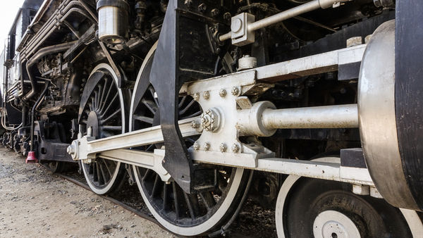
While reviewing the uploaded photos for this weeks challenge I noticed most fellow photographers used the classic 30 - 45 degree angle of the entire locomotive and/or train. I thought, "how could I make my photo different and be extremely interesting." I decided to make my photo a bit more masculine. I headed over to the Griffith Park Train Museum to snap pictures. After deciding on a locomotive with large driver wheels I set my aperture to F16 (my best DOF on the camera I was using), I used a manual exposure setting of ISO 320 which allowed me a hand held 1/15 second shutter speed, oh my! I then focused on what I considered the most masculine area, the huge piston and the massive driver wheels. In post processing I toned down the saturation to basically make the photo black and white and went with a bit higher contrast. I also sharpened the image a bit, no other enhancements were made. I was using a Sony RX10 which has it's limitations but felt the picture delivered what I had envisioned. Using a camera such as I did helps bring out the best in your abilities, you need to think it through, gleaning as much as you can from a good bridge camera but never less limited when compared to full frame DSLR's and high priced glass.
(Download)
May 18, 2014 08:13:24 #
May 19, 2014 10:20:45 #

St3v3M wrote:
Beercat has volunteered their WPC 1419 - Choo Choos entry to the Photo Critique Forum* to find out what they could have done to make it better. Be nice, but be honest as this will help everyone with their craft. Thank you Beercat and thank you everyone!
From WPC 1419 - Choo Choos RESULTS http://www.uglyhedgehog.com/photo_contest_ratings.jsp?pcnum=117
* If you are new to the Photo Critique Forum please read the Section Rules http://www.uglyhedgehog.com/t-159520-1.html
From WPC 1419 - Choo Choos RESULTS http://www.uglyhedgehog.com/photo_contest_ratings.jsp?pcnum=117
* If you are new to the Photo Critique Forum please read the Section Rules http://www.uglyhedgehog.com/t-159520-1.html
Well, it does seem a masculine photo, so I'm probably not the right one to critique it, though I do take photos of machinery from time to time. My initial impression is that the composition itself is quite good - the "approach" angle, what is included/excluded, how it's arranged in the frame. It doesn't really seem tack sharp to me, and I think for the detail that is shown, that is needed. But I'm looking at it on my old laptop so I may not be giving it a fair shake on this. I am not so fond of all that deep black and would probably try to get some detail out of it, it is probably there, hiding. And since there isn't enough color to distinguish it as a color capture, my own inclination would be to go with black and white, which might give more leeway to process detail and contrast in interesting ways.
Overall an interesting photo which looks like it did well in the challenge if I'm reading it right (I have never really figured out what all that scoring stuff means)
May 19, 2014 10:36:47 #
minniev wrote:
Well, it does seem a masculine photo, so I'm proba... (show quote)
I think I'll play around with it as simply a black and white, thanks for the observation.
May 19, 2014 11:10:13 #

Beercat, this is potentially a good picture. What I wonder about is the cropping. I do not like how the large, black vertical object in the centered is cropped off. The other cropping problem for me is on the right. Should more of the piston on the extreme right been shown? Or should you have cropped it in from the right by about a third of the frame?
May 19, 2014 11:20:17 #
abc1234 wrote:
Beercat, this is potentially a good picture. What I wonder about is the cropping. I do not like how the large, black vertical object in the centered is cropped off. The other cropping problem for me is on the right. Should more of the piston on the extreme right been shown? Or should you have cropped it in from the right by about a third of the frame?
All good points, thanks for the observation
If you want to reply, then register here. Registration is free and your account is created instantly, so you can post right away.