Color or B/W?
May 8, 2014 16:30:40 #
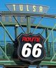
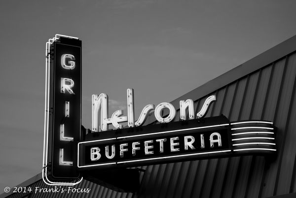
Seems to me the B&W is lacking something ..... would be interested in your thoughts

May 8, 2014 16:43:51 #

When deciding on B&W or color, I always consider whether the color adds anything. If the color is bland and boring, B&W might be a better choice. A brightly colored neon sign seems to me to be an obvious subject for color.
May 8, 2014 16:47:03 #
The first one is missing colour. Lol. Photographing neon signs is like photographing flowers. Who wants to see a pretty flower in B&W?
May 8, 2014 16:55:42 #
I have seen some nice B&W flower photos, but the lighting and composition has to be fantastic to make up for the color.
May 8, 2014 17:49:46 #

I think b&w is most effective when it's about shadows, light, textures, shapes.
Here is one article with tips:
http://www.outdoorphotographer.com/how-to/shooting/the-lost-art-of-shooting-black-and-white.html#.U2v73_ldVR9
Here is one article with tips:
http://www.outdoorphotographer.com/how-to/shooting/the-lost-art-of-shooting-black-and-white.html#.U2v73_ldVR9
May 9, 2014 08:03:54 #
Linda From Maine wrote:
I think b&w is most effective when it's about shadows, light, textures, shapes.
Here is one article with tips:
http://www.outdoorphotographer.com/how-to/shooting/the-lost-art-of-shooting-black-and-white.html#.U2v73_ldVR9
Here is one article with tips:
http://www.outdoorphotographer.com/how-to/shooting/the-lost-art-of-shooting-black-and-white.html#.U2v73_ldVR9
Yep, color for sure for this one. ;)
May 9, 2014 12:14:06 #

May 9, 2014 12:15:34 #

May 9, 2014 13:20:29 #
May 9, 2014 13:28:09 #
Linda From Maine wrote:
I think b&w is most effective when it's about shadows, light, textures, shapes.
Here is one article with tips:
http://www.outdoorphotographer.com/how-to/shooting/the-lost-art-of-shooting-black-and-white.html#.U2v73_ldVR9
Here is one article with tips:
http://www.outdoorphotographer.com/how-to/shooting/the-lost-art-of-shooting-black-and-white.html#.U2v73_ldVR9
Thanks, Linda for the insight & reference -- veru helpful.
May 9, 2014 13:29:59 #

Frapha wrote:
Seems to me the B&W is lacking something ..... would be interested in your thoughts
Why not both...keep the color only on the lighted parts of the sign the red and green...monochrome everything else.
May 9, 2014 13:30:50 #
JohnSwanda wrote:
I have seen some nice B&W flower photos, but the lighting and composition has to be fantastic to make up for the color.
Thx for your comments, John -- good insight for future situations.
May 9, 2014 13:32:49 #
RixPix wrote:
Why not both...keep the color only on the lighted parts of the sign the red and green...monochrome everything else.
Thx RixPix -- Selective color -- interesting idea -- one I'd completely overlooked.
May 9, 2014 13:34:30 #
HowardPepper wrote:
Agreed, color works best in this instance.
Agree -- thx for looking & commenting
May 9, 2014 13:35:06 #

If you want to reply, then register here. Registration is free and your account is created instantly, so you can post right away.