WPC 1417 - Blue Hour CRITIQUE
May 3, 2014 03:47:46 #

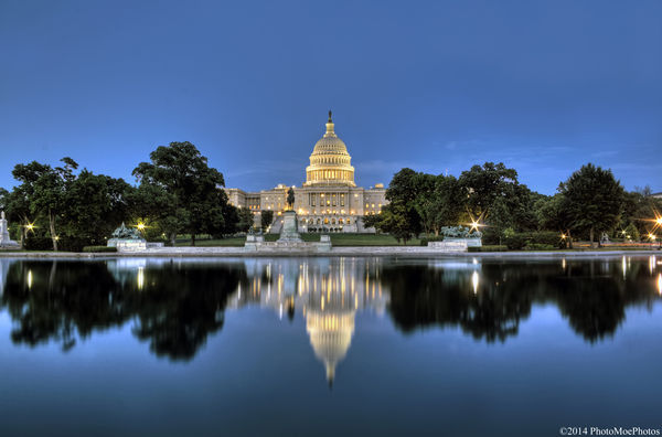
PhotoMoe has volunteered their WPC 1417 - Blue Hour entry to the Photo Critique Forum* to find out what they could have done to make it better. Be nice, but be honest as this will help everyone with their craft. Thank you PhotoMoe and thank you everyone!
From WPC 1417 - Blue Hour RESULTS http://www.uglyhedgehog.com/photo_contest_ratings.jsp?pcnum=115
* If you are new to the Photo Critique Forum please read the Section Rules http://www.uglyhedgehog.com/t-159520-1.html
From WPC 1417 - Blue Hour RESULTS http://www.uglyhedgehog.com/photo_contest_ratings.jsp?pcnum=115
* If you are new to the Photo Critique Forum please read the Section Rules http://www.uglyhedgehog.com/t-159520-1.html
May 3, 2014 11:21:43 #

St3v3M wrote:
PhotoMoe has volunteered their WPC 1417 - Blue Hour entry to the Photo Critique Forum* to find out what they could have done to make it better. Be nice, but be honest as this will help everyone with their craft. Thank you PhotoMoe and thank you everyone!
From WPC 1417 - Blue Hour RESULTS http://www.uglyhedgehog.com/photo_contest_ratings.jsp?pcnum=115
* If you are new to the Photo Critique Forum please read the Section Rules http://www.uglyhedgehog.com/t-159520-1.html
From WPC 1417 - Blue Hour RESULTS http://www.uglyhedgehog.com/photo_contest_ratings.jsp?pcnum=115
* If you are new to the Photo Critique Forum please read the Section Rules http://www.uglyhedgehog.com/t-159520-1.html
xxxxxxxxx
Focus/sharpness and exposure/tonal spectrum, and composition? All laudable!
The only technical solecism that intrudes at NVD is the incongruity of the color of open sky and that sky color showing through openings in the foliage of trees at the horizon.
I'm hoping a quick fix for this common problem will appear in this discussion!
Otherwise it's a wonderful image!
impact: 5
tech: 2.5
comp: 5
12.5/15
Dave in SD
May 4, 2014 06:30:09 #

This is a beautiful image, with excellent color, composition and sharpness. Well done.
May 4, 2014 08:45:07 #

From a technical standpoint, this is a good image. From a composition standpoint, I have some questions. I do not like the star effect emanating from the street lights. They are all the same suggesting a filter was used. I would have cropped of the light on the right. I wonder if a darker sky and reflection might have made this shot more dramatic.
While the panorama is certainly a valid way of framing this scene and suggests tranquility, a vertical composition also works. It conveys the majesty of the Capitol.
While the panorama is certainly a valid way of framing this scene and suggests tranquility, a vertical composition also works. It conveys the majesty of the Capitol.
May 4, 2014 10:19:07 #

This shot caught my attention in its original posting as being nicely done. Couple of suggestions:
In addition to cropping off the light on the right edge, I'd suggest cropping the partially seen structure on the left. "Horizon line" (in this case the water line) tilts very slightly downward to the left, at least on my monitor.
Obviously, this is being really nit picky - congratulations on a fine shot!
May 4, 2014 10:19:58 #

Impact: Excellent. My first thought upon viewing this is that it's a clean, sharp photograph with gorgeous color and light.
Technical: I zoomed into 150% and it looks tack sharp.Even the trees are in focus. The color is gorgeous as I said, and the "stars" don't bother me.
I like the composition. To me the capitol building should be dead center. I like the reflections in the perfectly still water, and I like the amount of environment you've include. There is practically nothing I don't like about this image.
Oh there is one thing ... is the horizon just a teeny weeny bit off? Or is there something here that's throwing me on that?
May 4, 2014 15:30:15 #
Impressive to me in artful and technical aspects. I wonder if the public's distaste for Congress dampened voter enthusiasm ...
May 4, 2014 15:33:45 #
May 4, 2014 17:37:44 #

I'm not a big fan of 'post card' scenics, central compositions or gimmicky filter generated star bursts. To my eye the image is not sharp. At 100% there is a definite double image of the capital dome and the trees on the left have definitely been softened by the wind during the 16 second exposure. Since the subject of the image is roughly at the infinity point (or very nearly) from the camera position there was no reason to shoot at f16. A larger aperture and a shorter exposure would have benefitted this image in my view. There is one very visible dust bunny in the image near the left edge just above the trees. A close examination reveals more of the same.
Impact: 4
Technical 2
Composition: 2.5
Impact: 4
Technical 2
Composition: 2.5
May 4, 2014 18:20:32 #
Nightski wrote:
Let's stick to critique of the image, please. Politics can be discussed in chit chat!
1 cri·tique noun \krə-ˈtēk, kri-\
: a careful judgment in which you give your opinion about the good and bad parts of something (such as a piece of writing or a work of art)
2 critique transitive verb
: to express your opinion about the good and bad parts of (something) : to give a critique of (something)
Here is a short list to think about when giving critique.
I. Visual-Emotional-Involuntary Impact,
II. Technical Accomplishment (exposure, tonal range and spectrum, use of contrast, key, color/monochrome, etc)
III. Composition
Check "I." above ...
May 4, 2014 18:48:53 #
Beautiful composition. I have just two suggestions: The horizon is slightly crooked and is right at the vertical center. I suggest the horizon be shifted to the top third of the image. Also the starburst effect of the street lights are very distracting, the reflections however are awesome!
May 4, 2014 20:24:11 #

It looks like a very good exposure, and not much noise. Very good for a blue hour shot. Unfortunately the subject horizon cuts the frame in half. Not good composition. As for the star bursts, I'd prefer not to see them here, but I can't be sure if they are caused by a filter or by a very small aperture. Most star filters are eight points, not six. In any case, the shot lacks sharpness, which a subject like this really demands.
May 10, 2014 20:19:18 #
lighthouse
Loc: No Fixed Abode
St3v3M wrote:
PhotoMoe has volunteered their WPC 1417 - Blue Hour entry to the Photo Critique Forum* to find out what they could have done to make it better. Be nice, but be honest as this will help everyone with their craft. Thank you PhotoMoe and thank you everyone!
From WPC 1417 - Blue Hour RESULTS http://www.uglyhedgehog.com/photo_contest_ratings.jsp?pcnum=115
* If you are new to the Photo Critique Forum please read the Section Rules http://www.uglyhedgehog.com/t-159520-1.html
From WPC 1417 - Blue Hour RESULTS http://www.uglyhedgehog.com/photo_contest_ratings.jsp?pcnum=115
* If you are new to the Photo Critique Forum please read the Section Rules http://www.uglyhedgehog.com/t-159520-1.html
Reflection shots scream out for a central composition so I have no problem with the composition.
And unless i pixel peep the image is plenty sharp enough.
I would like to see it darker to make the detail in the building more obvious and to darken the sky into more "blue hour".
For me though, this image has a "shot killer".
The lighter blue sky through the trees is unnatural and is a result of an inefficient/improper selection technique.
It kills the shot for me.
If you want to reply, then register here. Registration is free and your account is created instantly, so you can post right away.