Check out The Pampered Pets Corner section of our forum.
Feedback for portraits
May 2, 2014 06:32:36 #
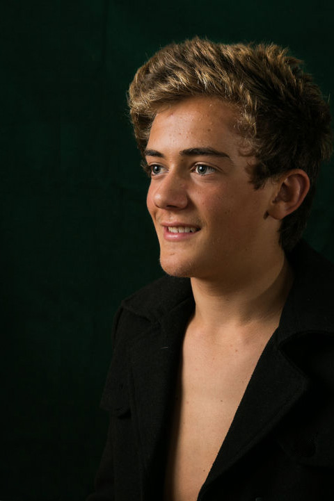
First time i am using a off camera flash with a white reflective umbrella. I am also using another flash bounced off the ceiling to take away ugly shadows and a under chin reflector. Seems like a lot of equipment for the outcome. any feedback would be greatly appreciated.
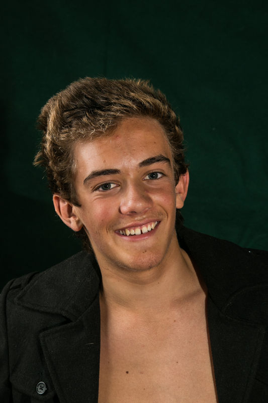
James 1
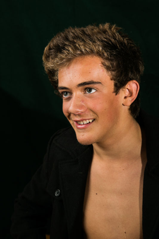
JAMES 3
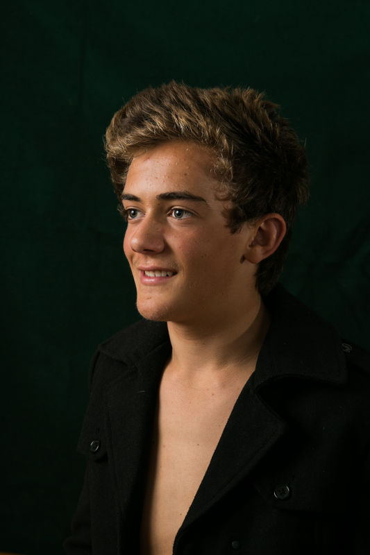
James 2
May 2, 2014 07:01:26 #
mardak wrote:
First time i am using a off camera flash with a white reflective umbrella. I am also using another flash bounced off the ceiling to take away ugly shadows and a under chin reflector. Seems like a lot of equipment for the outcome. any feedback would be greatly appreciated.
This is not my area of expertise (not that I have one), but I found the buttons distracting. I would work on better positioning of the model - maybe less chest. I like the black background, color, sharpness.
May 2, 2014 07:12:27 #
jerryc41 wrote:
This is not my area of expertise (not that I have one), but I found the buttons distracting. I would work on better positioning of the model - maybe less chest. I like the black background, color, sharpness.
lighting and shadows were excellent. Black shirt blended well with the background. Too much chest? I think that is a personal choice but everything looked good as far as technical issues.
May 2, 2014 07:25:48 #
TimS
Loc: GA
Not bad - too much chest for me but that's just me. First photo had too much head room - others are better. The subject has a nice jaw line and you might want to explore options to bring that out. Try having him stuck his neck out and then take a shot like the first but with much shallower depth of field. The third one - my eye keeps going to his hair. If it's a portrait to emphasize the hair style then that would be good. Otherwise, try grate thing the light of his hair and ears. I like how his ear in number 2 is darker because it's on the long side.
May 2, 2014 08:13:48 #
My favorite is the second one, because lighting is more dramatic. Though depending on what the portrait/headshot is for the very even lighting on the other two is good. If it's for an actors portfolio then the even lighting is best.
I also think there is to much chest. The large bright area keeps drawing the eye away from his face, which is something you don't really want to do with a portrait. The highlights on the buttons can also be a little distracting, but not as much as his chest. If this is your first attempt though it's quite good. Keep working on it, you will only get better! :) :thumbup:
Oh, and welcome to the Hog! Thanks for joining. :)
May 3, 2014 01:46:05 #
Thank you all so much for the feedback. It was very useful. The young man was a teenager wanting a picture for his social media and was fun to shoot.
May 3, 2014 10:26:22 #
Check out Digital Artistry section of our forum.
May 3, 2014 13:20:27 #

mardak wrote:
First time i am using a off camera flash with a white reflective umbrella. I am also using another flash bounced off the ceiling to take away ugly shadows and a under chin reflector. Seems like a lot of equipment for the outcome. any feedback would be greatly appreciated.
My personal choice is nos. 2 and 3. However, I think 2 is too static. The placement would be better if he were placed just a bit to the right in the frame. That way he'd be looking toward the center of the photo, rather than appearing to be looking "out" of the photo.
Additionally, for formal, as these appear, button up the shirt. That style might work for head shots, but for this style of photo, the shirt should be buttoned.
The lighting is quite nice. If you were to bounce the ceiling light a bit differently, in no. 2, to accent the hair a bit more, that would work nicely.
All in all, a nice series and I think you'll only get better.
--Bob
May 3, 2014 14:46:49 #
mardak wrote:
First time i am using a off camera flash with a white reflective umbrella. I am also using another flash bounced off the ceiling to take away ugly shadows and a under chin reflector. Seems like a lot of equipment for the outcome. any feedback would be greatly appreciated.
Thanks for the email and permission to post the slight revised version of one of the photos. I simply repositioned the subject, mimicked using a hair light, and de-highlighted some of the small distracting aspects of the image.
Thank you for your reply and permission to post this. I think it will add to your interest in obtaining some guidelines to improve.
-Bob
Re-worked
May 3, 2014 14:49:57 #
May 3, 2014 14:52:59 #
mardak wrote:
Oh yes! That's much better. How did you mimic hair lights?
I simply dodged the hair, which was highlighted to some degree already.
--Bob
Check out Traditional Street and Architectural Photography section of our forum.
May 3, 2014 14:57:59 #
May 3, 2014 15:03:36 #
mardak wrote:
Thank you Bob and for generously taking the time to help me
Martin
Martin
You're welcome, Martin.
--Bob
If you want to reply, then register here. Registration is free and your account is created instantly, so you can post right away.
Check out True Macro-Photography Forum section of our forum.