To Light Your Path
Apr 30, 2014 23:38:44 #
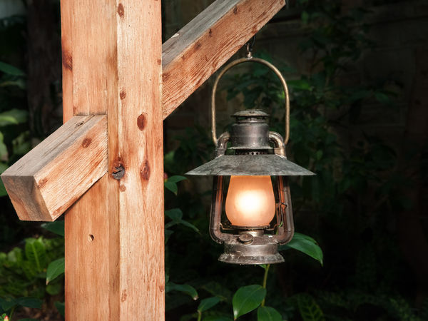
This is an indoor landscape. The background and foreground presented with equal brightness. One could barely tell that there was a light in the lantern.
Post processing in LightRoom. Some cropping and sharpening as well as selective burning and dodging. Because I wanted the suggestion of a background, cropping was limited.
Post processing in LightRoom. Some cropping and sharpening as well as selective burning and dodging. Because I wanted the suggestion of a background, cropping was limited.
May 1, 2014 06:44:05 #

lightchime wrote:
This is an indoor landscape. The background and foreground presented with equal brightness. One could barely tell that there was a light in the lantern.
Post processing in LightRoom. Some cropping and sharpening as well as selective burning and dodging. Because I wanted the suggestion of a background, cropping was limited.
Post processing in LightRoom. Some cropping and sharpening as well as selective burning and dodging. Because I wanted the suggestion of a background, cropping was limited.
xxxxxx
Given the titular intent, my first reaction is that the lantern illuminates distracting stuff nearby rather than the path. I suggest experimenting with longer exposures of scenes lit by the lamp, perhaps with discrete other lighting on the backgrround rather than on the wood post bracket suspending the lamp. It's a major distraction to your presumed intended effect.
Your composition and lighting suggest that the wood post/bracket, rather than the less bright lamp and what IT ILLUMINATES is the C.O.I.
impact:2
tech: 2
Comp:2
6/15
Dave in SD
May 1, 2014 07:44:56 #
Thank you for sharing your thoughts.
Uuglypher wrote:
xxxxxx br br Given the titular intent, my first r... (show quote)
May 2, 2014 10:08:15 #

Lightchime, two things to consider. How about running a linear gradient from the left edge to over the vertical post to darken the post? It is too bright for my taste.
The post is too prominent for me. Could you have shot this from the other side to emphasize the lantern instead?
The post is too prominent for me. Could you have shot this from the other side to emphasize the lantern instead?
May 2, 2014 12:24:18 #
abc1234 wrote:
Lightchime, two things to consider. How about running a linear gradient from the left edge to over the vertical post to darken the post? It is too bright for my taste.
The post is too prominent for me. Could you have shot this from the other side to emphasize the lantern instead?
The post is too prominent for me. Could you have shot this from the other side to emphasize the lantern instead?
The answer to your second question is that in the given environment, it doesn't make much difference - I have tried it many times. and this is by far the better view.
I believe that your suggestion regarding the linear gradient would have worked nicely. I could have also burnt it in.
We have different concepts here. I wanted to bring out the wood and the lantern. I think that your thoughts are very valid and appreciate what you have to say. I consider your thoughts valuable and nicely expressed. I will have a look your at your suggestions in the near future.
As a side bar, given my preferences as stated above, I found the colors to be muted and the background lighting was different than before the download. I was embarrassed as I looked at it. The composition remained the same, but the time spent in LightRoom was largely negated and, to its determent, the image was severely downgraded.
I think your comments are very helpful and look forward to seeing them again.
May 2, 2014 12:54:45 #
Thank you Lightclime for your compliments and your civil disagreement.
When it comes to using the burn-in or dodge tools, I stink. By time I get it dark or light enough, things have turned to an ugly gray. Perhaps you are better than I. The linear and radial gradients work so much better for me. Even the brush is better but for large, linear areas, the linear gradient works great for me. Same as printing in the darkroom.
As for the overall concept, the composition, I do not think that the post and lantern are equally important. I guess this is where we disagree. Excuse the pun but for me, the lantern is the main character and the post is merely a supporting actor. That is why I would tone it down. Thank you for mentioning that you tried other angles but this was the best. That way, I know you thought about it and tried. The textures and details of wood are among the most interesting things you can photograph.
Now, for your side bar. I have the same problem uploading to UHH. When I export from LR, I usually increase the exposure a blanket 2/3 stop in the quick develop module in Library. It is not LR or you but UHH. I have the problem when people view my jpg's in the operating system.
Hope this helps.
May 2, 2014 16:21:57 #

Lightchime, I like this image, but there are a couple of things that bother me. Why is it so bright? Did you use flash? For me, the image would have more atmosphere if it was taken by only the light of the lantern. I want it to be more rustic.
The lamp is rustic. The wood looks new. I wonder if there is a treatment you could apply in post to make the wood look more weathered.
The lamp is rustic. The wood looks new. I wonder if there is a treatment you could apply in post to make the wood look more weathered.
May 2, 2014 18:25:09 #
Nightski wrote:
Lightchime, I like this image, but there are a couple of things that bother me. Why is it so bright? Did you use flash? For me, the image would have more atmosphere if it was taken by only the light of the lantern. I want it to be more rustic.
The lamp is rustic. The wood looks new. I wonder if there is a treatment you could apply in post to make the wood look more weathered.
The lamp is rustic. The wood looks new. I wonder if there is a treatment you could apply in post to make the wood look more weathered.
The lamp is rustic and the post is relatively new and sheltered from the elements. Please refer to my post - it is the fifth one down.
I suppose that I could have some type of grunge treatment to age it, but I really don't care for it in landscapes or portraits.
Yes, flash was used and the lantern appears well aged.
It seems as though I am the only one who likes the brightness of the wood and the lantern. I have exchanged PM's and said that I would rework the image to others' preference.
By the way, the lantern is very dim and a longer exposure would have brought up everything; it would have not stood out unless it was dodged. Under the circumstances, not being able to use a tripod and disliking noise immensely, the long exposure was not in the cards.
The other thing which was disappointing is that the upload is very unsatisfactory when compared to the preuploaded JPEG.
Thanks for comments. They are eagerly accepted.
If you want to reply, then register here. Registration is free and your account is created instantly, so you can post right away.