Challenge: Side by Side 4/28~4/30
Apr 27, 2014 19:51:55 #
The purpose of this challenge is to explore and compare the visual and emotional impact of a color and a black and white image. The purpose of the challenge is NOT to prove that one is superior to another. Some photographers have strong feelings one way or another, but each has it's place. If you tend towards color, try a black and white conversion. If you tend to shoot mostly black and white, give color a chance. Most of all, have fun and see what you can learn.
Select one of your images, processes it in color and convert it to black and white and reprocess to get your best possible black and white image. Then post both the color image and the black and white (or sepia). Landscapes, flowers, portraits, old buildings, street photography, architecture - the sky is the limit.
Here are 2 links exploring the attributes of both, selecting images and offering plenty of tips.
http://masteringphoto.com/black-and-white-vs-color-photography/
http://digital-photography-school.com/why-black-and-white-photography/
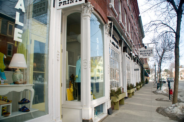
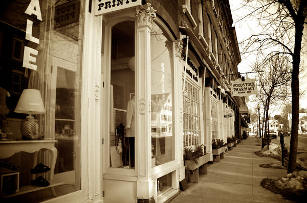
Storefronts, Woodstock, VT
In Sepia - nostalgic look, eye not distracted by color. Vignetting applied
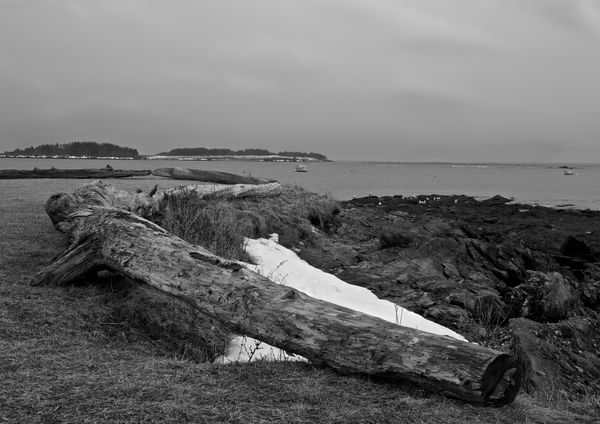
Seascape on a dreary day
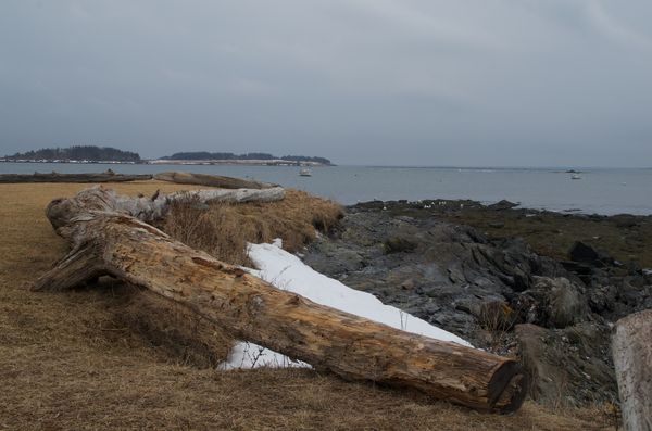
Black and white seemed to match the mood and foreboding sky.
Apr 27, 2014 20:07:49 #

Apr 27, 2014 20:11:26 #
markar wrote:
I will definitely try this Pat. Great idea!!
Oh good! Can't wait to see your results.
Apr 27, 2014 20:25:48 #

Apr 27, 2014 20:27:31 #
GrandmaJoy
Loc: North Carolina
All photos are great. I like the color but the black and white seascape is very pretty.
Apr 27, 2014 20:28:20 #
GrandmaJoy
Loc: North Carolina
All photos are great. I like the color but the black and white seascape is very pretty.
Apr 27, 2014 20:29:02 #
GrandmaJoy
Loc: North Carolina
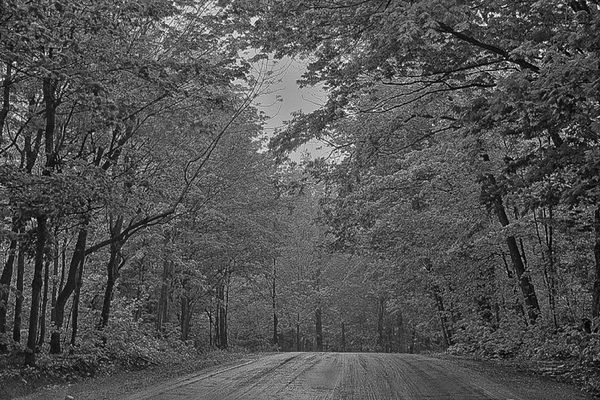
ooops, sorry. The mountain road is pretty. The black and white looks like the trees have snow on them. Very pretty.
Apr 27, 2014 20:45:13 #
GrandmaJoy wrote:
All photos are great. I like the color but the black and white seascape is very pretty.
Thank you - it gives such a diffferent "feel" .
Apr 27, 2014 20:46:20 #
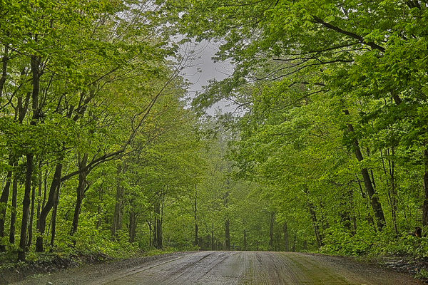
Roadrunner wrote:
One of my rambling hangouts
Without the color, my eye tends to see each branch and better definition of the leaves.
Apr 27, 2014 20:47:14 #
GrandmaJoy wrote:
ooops, sorry. The mountain road is pretty. The black and white looks like the trees have snow on them. Very pretty.
OK..The mountain road I did in HDR an then in Lightroom I post processed it in B&W an kept the same settings and converted it back to colour
Apr 27, 2014 21:01:39 #

PAToGraphy wrote:
The purpose of this challenge is to explore and co... (show quote)
I think color is beautiful....black and white has more impact and intrigue. Great challenge... More dental work on Monday, but will try to get something
Apr 27, 2014 21:02:56 #
Roadrunner wrote:
OK..The mountain road I did in HDR an then in Lightroom I post processed it in B&W an kept the same settings and converted it back to colour
Beautiful.....both ways
Apr 27, 2014 21:16:20 #
Sher wrote:
Beautiful.....both ways
Thanks Sher....Have a good time at the dentist :oops:
Apr 27, 2014 21:47:35 #

Thank you Pat for hosting...I always love color...but there are some b&w that fits the mood that the photographer is trying to convey... This one will be fun.
Apr 27, 2014 22:06:33 #
Roadrunner wrote:
Thanks Sher....Have a good time at the dentist :oops:
Thanks......... A lot......... :-(
If you want to reply, then register here. Registration is free and your account is created instantly, so you can post right away.