Masquerade
Mar 29, 2014 17:43:28 #

Mar 29, 2014 17:49:47 #

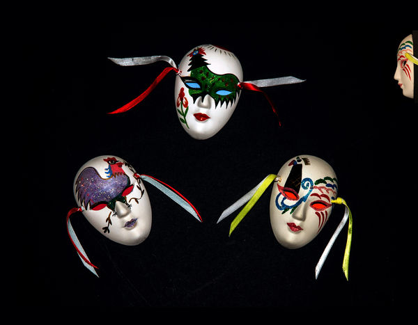
The biggest distraction is not the face but the weird eyes.
As to the general composition, you may want to revise it.
As to the general composition, you may want to revise it.
Mar 29, 2014 17:50:28 #

For me a distraction. Just the three masks makes a very nice picture, well done.
Mar 29, 2014 17:59:28 #

Mar 29, 2014 17:59:31 #

Mar 29, 2014 17:59:31 #
Rongnongno wrote:
The biggest distraction is not the face but the weird eyes.
As to the general composition, you may want to revise it.
As to the general composition, you may want to revise it.
Thx but the weirdness attracts me as for composition a suggestion please
Mar 29, 2014 17:59:43 #

Photomacdog wrote:
For me a distraction. Just the three masks makes a very nice picture, well done.
I agree. 8-)
Mar 29, 2014 18:00:20 #

Mar 29, 2014 18:28:23 #

Mar 29, 2014 18:58:28 #
kejoed wrote:
Play with the triangle it does not have to be regular in its points.Thx but the weirdness attracts me as for composition a suggestion please
The profile also can be moved/tilted so that it looks down or up on the three main masks.
Since you have shot this on a black background and is possibly already a composite there is no limit to what you can do...
As is this does not work for me BUT this is an opinion among others.
Mar 29, 2014 19:04:44 #
I think that if you managed to light the fourth mask on the wall as well as the other three it would have brought it more into balance. I would have also considered lifting the fourth mask so it was a somewhat of an angle. I don'e know what that have done but you always have the delete button if you don't like it.
Mar 29, 2014 20:08:59 #
Mar 30, 2014 10:37:32 #

I actually like this as is. The face on the side conveys a sense of voyeurism or a curiosity about the others. It works for me. Of course you could rearrange things in any number of ways and there are all sorts of different lighting options as well. For me, when I first looked at it, I liked it so my advice is leave it alone. I do not consider myself to be nearly as creative as many members here so take that into considerations too. Thanks for sharing.
Mar 30, 2014 10:59:15 #

If you want to reply, then register here. Registration is free and your account is created instantly, so you can post right away.