WPC 1412 - Spring ANALYSIS
Mar 29, 2014 00:31:55 #

dkinlaw has volunteered their WPC 1412 - Spring entry to the Photo Critique & Analysis Forum* to find out what they could have done to make it better. Be nice, but be honest as this will help everyone with their craft. Thank you dkinlaw and thank you everyone!
From WPC 1412 - Spring RESULTS http://www.uglyhedgehog.com/photo_contest_ratings.jsp?pcnum=109
* If you are new to the Photo Critique & Analysis Forum please read the Section Rules http://www.uglyhedgehog.com/t-159520-1.html
From WPC 1412 - Spring RESULTS http://www.uglyhedgehog.com/photo_contest_ratings.jsp?pcnum=109
* If you are new to the Photo Critique & Analysis Forum please read the Section Rules http://www.uglyhedgehog.com/t-159520-1.html
Mar 29, 2014 06:57:31 #

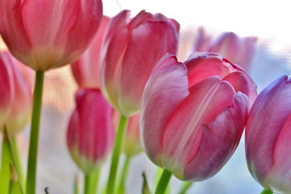
Lovely subject, nice color, but the focal point is not clear. In an image like this, you want to use your DOF to make one flower or one part of a flower really stand out from the others. The bright background in the upper right does not do the image any favors.
Mar 29, 2014 07:12:12 #

St3v3M wrote:
dkinlaw has volunteered their WPC 1412 - Spring entry to the Photo Critique & Analysis Forum
The colors and exposure are just right and the depth of field is fine as an abstract image although a little more DOF might have helped.
The bright white triangle in the upper right could be reduced a little by cropping without hurting the image to keep the emphasis on the petals.
Mar 29, 2014 08:33:11 #

This image has an awkward feel for me and I have had to study it awhile to figure out why that is. Part of it may be the flower that is your focus is tipping out of the frame and there is an awkward crop of the flower next to it. I think it would have been better if that had been a complete flower or almost complete. I would also like to see more of the stems of the flowers. I agree with Nightski that the bright light in the upper right needs to be reduced. I also think you could eliminate the flower on the left so you only have three main flowers in the image with the out of focus flowers making the background giving you the impression of many flowers.
Mar 29, 2014 12:59:36 #
dkinlaw, I retract my earlier comments on your photo. After I commented, Selmslie PM'd letting me know he thought I was way off on this one. I argued with him, and spent most of the morning mad at him, but as he is relentless, he finally got his point through to me. Now I am looking at your image in a whole different way. He explained to me that it's somewhat of an abstract shot. He said that Flower arrangements seldom have a center of focus, they are often just a collection of flowers. I still didn't get it, but then he sent me this link.
http://www.freemanpatterson.com/
After I went to see this link and clicked on the images there, and saw more, I began to understand. Thank you for letting me cut my teeth on your image this morning. :-) I learned something because I was the first to comment.
I very much like your image now. I think the only thing I would say is that it might be better with less of the white corner, but don't cut it out entirely. It gives a view of where the light is coming from. And... maybe a little more of the stem and include the flower on the left. And...maybe if that front flower had a eency weency more DOF ... but maybe it is good just the way it is. That DOF thing might be some of my concrete trying to creep back in. :-)
Mar 29, 2014 13:51:29 #

St3v3M wrote:
dkinlaw has volunteered their WPC 1412 - Spring entry to the Photo Critique & Analysis Forum
This is what it is, a very nice picture of tulips, it does what it says on the tin. Could it be improved? Of course it could. The biggest improvement would come from a better arrangement of the flowers, perhaps removing the head that is cut in two on the right and moving the camera position round to the right so that the out of focus flowers become the background for the flower that is in focus, put more simply, an improved flower arrangement, I'm not comfortable talking about flower arranging :lol:
The colour is good, the depth of field is fine, you could go either way with it, more or less dof, both could work.
Graham
Mar 29, 2014 17:08:22 #

Opening this photo in it's entirety enhances the light stream behind the tulips.
I like how the light is caught through the main tulip in focus. It could use a square crop, cutting off the left tall tulip.
You could emphasize the light coming in from behind, making the tulip petal more translucent. That white left top corner could be tinted that soft blue already in the background.
It is a nice photo.
Mar 29, 2014 21:35:08 #

Thanks so much for the feedback and honesty. I am a novice and do appreciate all of the advice I can get. This is how we learn and make ourselves better.
Mar 30, 2014 08:30:09 #

St3v3M wrote:
b dkinlaw /b has volunteered their WPC 1412 - Sp... (show quote)
This is simply a restful image that encourages slow, thoughtful appreciation and almost relaxes in gentle derision of some of the over-analysis it has received. That single well-focused tulip seems to be resting its weary head upon its neighbor as if to say,,,"we're tulips...relax and enjoy... and rest"
There are some images that can be over-critiqued six-ways-to-Sunday yet remain,as Graham said, merely what they are. This is one of those images that one could look at several times over several days and the different "critical takes" will be forgotten...but the beauty remains. Many other images lend themselves far more productively to "lessons" than does this one.
Would this image "ribbon" in a show? Maybe...maybe not. As always, it depends on the show and the judges. But I'd bet it stands a good chance for "Peoples' Choice" !
Dave in SD
Mar 30, 2014 09:59:37 #

At a photo club contest a while back a judge looked at a contest entry depicting a beautiful sunset. He gave it a 3 out of 5 points. His comment, "nice sunset scene but I have seen a lot of wonderful sunset pictures and there is little about this one to set it apart." In other words, for that judge sunset shots face an especially hard level of review, just because there are so many of them already out there.
I think flower shots face a similar challenge. There are many of them -- and many are very attractive.
I think that sort of thing colors my reaction to this flower shot. I like it, but I am not sure that it stands out in the universe of a gazillion flower shots. I think that doing something unique or special with a flower shot is a really difficult challenge.
This is a nice image but I am not sure that it is memorable.
Mar 30, 2014 11:18:26 #
If you want to reply, then register here. Registration is free and your account is created instantly, so you can post right away.