Check out Close Up Photography section of our forum.
Which white is right?
Mar 24, 2014 16:05:34 #

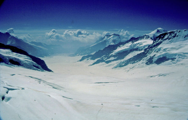
I have been looking at these two versions of the same photo for days and I can't settle on one or the other. The bluish version is the one that I've been looking at for so long that it just seems right to me. My Minolta had a way of picking up blue on white. There was no digital correction for white balance in those days. But when I think about it the white was so blinding that I couldn't keep my eyes fully open; I was squinting a lot. So I put up a version as I remember the white to be, sort of over-white if that's possible. You can see in the middle that we are on top of the clouds. I'd like to know which version looks more real?, or if there's more that needs to be done, please help me by telling what you suggest. I've stored both originals for you to work with. Just remember that it's a simple shot of snow, rocks, clouds, and sky.
Thanks,
Moshe
Thanks,
Moshe


Mar 24, 2014 16:30:59 #
Very dramatic shot, Moshe. I personally think both are too blue. If you have Lightroom try adjusting the color temp. to remove the blue in the snow, while leaving the sky blue. If you would allow I would try it and post here. It should be a quick fix.
Mar 24, 2014 16:52:46 #

The blue is caused by the way light waves behave. I looked it up on google once.... something about the way the red light wavesys disappear into the snow, leaving visible blue. Also, time of day intensified the effect.
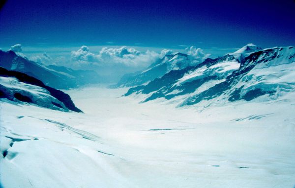
I was able to correct this with two clicks in PSE12. May I post it to show you how it looks when you use the "correct color cast" guided edit in Elements?
I was able to correct this with two clicks in PSE12. May I post it to show you how it looks when you use the "correct color cast" guided edit in Elements?
Check out Street Photography section of our forum.
Mar 24, 2014 19:12:08 #

Mar 24, 2014 19:35:13 #
Heirloom Tomato wrote:
The blue is caused by the way light waves behave. I looked it up on google once.... something about the way the red light wavesys disappear into the snow, leaving visible blue. Also, time of day intensified the effect.
I was able to correct this with two clicks in PSE12. May I post it to show you how it looks when you use the "correct color cast" guided edit in Elements?
I was able to correct this with two clicks in PSE12. May I post it to show you how it looks when you use the "correct color cast" guided edit in Elements?
I just added one more click (auto brightness/contrast) and your gorgeous glacier photo now looks amazing. I hope to be able to show you soon how good it looks with these easy adjustments.
Mar 25, 2014 01:39:38 #
Bushpilot wrote:
Very dramatic shot, Moshe. I personally think both are too blue. If you have Lightroom try adjusting the color temp. to remove the blue in the snow, while leaving the sky blue. If you would allow I would try it and post here. It should be a quick fix.
Please do, Bushpilot. Thanks.
Mar 25, 2014 01:41:13 #
Heirloom Tomato wrote:
The blue is caused by the way light waves behave. I looked it up on google once.... something about the way the red light wavesys disappear into the snow, leaving visible blue. Also, time of day intensified the effect.
I was able to correct this with two clicks in PSE12. May I post it to show you how it looks when you use the "correct color cast" guided edit in Elements?
I was able to correct this with two clicks in PSE12. May I post it to show you how it looks when you use the "correct color cast" guided edit in Elements?
HT: I would be very grateful. Thanks
Check out Digital Artistry section of our forum.
Mar 25, 2014 01:44:29 #
Mainlander wrote:
Very interested in see other versions of your photo.
Yes, Mainlander, it's always been a mystery to me why this happens. I've grown to like the blue even though I remember the blinding white. I never knew what to do about it.
Be well,
Moshe
Mar 25, 2014 02:02:42 #
mosbenav wrote:
HT: I would be very grateful. Thanks
Do you have a post processing program that makes it easy to correct color casts? I did this one in PSE12 by putting the color cast color picker on a billowy cloud. I was pretty sure that those looked white on that day. The scene magically lost the blue cast, it works so well. Then I adjusted auto brightness/contrast with one more click. I hope this looks like it did to your eyes that day.
My edit looked too bright, so I deleted it, took the highlights down by ten percent, and re-posted. I think it looks better now... the whites were too bright in the first one I posted.

Mar 25, 2014 02:22:36 #
Heirloom Tomato wrote:
Do you have a post processing program that makes i... (show quote)
I like this. I even see a bit of warmth in the white which was out of the question. I guess still photos will never get that feature that we can't see. The chill that makes your lungs hurt on inhaling and the tears from your eyes as a defense against the attack of the stinging brightness. I tried to really brighten it up. I posted it earlier, and it looked phony to me.
This is very far along to the real thing. Would you detail what you did step by step so that I can try it for myself? I think others would like to hear about your steps too.
Thanks a lot HT.
All my best,
Moshe
Mar 25, 2014 02:34:12 #
mosbenav wrote:
I like this. I even see a bit of warmth in the wh... (show quote)
You are very welcome, Moshe. Glad to help anytime!
If you would like the hint of warmth removed, I could take it out. I noticed that too.
Here are the steps I took. Very simple.
In Photoshop Elements (version 11 or 12) I went to the guided edit section and selected the "remove color cast" option. When the box comes up, click on the color picker tool and then click it onto something in your photo that you know should be pure white or pure black. If you have guessed correctly, the color cast will instantly disappear. If you get a strange result, try clicking again on a different area. Sometimes this will take more than one try.
Next, I noticed it looked a little dark so, still in the guided edit section, I chose the brightness/contrast option and clicked on "auto fix" box at the top of the page.
Then, when I posted it, the white glacier area looked too bright and a bit blown out, so I went back in to the guided edit section and selected the Lighten/Darken option. Then I reduced the highlights by ten percent.
I went back into it and removed the warmth by once again using the remove color cast tool. This time I clicked on the glacial snow. it looks colder now!
All this took about three minutes. Easy to do if you have good tools.
Best regards and good wishes,
Tomato
Check out Landscape Photography section of our forum.
Mar 25, 2014 05:30:56 #
Heirloom Tomato wrote:
You are very welcome, Moshe. Glad to help anytime!... (show quote)
This is a wonderful approach to achieving reality under weird color conditions. Your explanation of what happens to the reds and why the blues come out, was perfectly acceptable to me and left me feeling that it wasn't a freaky or phony shot, that there was science behind the phenomenon. It is accurate now but I sense that the original conveys a vastness, a mystery, and a fear factor that are way less ominous and threatening in your final touch up, and all those human emotions were on the faces of the observers. I'll have to live with it a while. Right now it is accurate but underwhelming. Maybe if my blue shot is brightened some it will still make us shudder at the possibilities. Now the colors are accurate, for which i am grateful, but somehow tame by comparison. Maybe I am looking for factors that can only be found in motion pictures.
Right now, Tomato, your corrections are accurate and that's a big step in the right direction.
Thanks a million,
Moshe
Mar 25, 2014 14:35:48 #
mosbenav wrote:
This is a wonderful approach to achieving reality ... (show quote)
Moshe, if your blue version better conveys the feeling you got up there, then I think that's what you should go with. I think the feeling one gets from a photo or a work of art is more important than technical accuracy unless you are making a documentary illustration for a technical journal or something. I liked your blue version quite a bit and it certainly looks colder. A small photo has a hard time conveying what it feels like to be up there on a glacier with the biting cold on your face and the vast icy landscape and thin high mountain air spread out as far as your eye can see in every direction. There's no comparison. I just gave you a version with some color correction in case you want that look, too. Go with what your heart tells you!
Your friend, Tomato
Mar 25, 2014 20:40:58 #
reminded me of when I was in a helicopter in Alaska taking shots .. Love the photo . My version of the correction . some light level adj and a minor hue adj

Mar 25, 2014 23:16:19 #
I think something in between the two would look more natural. I ran it through Photoshop CS3 and did a curve adjustment to balance the white out and made an adjustment with the Levels tool to bump up the contrast. Beauty is in the eye of the beholder so what looks good to one person might not look good to someone else. Its just a matter of taste....
If you want to reply, then register here. Registration is free and your account is created instantly, so you can post right away.