2021 - make a tutorial? rectilinear distortion correction + contrast
Mar 16, 2014 17:55:16 #

i think that's what it's called anyway. what i mean is when things get farther away from the lens, they more they start to lean in towards the centre of the photo.
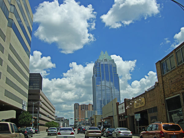
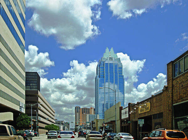
this is a picture of downtown austin. it's not a particularly wonderful image, and i'm sure it should be cropped in order to make it more appealing in general, but i chose this one for practice purposes. i straightened it out and then got a little (a lot) crazy with the contrast. i know i'm heavy-handed, but i'm kind of a contrast junkie. love it, love it, love it!
so, i just skewed it to straighten it, then cropped the edges to square it back up again and as a bonus, that got rid of the lamp post in the upper right hand corner. if i had cropped it for content, i would have removed the tall building on the left hand side entirely, but that line was kind of what i was practising on. is there a more preferred method of correcting the visual distortion? other than using skew, i mean? i was being more logical than learned when i chose to skew it.
i've included the large version of the unedited original in case anyone else wants to have a go at it themselves. i'd be interested in seeing other versions, or tips and/or suggestions.
my apologies if this seems entry-level or elementary to some (all) of you. i just wanna learn more stuff :D
xx
;-) ;-)
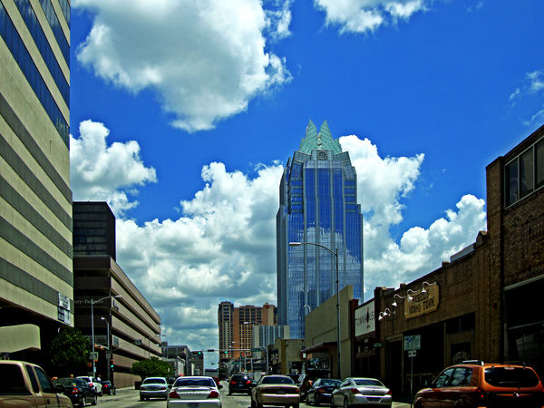
Mar 17, 2014 00:01:08 #
pseudopretentious wrote:
i think that's what it's called anyway. what i mea... (show quote)
Hi. Wanting to learn more stuff is exactly why you should post here.
Some suggestions:
If you look at the left building which you have used skew to straighten you will notice that the wall is actually curved. This is due to lens distortion. Before you do any work skewing the pic you need to correct lens distortion to remove the curvature. An easy task in PS. At the same time you should remove the chromatic aberration that is showing up as a purple/magenta line on the buildings on the right.
Then the next step is to use skew or skew and distort in combination, get all the verticals right, but don't forget the horizontals at the same time. Don't trust your eye, use guidelines to actually check. There is nothing that looks worse than an attempt to straighten which just isn't quite there, it really sticks out as a processing error. The next thing you need to tackle is the halo around the building on the right. Any boost in contrast will make this worse as you can see around the building on the right for your processed version. The easiest way to remove a halo (do this before you do any processing to do with the contrast) and it is quite effective is to duplicate the layer, reduce the brightness of the top layer. Then add a layer mask set to 'hide all.' Then use a soft brush set to 0% hardness and opacity of around 10 and paint out the halo. The trick to this is to work inside the edge of the building with a reasonably large brush so that only the soft edges actually contact the blue. This graduates the effect so that the halo just disappears. Of course in the process you end up darkening the building. So all you need to do is change your brush to 100% hardness and 100% opacity and paint out any darkened areas of the building. I see that you are a contrast junky thats fine but you need to be careful with the whites. Look at the clouds in your processed version, there are some spots where your processing has burned out the whites so that you are left with pure white and no features. If you want to go for a higher contrast then rather than apply it to the whole pic, duplicate your layer, apply the contrast that you want then add a layer mask so that you can paint the detail back into burnt out areas and also any areas where the blacks have been crushed.
I hope this makes sense
Peter
Mar 17, 2014 07:26:19 #
thank you so much! that's incredibly helpful. i try to look at as many tutorials as i can, but sometimes it's overwhelming even just trying to find the one that will help me address the particular issue i'm trying to edit.
thanks for taking the time to type all of that out and explain it to me. i really appreciate it.
thanks for taking the time to type all of that out and explain it to me. i really appreciate it.
Mar 17, 2014 14:42:38 #
I just tried your suggestions on his/her image and it works great. Thanks for the lesson.
conkerwood wrote:
Hi. Wanting to learn more stuff is exactly why you... (show quote)
Mar 17, 2014 15:02:20 #
jeep_daddy wrote:
I just tried your suggestions on his/her image and it works great. Thanks for the lesson.
i'm a "her" :)
for various reasons i won't have time to do any extracurricular photo editing for a couple of weeks (with the exception of thursday... maybe), but please feel free to post your own results here. i'll still be online, and i'd love to see.
ta!
Mar 17, 2014 17:53:13 #
Ok "her"
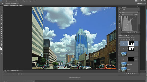
I did like conkerwood said and I'm posting the screen grab of what my layers looked like. Before I did anything I opened ACR filter (new in CC) and did the lens corrections and then cropped out the empty space. Then I darkened the image with a Brightness Contrast adjustment layer and used the mask to paint on the halo essentially darkening the halo. Then I did a Ctrl/Alt/Shift-E to create a "Stamp Visable" layer. This allows you to keep the work one the lower layers but create a combined layer of those so that you can do more of the same to it using more adjustment layers. So then I selected the sky and created a Curves adjustment layer so that I could give it more contrast without affecting the buildings. Then I did the opposite so I could do the same to the buildings but the adjustment could be different. Keep in mind that I didn't take a lot of care making selections nor did I take a lot of time on the halo. The halo isn't perfect but I only took a minute or so on it.
I did like conkerwood said and I'm posting the screen grab of what my layers looked like. Before I did anything I opened ACR filter (new in CC) and did the lens corrections and then cropped out the empty space. Then I darkened the image with a Brightness Contrast adjustment layer and used the mask to paint on the halo essentially darkening the halo. Then I did a Ctrl/Alt/Shift-E to create a "Stamp Visable" layer. This allows you to keep the work one the lower layers but create a combined layer of those so that you can do more of the same to it using more adjustment layers. So then I selected the sky and created a Curves adjustment layer so that I could give it more contrast without affecting the buildings. Then I did the opposite so I could do the same to the buildings but the adjustment could be different. Keep in mind that I didn't take a lot of care making selections nor did I take a lot of time on the halo. The halo isn't perfect but I only took a minute or so on it.
pseudopretentious wrote:
i'm a "her" :)
for various reasons i won't have time to do any extracurricular photo editing for a couple of weeks (with the exception of thursday... maybe), but please feel free to post your own results here. i'll still be online, and i'd love to see.
ta!
for various reasons i won't have time to do any extracurricular photo editing for a couple of weeks (with the exception of thursday... maybe), but please feel free to post your own results here. i'll still be online, and i'd love to see.
ta!
If you want to reply, then register here. Registration is free and your account is created instantly, so you can post right away.