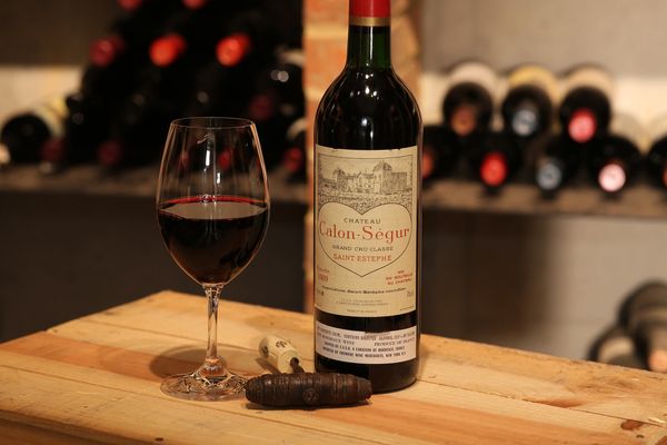
WPC 1410 - Product Shot ANALYSIS
Mar 15, 2014 00:15:25 #

GA shooter has volunteered their WPC 1410 - Product Shot entry to the Photo Critique & Analysis Forum* to find out what they could have done to make it better. Be nice, but be honest as this will help everyone with their craft. Thank you GA shooter and thank you everyone!
From WPC 1410 - Product Shot RESULTS http://www.uglyhedgehog.com/photo_contest_ratings.jsp?pcnum=107
* If you are new to the Photo Critique & Analysis Forum please read the Section Rules http://www.uglyhedgehog.com/t-159520-1.html
From WPC 1410 - Product Shot RESULTS http://www.uglyhedgehog.com/photo_contest_ratings.jsp?pcnum=107
* If you are new to the Photo Critique & Analysis Forum please read the Section Rules http://www.uglyhedgehog.com/t-159520-1.html
Mar 15, 2014 00:35:48 #

The first three things that would make the image more appealing to me are:
I would like the top of the bottle included.
The image needs to be rotated about -.5 degrees
The background is too bright for me.
I would like the top of the bottle included.
The image needs to be rotated about -.5 degrees
The background is too bright for me.
Mar 15, 2014 00:59:02 #

I would lower the camera and shoot straight on. I would also use a window for side lighting, or use a soft box to light one side and another to light the other side, the board or bricks behind the bottle are a distraction for me. My eyes are drawn to the table, it takes a lot of space and is bright, a lower camera angle would really help there.
Mar 15, 2014 07:13:04 #

I'd suggest portrait instead of landscape as Rick suggested to capture the top of the bottle.
I'd also move in closer to the subject and / or remove the blemishes in the wood near the picture edges on the right and bottom left
I'd also move in closer to the subject and / or remove the blemishes in the wood near the picture edges on the right and bottom left
Mar 15, 2014 18:36:11 #

GA Shooter, I liked this shot right away. I think you've exposed nicely for it, love the color, and I really like the DOF choice you made. I may have fiddled with the position of the wine bottle opener a little or left it out completely. There is a rectangular reflection on the wine glass and some hot spots on the bottle. These are difficult to avoid. There is an unattractive shadow on the table from your light, and I too want to see the top of the bottle. I recently saw a youtube video that you might like on product photography. I found it quite interesting. It also makes clear how hard this is to do perfectly. There are so many factors involved. I think you did very well.
http://www.youtube.com/watch?v=IIm-SZHKOW4
http://www.youtube.com/watch?v=IIm-SZHKOW4
Mar 15, 2014 19:48:20 #
Thanks to everyone for their critique. Comments like these are critical to help an amature like me. This was a hastily taken photo which could have been improved taken in my wine cellar with only the ambient light from the ceiling spot lights. Since the bottle was a prized '89 bordeaux I did not open it, hence I did not show the full bottle with it's still sealed top! I took it off the jpg card in the 5D, loaded it on a i-Pad and downloaded it with no PP. I took 3 shots at different aperatures using an 85mm 1.8 lens with varying degrees of background blurr and picked the middle one as one was too indistinct and you couldn't tell you were in a wine cellar and the other was too clear and distracting. The cork was from a cheap bottle of wine (as most wine snobs would easily spot) and the wine a leftover cab from the evening before. Again, thanks to all for their constructive help!
Mar 15, 2014 19:49:38 #
As a product shot I would suggest it would be much better shot in portrait orientation and include the entire bottle. Having the top of the bottle cut off draws my eye out the top of the photo rather than helping me focus on the label, which is where I would assume the vintner would hope I looked. I would also suggest zooming in tighter on the bottle and glass and eliminating much of the background. As it stands now, there is too much background adding nothing to help put attention on the product.
Mar 16, 2014 07:34:50 #

Top of bottle for sure. I like the portrait idea.
The glass caught my attention and just seemed to overpower everything else. The bottle just doesn't seem to have the same punch to me. More contrast on it, maybe. Hmmm
I like the bottles in the back, but maybe a little less depth-of-field, but you can still recognize what they are. The brick pole started to distract me some, but only after I looked at it for a bit.
I would probably try a LOT of different shots with this one. :-)
Mar 16, 2014 09:58:05 #

For a product shot it needs the top of the bottle. It would have been better shot in portrait orientation. The corkscrew does not add anything for a product shot.
Mar 16, 2014 11:40:39 #

I like the concept of this image, but here are a few of my comments.
1. The perspective is odd (straight up bottle and glass on a slanted table top gives me a sense that the bottle is slightly tipped to the right). Try a vertical composition and capture the entire bottle.
2. The lighting seems to affect the table top more than the bottle and glass, which are the main objects in the image.
3. The bottle label could use a sharper focus, particularly for an image having a commercial purpose.
4. The blurry background is fine, but the left side middle areas seems to be as dark as the background.
Mar 16, 2014 12:54:11 #

St3v3M wrote:
b GA shooter /b has volunteered their WPC 1410 -... (show quote)
GA shooter,
The overall picture is well exposed, the focus is very sharp, and the DOF is right on for the foreground and background, very nicely done.
To improve this image as a salable item to a potential customer you need to make the product very inviting, one the viewer would be enticed to try. Consider some, or all of the following:
1. Change the horizontal format to vertical, like the portrait of a young woman.
2. Include the angle of the table and corner, the glass, and bottle; but exchange the bottle opener with the cork only, and the label of the Venter showing on the body of the cork.
3. Make sure the bottle top is in view and clean any tears if the seal.
4. The vertical shelf support is distracting, position the camera, or table, so the bottle is not in front of the support. Preferably not showing at all.
5. If necessary, add more bottle to the shelf in back, and allow them to provide an imaging support to the product.
6. The background illumination must not compete for attention with the product. The out of focus background is good, but you need to keep the lighting down below the illumination of the product.
Now for the Nit-Picky stuff.
1. The wooden shelf in the background should not bisect the product, it is not dead center on the product, but could be a little bit higher. Reducing the illumination on the background objects will help to remove distractions, and positioning the product more to the left may remove the brighter wooden shelf. It is not important to totally remove the background objects, just control the attraction of the eye to them. Let them support the product, and make the product the central point of interest.
2. With you DOF everything looks good, and this will allow you to create more interest in the product. Rotate the bottle slightly to the right, so the label is not directly looking at the viewer. Allow the label to be slightly off center of the line of sight.
3. You have some distracting shadows; caused by your strobe lights, positioning these to create a perception of depth can enhance the overall product.
4. Reducing the light intensity from the lights and increasing shutter speed may help both the shadows and the background illumination. (Be careful with shutter speed you do not exceed the strobe to shutter sync speed).
5. Changing from landscape to portrait mode will remove many of the blemishes in the tabletop. Do not be too concerned with wood blemishs; they can add character to the overall image.
6. The reflections in the wine glass and bottle are a bit distracting, by positioning the strobes to create realistic shadows may move the reflections off to one side, or another, well placed reflections can add shape and form to a product.
If your strobe lights have Modeling Lights included, turn these on to position the lamps for shading effects; if you dont have Modeling Lights, use a flashlight to simulate the modeling of your strobes.
Good Shooting,
Michael G
Mar 16, 2014 16:37:04 #

A lot of good information has been given for your use in the next production shot you may make.
I would just like to point out the big mistake I see, and that is the wine glass containing wine, but the wine bottle is not missing any wine.
I would just like to point out the big mistake I see, and that is the wine glass containing wine, but the wine bottle is not missing any wine.
Mar 16, 2014 18:20:44 #
SoHillGuy wrote:
the wine glass containing wine, but the wine bottle is not missing any wine.
Good observation. Also, the cork screw still has a cork in it, which must be from the missing bottle; perhaps the bottle from where the wine in the glass came.
If you want to reply, then register here. Registration is free and your account is created instantly, so you can post right away.