Challenge 2/27 - 3/1: Placing Your Subject
Feb 26, 2014 22:26:27 #
Every photograph has a subject. How and where that subject is placed in the frame can be the difference between an ordinary "snapshot" and a unique "stand out" shot. The purpose of this challenge is to review basic information (yes, "rule of thirds" is just one tip for review) related to composition and then go out, practice and post.
These articles are short, have excellent examples and PLEASE don't skip over them. Guaranteed there will be something in them for everyone no matter your skill level or camera. The second article is more than just the rule of thirds.
http://www.picturecorrect.com/tips/subject-placement-tips-in-photography/
http://www.ultimate-photo-tips.com/photography-rule-of-thirds.html
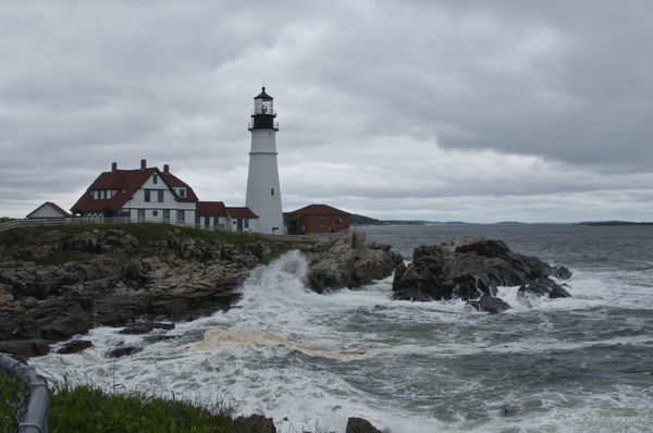
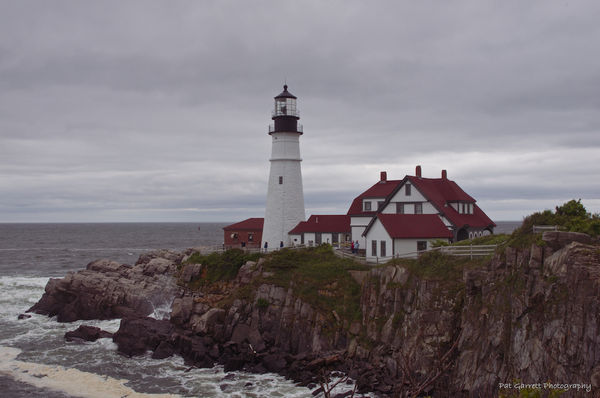
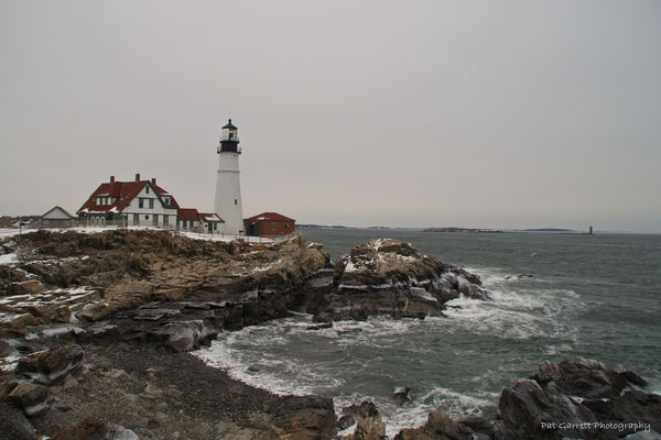
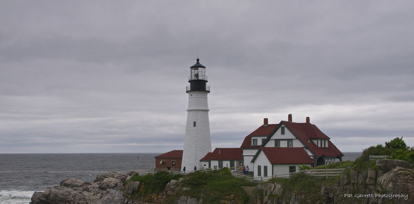
Which of the following shots do you think is a good example of "subject placement" and why. (Sher, you wanted the light house, so here it is in this set). Do keep in mind that what appeals to your eye, may not appeal to another. And...while the goal is to compose "in camera", you might recompose an image by cropping in post processing.
Looking forward to your "composed" images.
These articles are short, have excellent examples and PLEASE don't skip over them. Guaranteed there will be something in them for everyone no matter your skill level or camera. The second article is more than just the rule of thirds.
http://www.picturecorrect.com/tips/subject-placement-tips-in-photography/
http://www.ultimate-photo-tips.com/photography-rule-of-thirds.html
Which of the following shots do you think is a good example of "subject placement" and why. (Sher, you wanted the light house, so here it is in this set). Do keep in mind that what appeals to your eye, may not appeal to another. And...while the goal is to compose "in camera", you might recompose an image by cropping in post processing.
Looking forward to your "composed" images.
Feb 26, 2014 22:32:56 #
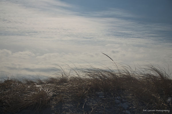
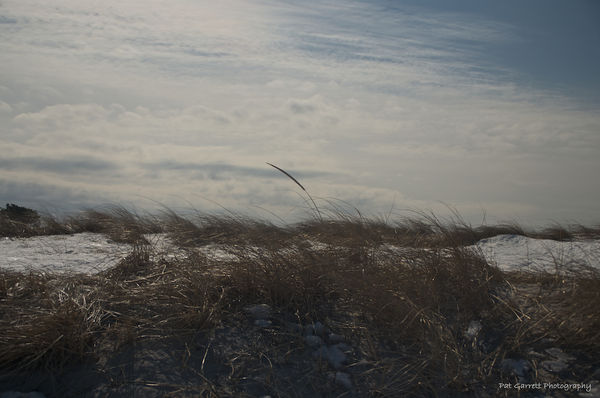
This set was taken today, none were cropped. Which most closely follows some of the tips mentioned in the articles?
Dune Grass in the Wind -1

Dune Grass in the Wind - 2
Dune Grass in the Wind - 3
Feb 26, 2014 22:45:31 #

Feb 26, 2014 22:54:52 #
In the lighthouse series, #3 best illustrates leading lines - the cove in the foreground drawing the eye around to the light house, the foam in water and white caps, repeat the white in the snow around the light house. The light tower is on the left intersection of the grid of 3rds and the water and rocks are more interesting than the sky so they take up the bottom 2/3rds of the frame.
In series #2, my preference is #2. The subject - the one head of waving dune grass is off centered to the right on the right grid intersections. All the grass is windswept to the left. There is a sense of wind or motion. The sky is of greater interest than the tangled grass roots, so the horizon is along the lower third of the grid. In #1, the lone grass is too far right and the background snow is distracting. In #3 the grass is smack dab in the middle and has the snow in background and the uninteresting foreground takes up too much of the image.
Series 2 was backlit and taken using a neutral density filter.
And it's OK if you disagree.
Feb 26, 2014 22:55:17 #
plessner wrote:
great examples and explanations Pat
Thank you, Katherine.
Feb 26, 2014 23:06:12 #
Feb 26, 2014 23:07:57 #

a wonderful challenge...I love learning about new things an practicing the old principles that I learned long ago but I know I could use a refresher in....looking forward to it... Thanks for hosting...love lighthouses...the second one is my fav composition!
PAToGraphy wrote:
Every photograph has a subject. How and where that... (show quote)
Feb 26, 2014 23:08:39 #

Good start Pat and wonderful images even if not all follow the rule of thirds.
Feb 26, 2014 23:09:04 #
Rockrunner wrote:
Second article was very interesting, loved the math lesson
Thank you; I thought so too. I am not a "math" person, but it made sense and the illustrations and examples were very good. Now if only I could remember all that....
Feb 26, 2014 23:10:55 #
laskalass wrote:
a wonderful challenge...I love learning about new things an practicing the old principles that I learned long ago but I know I could use a refresher in....looking forward to it... Thanks for hosting...love lighthouses...the second one is my fav composition!
Thanks, Laska. Looking forward to your posts.
Feb 26, 2014 23:12:43 #
Bushido wrote:
Good start Pat and wonderful images even if not all follow the rule of thirds.
Thank you very much. Sometimes those rules are merely guidelines and breaking them can lead to interesting shots.
Feb 26, 2014 23:20:45 #
Guess I'm a rule breaker...lol....I liked the last one with the grasses because I liked the balance of the snow ...it added interest to me and dimension...even though the grass stalk was in the center....
PAToGraphy wrote:
In the lighthouse series, #3 best illustrates lead... (show quote)
Feb 26, 2014 23:20:59 #
Feb 26, 2014 23:33:09 #
PAToGraphy wrote:
This set was taken today, none were cropped. Which most closely follows some of the tips mentioned in the articles?
Excellent Pat. I like Dune #1 the best . I believe the snow brings an extra factor into the picture. It creates a wider area of interest. #1 for the lighthouse. While the rocks and ocean are of interest the main subject is the lighthouse and is easier to see in #1. I might have cropped out the pipe or cloned it out.
Feb 26, 2014 23:34:42 #
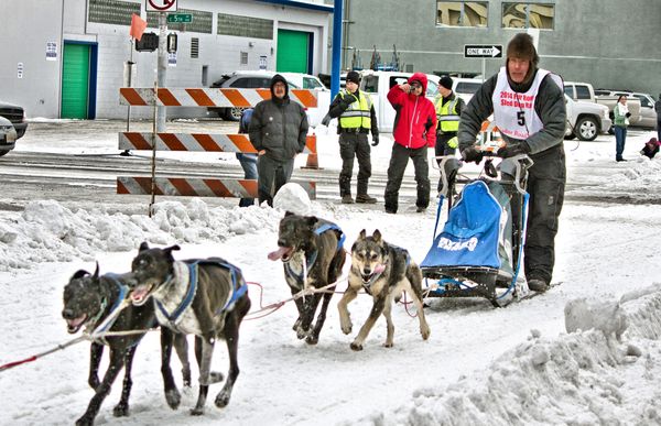
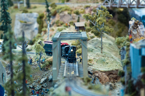
These were taken last weekend during Fur Rondezvous....In the first one the musher is aligned with the rule of thirds but your eye also goes to the dogs running.....the second one is the model train competition...I put the train just a little off center as I wanted it to catch the interest of the viewer...the rest of the photo is not totally in focus helping to keep the train as the center of interest...
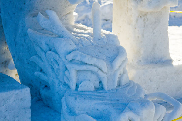
The snow dragon is made by a block of snow from the city snow dump...where a giant block is placed in the arena to be carved into a sculpture
The snow dragon is made by a block of snow from the city snow dump...where a giant block is placed in the arena to be carved into a sculpture
musher coming down main street..the musher is aligned with thirds
(Download)
model train scene
(Download)
snow dragon
(Download)
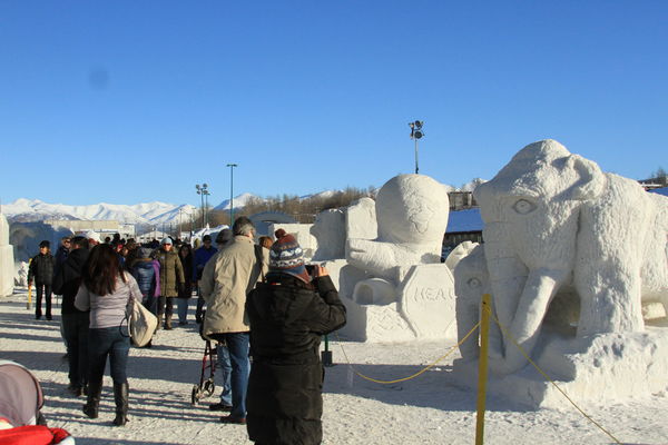
snow sculptures.....a street scene with the crowd balancing the sculptures
(Download)
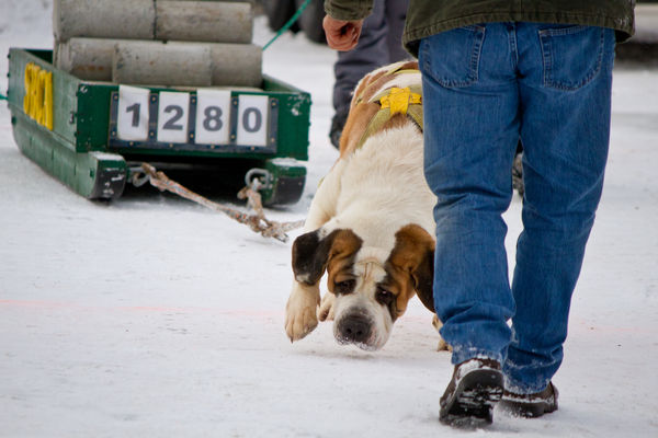
Dog pull....St Barnard pulling weight
(Download)
If you want to reply, then register here. Registration is free and your account is created instantly, so you can post right away.