WPC 1407 - Red ANALYSIS
Feb 22, 2014 02:06:57 #

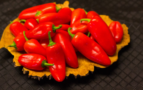
Terrym9 has volunteered their WPC 1407 - Red entry to the Photo Critique & Analysis Forum* to find out what they could have done to make it better. Be nice, but be honest as this will help everyone with their craft. Thank you Terrym9 and thank you everyone!
From WPC 1407 - Red RESULTS http://www.uglyhedgehog.com/photo_contest_ratings.jsp?pcnum=104
* If you are new to the Photo Critique & Analysis Forum please read the Section Rules http://www.uglyhedgehog.com/t-159520-1.html
From WPC 1407 - Red RESULTS http://www.uglyhedgehog.com/photo_contest_ratings.jsp?pcnum=104
* If you are new to the Photo Critique & Analysis Forum please read the Section Rules http://www.uglyhedgehog.com/t-159520-1.html
Feb 22, 2014 03:22:28 #

Focusing is on the first pepper forward tip.
Depth of field is really narrow and narrowly covers the first pepper (saving the picture from being bad).
Highlights can be toned down but are needed.
Color balance reflects Nikon bias toward red, this needs to be corrected especially when the main subject is red.
Other than that pixel peeping, it is a pleasant image, just not a 'winner'.
Feb 22, 2014 10:02:28 #

I think this Image could be done better this way:
-Shoot from above not from the side
-get every pepper in sharp focus
-Crop everything out except the tortilla and the peppers
-Pile the peppers so you can see the tortilla between them
-Shoot from above not from the side
-get every pepper in sharp focus
-Crop everything out except the tortilla and the peppers
-Pile the peppers so you can see the tortilla between them
Feb 22, 2014 10:29:02 #

Nightski wrote:
I think this Image could be done better this way:
-Shoot from above not from the side
-get every pepper in sharp focus
-Crop everything out except the tortilla and the peppers
-Pile the peppers so you can see the tortilla between them
-Shoot from above not from the side
-get every pepper in sharp focus
-Crop everything out except the tortilla and the peppers
-Pile the peppers so you can see the tortilla between them
Thsnk for the comments, its not a tortilla, its actually a wooden platter turned from a maple burl
Feb 22, 2014 11:41:02 #

This is a shot I would have tried. I love the idea of it. And, I think this is a hard kind of photo to make really special.
I love the vibrant red color. Another contributor suggested toning it down a bit and maybe that is a good suggestion. But I wouldn't. I love flagrant redness. That is just my personal prejudice.
And, as I noted above, I love the subject.
I agree that this image would have benefited from the greatest depth of field possible. I don't know if a tripod was used here, but it would have been a good idea so that a long exposure might have allowed a greater depth of field. I think this is the kind of photo where overall sharpness is very important.
And now for an observation about which I am less sure:
I think that there is an issue in this kind of image about locating a center of attention for the viewer.
If there had been one green pepper strategically placed, the viewer's eyes would have known to focus there first. But without that sort of thing, this becomes a kind of pattern image -- like a field of flowers where the image is appreciated primarily as pattern of shapes and/or colors formed by all the constituent visual elements.
In this instance, however, because of the inclusion of the plate and background, this is not a pure pattern shot. The pattern shot might have zoomed in so that the peppers occupied the entire frame. But the plate and background make it into a different kind of shot and somehow make me want a primary point of attention.
I am not sure any of that will make any sense to anyone else -- but I sort of understand what I am trying to talk about.
Peppers are wonderful subjects for photographers. They have fun shapes and colors. This particular image of peppers is interesting enough -- but I bet another few tries might make a more special image.
Feb 22, 2014 12:12:31 #
I love jgordon's idea of adding a green pepper to the mix, but I think for the Red contest it may have been better to add a red pepper to a bunch of green ones, thereby emphasizing the red pepper.
Feb 23, 2014 09:55:06 #

I'll simply add my thumbs up to the DOF issue. In an image of this sort, I think more DOF is needed. My other issue is the background. One without a pattern would have been better. The pattern in the background draws my attention away from the peppers.
Feb 23, 2014 11:10:15 #
I like the composition. I agree with everyone that it needs more depth of field. I would have centered the platter rather than have it too close to the left edge. I also think a green pepper would have worked as well as the red would have easily overpowered the green. Maybe just a small jalapeno for contrast.
Dennis
Dennis
Feb 23, 2014 22:31:08 #
AzPicLady wrote:
I'll simply add my thumbs up to the DOF issue. In an image of this sort, I think more DOF is needed. My other issue is the background. One without a pattern would have been better. The pattern in the background draws my attention away from the peppers.
I definitely agree about the back ground, I just about changed it before the contest was over but ran out of time, and also felt that a closer crop would have worked better, not certain I agree with the depth of field, I may try another and see what I think. I wanted to focus on the front peppers and the rough edge of the platter. I very much appreciate all the comments as I am just learning this. I really enjoy UHH
Feb 27, 2014 14:57:53 #

Cropping out the edge of the platter isn't working for me, and there isn't enough of the pepper pile in focus. Having the background and the back of the plate going softis maybe desireable, just try to be a little sharper in the foreground and increase the DOF so about 2/3 of the subject is sharp. White balance is always an issue with this kind of picture. shooting one frame with a grey card for reference to balance the others is a good tactic. I like the idea and the setup.
Mar 4, 2014 00:27:54 #

St3v3M wrote:
b Terrym9 /b has volunteered their WPC 1407 - Re... (show quote)
xxxxxxxx
Hi, St3v3m,
Are more entries in this red theme still being accepted? (you've seen the one I'd enter)
Dave in SD
Mar 4, 2014 00:30:38 #
Uuglypher wrote:
xxxxxxxx
Hi, St3v3m,
Are more entries in this red theme still being accepted? (you've seen the one I'd enter)
Dave in SD
Hi, St3v3m,
Are more entries in this red theme still being accepted? (you've seen the one I'd enter)
Dave in SD
RESULTS http://www.uglyhedgehog.com/t-187723-1.html
If you want to reply, then register here. Registration is free and your account is created instantly, so you can post right away.