WPC 1406 - Windows ANALYSIS
Feb 15, 2014 03:30:18 #

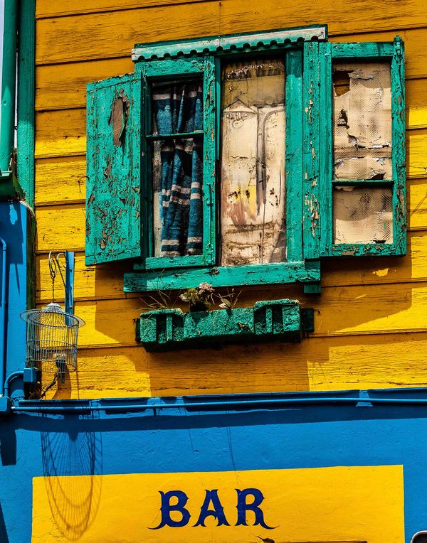
Schwabo has volunteered their WPC 1406 - Windows entry to the Photo Critique & Analysis Forum* to find out what they could have done to make it better. Be nice, but be honest as this will help everyone with their craft. Thank you Schwabo and thank you everyone!
From WPC 1406 - Windows RESULTS http://www.uglyhedgehog.com/photo_contest_ratings.jsp?pcnum=102
* If you are new to the Photo Critique & Analysis Forum please read the Section Rules http://www.uglyhedgehog.com/t-159520-1.html
From WPC 1406 - Windows RESULTS http://www.uglyhedgehog.com/photo_contest_ratings.jsp?pcnum=102
* If you are new to the Photo Critique & Analysis Forum please read the Section Rules http://www.uglyhedgehog.com/t-159520-1.html
Feb 15, 2014 07:37:47 #
In many ways this is my kind of pic, grunge and decay and a genuinely fascinating window structure. But for me there is too much distracting clutter around the window. There is plenty of material available to rebuild a section of yellow wall to clone out the bird cage and blue bracket, a little care and it would be undetectable. You are then in a position to crop away all the blue to the left and below so that you are left with the green frame on the yellow background with the yellow shadows adding interest. The curtains on the left seem a little dark at the top, might be worth bringing some of those details a little. But do I like it? Certainly. Would I have taken pics of it? Absolutely. Well spotted.
Peter
Peter
Feb 15, 2014 08:57:30 #

I agree with conkerwood that there is just a little too much going on in this photo. What I love is the vivid colors, the textures of the peeling paint and the decaying curtains.
Feb 15, 2014 13:30:12 #

St3v3M wrote:
b Schwabo /b has volunteered their WPC 1406 - Wi... (show quote)
I can see what caught your eye. The colors and textures going on in this image are phenomenal. I would like to see this shot straight on, not at an angle, and I would crop the lower level off.
I may even tone down the color a bit. Here is an edit that Graham Smith did on an image like yours. He brought it home in this edit. I would suggest taking a peek at what he did.
http://www.uglyhedgehog.com/t-168765-2.html
I would love it if you did an edit, and then reposted this image in a new thread for critique in the PC&A Section.
Feb 20, 2014 19:31:07 #
Memphis
Loc: Seattle
I like all the interesting detail...even the bird cage...I would crop about halfway into the blue section above the Bar sign...that way you have a line of color down the left side and along the bottom, framing the main subject.
Feb 21, 2014 11:18:44 #

Nice shot.
I think the sign at the bottom competes a little with the window as a central focus for the image. When I adjust my screen view to exclude the sign, the feeling of clutter disappeared (at least for me) and I liked the image better.
I would not tone down the colors! I love them in all their vibrancy.
Like someone else remarked about this image, this is one I would have tried as well. I think you did a nice job with it.
Feb 21, 2014 14:23:23 #
I think the smooth texture below the conduit shadow subtracts from the rest of it and would crop at the shadow so there's an equal amount of blue as the left side.
Colors, textures, peeling paint, decay... Lots to catch the eye.
Colors, textures, peeling paint, decay... Lots to catch the eye.
Feb 22, 2014 08:46:31 #
Nice shot if for some reason you had to capture the window and word bar, if not I would crop as Memphis suggested and focus or subject on the window.
If you want to reply, then register here. Registration is free and your account is created instantly, so you can post right away.