B&W or a little colour
Feb 9, 2014 20:57:59 #

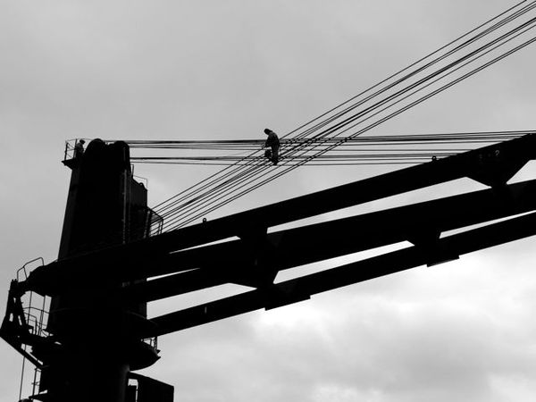
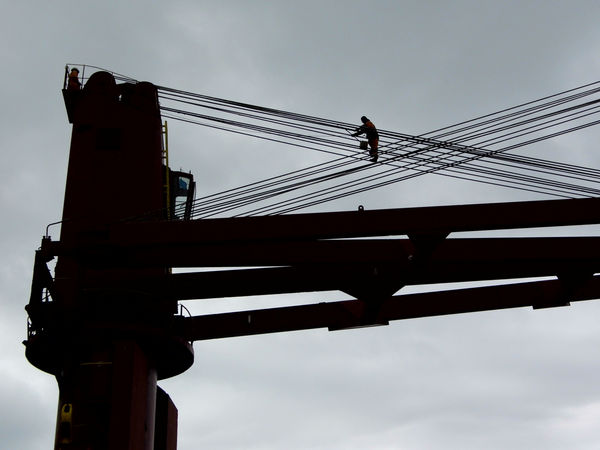
Which of these two is better in your opinion? They were taken on slightly different angles as you can see. Please comment.
Feb 9, 2014 21:05:17 #

Tough decision. I like them both, but find the second has more drama ...at least for me, and that makes it the winner.
Feb 9, 2014 21:09:13 #
erbiv wrote:
Tough decision. I like them both, but find the second has more drama ...at least for me, and that makes it the winner.
Thanks very much for your opinion. C
Feb 9, 2014 21:15:34 #

Second takes the person a bit off of dead center left to right. That makes a more interesting composition.
Feb 9, 2014 21:18:15 #
Feb 9, 2014 21:20:09 #

Number 2 by a hair because the man's arms are extended suggesting more activity.
Feb 9, 2014 21:20:14 #

It's a subtle difference, but in the second one, the workers silhouette looks better with his arm extended, and there is more symmetry in the little rectangles created by the crossing cables. Nice shots.
Feb 9, 2014 22:19:05 #

An image with a strong, interesting composition. I prefer the first due to the long diagonal leading from the top right down to the man. That diagonal, in my opinion, is enough to negate any downside of having the man towards the middle. Nice photo. 8-)
Feb 9, 2014 22:38:38 #

Feb 10, 2014 19:09:28 #

The criss-cross wires form a more dynamic composition in the second version. I also like the touch of color in the sky.
Feb 10, 2014 21:30:24 #
ronwande wrote:
Second takes the person a bit off of dead center left to right. That makes a more interesting composition.
Thanks for your input, a very valid point. Caro
Feb 10, 2014 21:31:13 #
Literati wrote:
1 for tone...2 for composition
Okay, think I'll go with the composition, thanks very much.
Feb 10, 2014 21:32:11 #
frjack wrote:
Number 2 by a hair because the man's arms are extended suggesting more activity.
Another good point, something I didn't consider.
thank you so much. Caro
Feb 10, 2014 21:33:22 #
Timarron wrote:
It's a subtle difference, but in the second one, the workers silhouette looks better with his arm extended, and there is more symmetry in the little rectangles created by the crossing cables. Nice shots.
Thanks for your input too, Timarron, most are preferring #2.
Feb 10, 2014 21:35:00 #
Bmac wrote:
An image with a strong, interesting composition. I prefer the first due to the long diagonal leading from the top right down to the man. That diagonal, in my opinion, is enough to negate any downside of having the man towards the middle. Nice photo. 8-)
Thanks for commenting, Bmac. I also prefer asymmetry.
If you want to reply, then register here. Registration is free and your account is created instantly, so you can post right away.