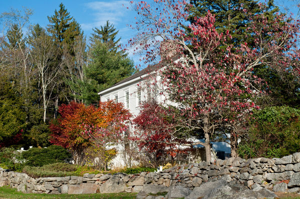
Autumn colors in black and white
Feb 8, 2014 15:52:04 #

I converted this photo from color. How does it work in black and white?

Feb 8, 2014 16:14:08 #

It's nicely composed, RMM, but the lighting is somewhat flat. I especially notice this in the rocks. The light on the trees is rather harsh too. There is movement blur in the trees. This may be acceptable, but it's not something I like in a photo. This is a personal preference thing, but I always want to see fall colors, in color.
Feb 8, 2014 16:21:48 #

I have to agree. If you are photographing fall colors and that is your subject which your title indicates that it is then it should be in color.
Looking at it in monochrome it lacks a subject.
Looking at it in monochrome it lacks a subject.
Feb 8, 2014 16:29:11 #
Feb 8, 2014 16:49:46 #

RMM wrote:
I converted this photo from color. How does it work in black and white?
Well, I think there's an inherent problem with us having an opinion (based on the title) about what fall colors look like. We open the photo and it is monochrome, which isn't typically associated with fall color and may not do justice. I have not had much luck with monochrome on my fall color shots, and I have tried all kinds of tricks. We just can't match, in conversion, what nature gives us in that color palette, and there often isn't enough variation in the tonalities of the colors to give us an exciting monochrome. What about a winter photo of the same house, with bare trees against the sky? That might give you more delineation to work with in monochrome.
I also see, in your photo, a most wonderful rock wall that I believe would give you some fine opportunities for monochrome conversions in any season, but would be especially interesting with some snow piled up - rock walls have the kind of texture and contrast that lends itself to B & W.
Feb 8, 2014 17:19:41 #

MinnieV mentioned the texture and contrast of the rock walls as being a good subject for b&w. If you are interested in a monochrome result, perhaps experiment with trying to see your subjects as having no color as you compose your image - just look at the light, shadows, texture and shapes. It's a whole different mindset :)
Feb 8, 2014 17:26:20 #

RMM wrote:
I converted this photo from color. How does it work in black and white?
Hello RMM, as has been pointed out fall colours don't work well in B&W. B&W images generally need a strong graphic element rather than being pictorial. Strong shapes, definite patterns and a story are all needed in a B&W image. Fall colours need colour. (Did I just say fall? I meant autumn ;)
Feb 8, 2014 17:45:22 #
minniev wrote:
Well, I think there's an inherent problem with us ... (show quote)
I'll probably take some shots around there, preferably on a day where everything isn't gray and white. (Which sounds kind of weird if I'm talking about converting to black and white, but the light is just so flat.)
Feb 8, 2014 17:54:14 #
The original. I wasn't thinking "black and white" when I took this. I was just trying to see what I could do with it, whether it could be interesting in black and white. No doubt more could be done with it than I was able to accomplish.
Feb 8, 2014 17:57:24 #
RMM wrote:
The original. I wasn't thinking "black and white" when I took this. I was just trying to see what I could do with it, whether it could be interesting in black and white. No doubt more could be done with it than I was able to accomplish.
If the two images were side by side my eyes would pass over the B&W and settle on the colour version.
Graham
Feb 8, 2014 18:01:21 #
Graham Smith wrote:
If the two images were side by side my eyes would pass over the B&W and settle on the colour version.
Graham
Graham
So would mine. :(
Feb 8, 2014 23:06:39 #

RMM wrote:
I converted this photo from color. How does it work in black and white?
It appears somewhat overexposed to me; I'd say by at least one stop. Composition is good, but the overexposure affects the contract between the house and the trees.
Feb 8, 2014 23:38:07 #
Mogul wrote:
It appears somewhat overexposed to me; I'd say by at least one stop. Composition is good, but the overexposure affects the contract between the house and the trees.
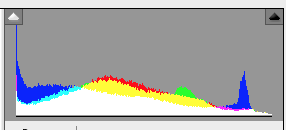
Here's the histogram. It doesn't suggest overexposure. Doesn't rule it out.
Feb 9, 2014 03:56:47 #

Many composition elements help to move your eye around a pic but often the eye tends to be drawn by the bright areas, sharply focussed areas and high contrast areas. In this pic the eye is immediately drawn to the white house. But the boards and windows of the house lack contrast so that the house itself has little to retain your interest. In the colour version the trees at the front were relatively dark which gave the house a sort of hidden, peeping out feeling which was rather nice but your conversion has lightened up the front trees considerably so that the pic feels flatter and it has lost that 'house peeping out' quality. So the subject, ie the house, isn't grabbing or holding my attention and I am finding myself exploring the high contrast wooded area at the back and the view through the trees to the building on the bottom right. To my eye these two areas have a much more attractive range of light and dark and it would have been nice if you could have got that same range for the main house view and the front trees. I can't talk much about Autumn/Fall colours because where I live we mainly have evergreens but I do think that a reprocess to darken the front trees, and lift the contrast to bring out the window and board details may give a better result. But I would probably still prefer the colour version. Just a thought. I hope this helps.
Peter
Peter
Feb 9, 2014 06:06:30 #

RMM wrote:
Here's the histogram. It doesn't suggest overexposure. Doesn't rule it out.
I would be very interested for you to explain how you can determine that the image is not overexposed simply by looking at the histogram. Rob.
If you want to reply, then register here. Registration is free and your account is created instantly, so you can post right away.