Color or B&W
Feb 4, 2014 09:51:44 #

Color or B&W
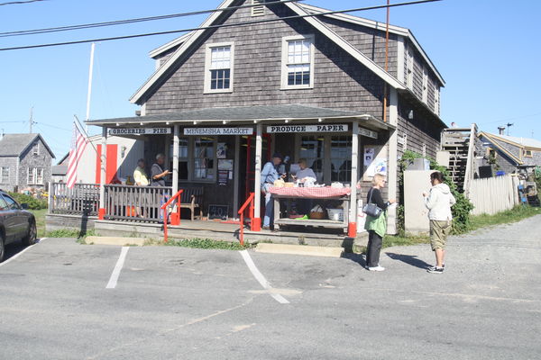
This is a photo taken on a day trip to Marthas Vineyard several years ago. The original was a jpeg , taken with a Cannon EOS Digital Rebel XS @ 24 mm 1/250 f11 ISO 200. I like the context of the photo and I am experimenting with software techniques I have learned since then to see what I can do. The question here is which better conveys the mood, color or black and white? I am leaning to B& W, but I would love to have your take and reasons why.
This is a photo taken on a day trip to Marthas Vineyard several years ago. The original was a jpeg , taken with a Cannon EOS Digital Rebel XS @ 24 mm 1/250 f11 ISO 200. I like the context of the photo and I am experimenting with software techniques I have learned since then to see what I can do. The question here is which better conveys the mood, color or black and white? I am leaning to B& W, but I would love to have your take and reasons why.
Feb 4, 2014 10:01:29 #

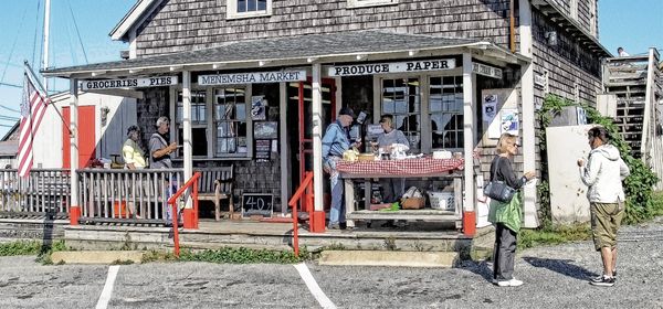
I feel that the third image needs more "black" in it and not crop the image so tightly, the bottom is fine, just keep the upper part of the house the way it was in the original.
Feb 4, 2014 10:34:33 #

How did you visualize the scene? Why do you think that it needs to be in black and white? Do you feel that it better suits the intent of the photo?
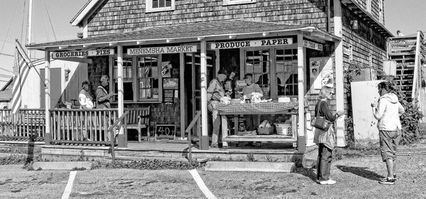
I feel that you will better tonality if you go back to the original and convert to b&w and crop.
As it is now the third photo is very harsh and complex without having a clear focal point.
I feel that you will better tonality if you go back to the original and convert to b&w and crop.
As it is now the third photo is very harsh and complex without having a clear focal point.
Check out Travel Photography - Tips and More section of our forum.
Feb 4, 2014 10:46:07 #
I'm leaning toward the color version because I think the colors are very much an important part of the Martha's Vineyard experience... the slightly bleached out colors resulting from exposure to sand and salty air, the color of the architecture, the very pale blue sky so typical at sea coasts, etc. In the b&w version, you lose most of this, and the focus shifts more to the details within the composition.
It really comes down to what you want to communicate to the viewer, what you feel is most important in the image, and which version most effectively expresses what you are trying to communicate to the viewer. If this was my image, I'd pick color.
It really comes down to what you want to communicate to the viewer, what you feel is most important in the image, and which version most effectively expresses what you are trying to communicate to the viewer. If this was my image, I'd pick color.
Feb 5, 2014 10:59:04 #

Considering there is too much parkinglot in the front and the roof is cut off, the crop is a good one. I really like the relaxed, neighbourly atmosphere the entire pictue portrays.
I feel that both the colours and the cloudless sky convey the fact that it was a bright day, not overly hot (long sleeves).
To convey the mood, I vote for the colour picture.
Then looking at your cropped pictures: This is the critique you didn't ask for but I'll give it anyway, then I'll go and hide somewhere in the basement....
I don't know what software techniques you used, but I feel that the cropped image is "overcooked". If you look at the people's faces, facial features are gone, or almost so.
The picture gives me the impression of a coloured pencil drawing, and I don't like it.
There certainly are enough pixels to have retained the details, the crop is about 3 times as large (at least in pixels across) as the original.
The B/W crop, I think would do much better if there was more contrast, or at least deeper black areas. But I believe the brightness of the day may be very difficult to express in a B/W photo.
OK, I've had my say, now I'll go and hide...
Feb 5, 2014 11:06:23 #
The third photo clearly illustrates why I prefer color nearly all the time. I feel you composed the first photo with a level camera in order to preserve perspective/distortion problems when pointing a camera upward, but I would have pointed the camera upward to leave out some of the foreground street and include the roof peak. Distortion and the phone lines can be reduced in camera and/or eliminated in post processing... just personal opinion without intent to offend. :thumbup:
Feb 5, 2014 11:13:45 #

Profg wrote:
Color or B&W
This is a photo taken on a day trip to Marthas Vineyard several years ago. The original was a jpeg , taken with a Cannon EOS Digital Rebel XS @ 24 mm 1/250 f11 ISO 200. I like the context of the photo and I am experimenting with software techniques I have learned since then to see what I can do. The question here is which better conveys the mood, color or black and white? I am leaning to B& W, but I would love to have your take and reasons why.
This is a photo taken on a day trip to Marthas Vineyard several years ago. The original was a jpeg , taken with a Cannon EOS Digital Rebel XS @ 24 mm 1/250 f11 ISO 200. I like the context of the photo and I am experimenting with software techniques I have learned since then to see what I can do. The question here is which better conveys the mood, color or black and white? I am leaning to B& W, but I would love to have your take and reasons why.
The key question is, what is this mood or context in which you took it? If it's about the people that's one crop, if it's about the mood of the old building that's another crop. That also might answer your question about color or black and white. My mental focus, mood, context would be the door and the old building, with just a few people--an accepted invitation to an old yet re-invented building.
Check out Printers and Color Printing Forum section of our forum.
Feb 5, 2014 11:35:19 #

I usually prefer b&w, but in this case I prefer color version #2 because it adds a three-deminsional depth that I don't see in the b&w. Also, as pointed out by flyguy, the b&w is very gray and needs more black in it. A photography professor (an ex-photojournalist for Life magazine) told me once that all b&w photos need black blacks and white whites. I think that's a good rule to follow whenever we can.
Feb 5, 2014 12:21:27 #
I really appreciate all your comments. This photo was taken in 2010, when I was just beginning to try to learn how to do photography as a form of art. I went to the Vinyard to look for nature and landscape subjects. I took the photo because it represented an example of the life of islanders in a rural area after most of the tourists have left - a market (that also served as the post office) that catered to the locals . I purposely processed this to emphasize the activity of the people rather than their individual identities - a watercolor or charcoal effect.
I know that all the thoughtful comments you have made will help me to advance in my quest to become a better photographer. I sense that the people on this forum really want to help, and more importantly, have a lot of knowledge that does help.
I know that all the thoughtful comments you have made will help me to advance in my quest to become a better photographer. I sense that the people on this forum really want to help, and more importantly, have a lot of knowledge that does help.
If you want to reply, then register here. Registration is free and your account is created instantly, so you can post right away.
Check out AI Artistry and Creation section of our forum.