Something Different
Feb 2, 2014 23:29:30 #
I hesitated to post these two shots.....they are so different from what I've done recently. I'm not sure if they are artistic or just a waste of a click. There is something about both of them that I like, though, so here goes.
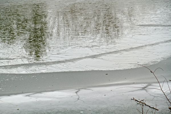
This is the ice on the surface of the lake as it begins to fracture. I tried it in B&W, but I like the green in the reflection of the pine trees. If I could do it over, I think I would frame the limbs in the lower right corner a little better.
(Download)
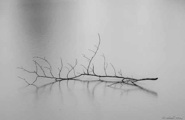
I like this in B&W. I tried it with a slight vignette, but couldn't get it to where I was satisfied with it.
(Download)
Feb 3, 2014 00:00:51 #

I really like the second one. I think it's perfect just like it is!
Feb 3, 2014 00:09:52 #

luvmypets wrote:
I really like the second one. I think it's perfect just like it is!
Oh, yes, me too.
Feb 3, 2014 02:39:42 #
I like them both, though you are right about the branches in the lower right. The tinge of green definitely adds interest.
I saw something similar to the second one recently. Wish I could remember if it was here or on another photo forum I'm on. That one had the contrast set darker for more drama and was quite beautiful. I like yours for its more ethereal quality.
I saw something similar to the second one recently. Wish I could remember if it was here or on another photo forum I'm on. That one had the contrast set darker for more drama and was quite beautiful. I like yours for its more ethereal quality.
Feb 3, 2014 04:56:34 #

Feb 3, 2014 06:13:54 #
I like them both. Not a wasted click at all. The first one, I would definitely crop tighter. Make it more of an abstract with just the shapes and patterns accentuated. The second one is very lovely. I love the soft light. I might try to crop it a bit tighter; but that could take away the lovely muted reflections that are important in this composition.
Feb 3, 2014 08:00:21 #

Feb 3, 2014 08:29:59 #

Feb 3, 2014 08:56:17 #
luvmypets wrote:
I really like the second one. I think it's perfect just like it is!
Thank you, luvmypets. I appreciate your comment!
Feb 3, 2014 08:56:48 #
Feb 3, 2014 08:57:22 #

Feb 3, 2014 08:58:30 #
Selkii wrote:
I like them both, though you are right about the branches in the lower right. The tinge of green definitely adds interest.
I saw something similar to the second one recently. Wish I could remember if it was here or on another photo forum I'm on. That one had the contrast set darker for more drama and was quite beautiful. I like yours for its more ethereal quality.
I saw something similar to the second one recently. Wish I could remember if it was here or on another photo forum I'm on. That one had the contrast set darker for more drama and was quite beautiful. I like yours for its more ethereal quality.
Thanks, Selkii. I tried lots of different effects and adjustments for the second one, but just couldn't come up with one that I was totally satisfied with. I think this is one I will continue to work on for awhile.
Feb 3, 2014 08:59:08 #
angler wrote:
Number 2 for me Nehall,good shot.
Thanks, angler. Your kind comment is appreciated.
Feb 3, 2014 09:00:14 #
ebrunner wrote:
I like them both. Not a wasted click at all. The first one, I would definitely crop tighter. Make it more of an abstract with just the shapes and patterns accentuated. The second one is very lovely. I love the soft light. I might try to crop it a bit tighter; but that could take away the lovely muted reflections that are important in this composition.
Thanks for your comment and for the suggestions, ebrunner. I'll give them a try.
Feb 3, 2014 09:01:04 #
colo43 wrote:
2nd one for myself as well.
it has a mystic look to it.
it has a mystic look to it.
Thanks, colo43, for looking and for your comment as well.
If you want to reply, then register here. Registration is free and your account is created instantly, so you can post right away.