Yesteryear Village
Jan 20, 2014 07:54:24 #
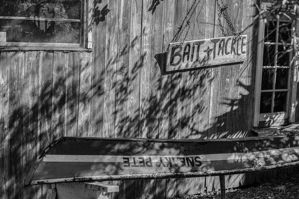
Please critique. Any comments appreciated.
Camera Info: ISO 100
70mm
F5.6
1/320 sec
Camera Info: ISO 100
70mm
F5.6
1/320 sec
Yesteryear Village-S Florida Fair
Jan 20, 2014 08:03:16 #

Love the old bait and tackle sign! I think this would have been better had you shot this straight on. I would have included more of that window which looks old, and possibly left the fancier window out of the frame, but it's hard to tell because I was not there. This could make a wonderful b&w if you worked in post to bring out all the tones. I think the tree shadows are more of a distraction so it might be better to shoot at a different time of day.
Jan 20, 2014 08:30:24 #

For me there is too much going on here. If its the bait sign then the upside down writing on the boat is quite a distraction as I spent quite a few seconds trying to work out what it said. I guess what i am really saying is that i don't know what the subject is and I don't know where to look. And a little more contrast would probably help. But its a nice idea and there is probably a pic in there somewhere.
Peter
Peter
Jan 20, 2014 15:27:57 #

Hey steve, I think I know where you were headed, but either by choice or necessity the shot feels a little off kilter.
The concept is good, but as stated the angle distracts rather than draws you in. The shot is quite close too so if this was a crop then zoom out a little to let us see more. Notice the angle in this shot and how you know exactly where you are http://kevinliebl.files.wordpress.com/2010/07/regs-bait-shop001.jpg
For me, the shadow of the tree is very distracting. It is the first thing I noticed, but luckily a re-shoot at a different time of day would correct that. I would also like to see more depth in the wood grain. It will give that old feel and make the shot.
Again as stated above, the main thing I would focus on when shooting something like this is to think about the story. What is it you are trying to say? I have said this before, but your photo reminds me of looking at a friend's vacation photos. They were there so they know the story, but without the friend telling me all about it I am lost. I know it is a bait and tackle shop, but ...
I hope this helps and keep posting here! Steve
Jan 20, 2014 15:43:07 #

Rather than rehashing what others have already stated, I noticed you used an aperture of f/5.6. In my opinion, in a scene like this where usually you want everything in sharp focus to show texture, rather than a subject/background separation, perhaps a smaller aperture, say f/16, would have been more applicable. I also believe this image is not well suited for b&w but might have more impact in color. 8-)
Jan 20, 2014 16:22:04 #
There is a good discussion going on here about whether to use b&w or not. You might find this interesting, Steve.
http://www.uglyhedgehog.com/t-179044-1.html
http://www.uglyhedgehog.com/t-179044-1.html
Jan 20, 2014 19:57:28 #

Shadows are generally your friend. In this case they tell you something about the environment that you wouldn't know without them, and they break up what would otherwise be a rather plain empty wall. I'll buck the trend and say I like them...the reflections too. This may not be a DiVinci, but it is well executed, and it tells a story. The only thing that I feel needs to be done is to get the blacks black and the lights close to white... more contrast.
If you want to reply, then register here. Registration is free and your account is created instantly, so you can post right away.